
This complete guide for developers covers web accessibility basics, WCAG standards,
ARIA, and real code examples. Build inclusive websites that work for every user.
Millions of people visit websites every day and millions of them are being
accidentally locked out of yours.
Web accessibility isn’t a “nice to have” anymore. It’s a fundamental part of
professional web development, and this guide for developers will walk you through
everything you need to know from core principles to real, copy-paste code examples.
Whether you’re building your first site or refactoring an existing one, making your
web projects accessible is one of the highest-impact improvements you can make.
Let’s build a web that works for everyone.
What Is Web Accessibility? (And Why Developers Must Care)
Web accessibility means building websites and applications that everyone can use including people with visual, auditory, motor, or cognitive disabilities.
The goal is simple: no user should be excluded from your content because of how they
interact with technology.
The Scale of the Problem
The numbers make this impossible to ignore:
- 1.3 billion people worldwide live with some form of disability (WHO)
- 71% of users with disabilities will leave a website that is hard to use
- 98% of the top 1 million websites have detectable accessibility failures
(WebAIM Million Report) - The U.S. Web Accessibility market represents $490 billion in annual spending
power
This isn’t just a moral argument. It’s a business argument. Inaccessible websites
lose real customers every single day.
The Legal Side of Accessibility
In many countries, web accessibility is legally required:
- USA Americans with Disabilities Act (ADA) applies to websites
- EU European Accessibility Act (EAA) enforces digital accessibility
- UK Equality Act 2010 covers digital services
- Australia Disability Discrimination Act applies online
Companies including Domino’s Pizza, Target, and Netflix have faced costly lawsuits
over inaccessible websites. For any guide for developers to be complete, legal
awareness must be part of it.

Understanding WCAG: The Accessibility Standard Every Developer Needs
The Web Content Accessibility Guidelines (WCAG) are the globally recognized
standard for web accessibility. Created by the W3C, they provide a clear framework
for building accessible digital content.
WCAG Versions
| Version | Year | Key Change |
|---|---|---|
| WCAG 2.0 | 2008 | Original standard, 61 criteria |
| WCAG 2.1 | 2018 | Added mobile + cognitive guidelines |
| WCAG 2.2 | 2023 | New focus criteria, removed outdated ones |
| WCAG 3.0 | In progress | Major restructure (not yet finalized) |
For most developers today, WCAG 2.1 AA is the target standard. It’s what most
legal requirements reference and what employers and clients typically require.
The Four POUR Principles
WCAG is built on four core principles. Every accessibility requirement maps back to
one of these:
1. Perceivable
Information must be presentable to users in ways they can perceive.
- Provide text alternatives for all non-text content
- Offer captions for videos and audio
- Don’t rely on color alone to convey meaning
- Ensure sufficient color contrast
2. Operable
All interface components must be navigable and usable.
- Make all functionality available via keyboard
- Give users enough time to read content
- Don’t use content that flashes more than 3 times per second
- Provide clear focus indicators
3. Understandable
Content and interface behavior must be clear and predictable.
- Use plain, readable language
- Make navigation consistent across pages
- Provide helpful error messages in forms
- Identify the page language in HTML
4. Robust
Content must be interpreted reliably by assistive technologies.
- Use valid, well-structured HTML
- Use ARIA roles and attributes correctly
- Ensure compatibility with current and future user agents
Think of POUR as your accessibility compass. Whenever you’re unsure if something is
accessible, ask: is it Perceivable, Operable, Understandable, and Robust?
A Developer’s Guide to Semantic HTML for Accessibility
The single most powerful accessibility tool you have is already built into HTML.
Semantic markup gives meaning to your content and assistive technologies
depend on that meaning.
Use the Right Element for the Job
<!-- Non-semantic screen readers don't understand this -->
<div class="button" onclick="submit()">Submit Form</div>

<!-- Semantic announces itself as a button -->
<button type="submit">Submit Form</button>
<!-- Generic container with no meaning -->
<div class="nav-links">
<div><a href="/">Home</a></div>
</div>
<!-- Semantic navigation landmark -->
<nav aria-label="Main navigation">
<ul>
<li><a href="/">Home</a></li>
<li><a href="/about">About</a></li>
</ul>
</nav>Heading Hierarchy Matters More Than You Think
Screen reader users often navigate a page by jumping between headings just like
sighted users scan visually. A broken heading structure is like a book with chapters
in random order.
<!-- Wrong skipping levels and using headings for styling -->
<h1>Page Title</h1>
<h3>First Section</h3>  <!-- Skipped h2! -->
<h5>Subsection</h5>     <!-- Skipped h4! -->

<!-- Correct logical, sequential heading structure -->
<h1>Page Title</h1>
  <h2>First Section</h2>
    <h3>Subsection</h3>
  <h2>Second Section</h2>
    <h3>Another Subsection</h3>
Rules to follow:
- One
<h1>per page it’s the page title - Never skip heading levels
- Use headings for structure, never for visual styling
- Use CSS to control heading appearance separately
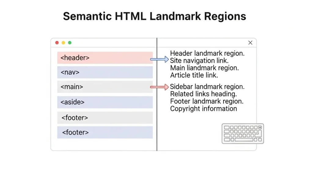
Landmark Roles in HTML5
HTML5 semantic elements double as ARIA landmark roles automatically:
| HTML Element | Implicit ARIA Role | Purpose |
|---|---|---|
<header> | banner | Site header |
<nav> | navigation | Navigation links |
<main> | main | Primary content |
<aside> | complementary | Sidebar content |
<footer> | contentinfo | Site footer |
<form> | form | Form region |
<section> | region (with label) | Thematic section |
Screen reader users navigate by landmarks it’s how they jump directly to the
main content without sitting through the entire header every time.
ARIA: When HTML Isn’t Enough
ARIA (Accessible Rich Internet Applications) is a set of attributes you add to
HTML to communicate extra accessibility information to assistive technologies.
The first rule of ARIA is: don’t use ARIA if native HTML can do the job.
Semantic HTML should always come first. ARIA fills the gaps.
The Three Types of ARIA Attributes
1. Roles Define what an element is:
<div role="alert">Your session will expire in 2 minutes.</div>
<div role="dialog" aria-labelledby="dialog-title">...</div>
<span role="img" aria-label="Five star rating"></span>
2. Properties Describe element characteristics:
<input type="text" aria-required="true" aria-describedby="email-hint">
<p id="email-hint">Enter the email address associated with your account.</p>

<button aria-expanded="false" aria-controls="dropdown-menu">
  Open Menu
</button>
3. States Communicate dynamic conditions:
<li role="menuitem" aria-selected="true">Option 1</li>
<button aria-pressed="false">Toggle Dark Mode</button>
<div aria-live="polite" aria-atomic="true">
  <!-- Dynamic content updates announced here -->
</div>
Live Regions: Announcing Dynamic Content
When content changes dynamically (like a loading spinner, error message, or
notification), screen readers won’t announce it unless you use aria-live:
<!-- Polite: waits for user to finish current action -->
<div aria-live="polite" id="status-message"></div>

<!-- Assertive: interrupts immediately (use sparingly!) -->
<div aria-live="assertive" id="error-message"></div>

<script>
  // This update will now be announced to screen reader users
  document.getElementById('status-message').textContent =
    'Form submitted successfully!';
</script>
Common ARIA Mistakes to Avoid
- Don’t add
role="button"to a<div>just use<button> - Don’t use
aria-hidden="true"on focusable elements keyboard users will
still reach them - Don’t label everything too many ARIA labels create noise for screen readers
- Never use
tabindexvalues above 0 it breaks natural tab order
Keyboard Accessibility: Building for Users Who Don’t Use a Mouse
Many users navigate entirely by keyboard including people with motor disabilities,
power users, and screen reader users.
Every interaction on your site must be reachable and operable without a mouse.
The Core Keyboard Navigation Rules
- All interactive elements must be focusable via
Tab Enteractivates buttons and linksSpacetoggles checkboxes and activates buttonsArrow keysnavigate within components (menus, radio groups, tabs)Escapecloses modals, dropdowns, and overlays
Make Focus Visible Never Hide It
The most common keyboard accessibility mistake is removing the focus outline:
/* NEVER do this keyboard users become completely lost */
*:focus {
  outline: none;
}

/* Style it beautifully instead */
*:focus-visible {
  outline: 3px solid #005FCC;
  outline-offset: 3px;
  border-radius: 4px;
}
The focus-visible pseudo-class shows the outline for keyboard users but hides it
for mouse clicks giving you the best of both worlds.
Building a Custom Accessible Modal
Modals are one of the trickiest components to make accessible. Here’s the full
pattern:
<dialog id="myModal" aria-labelledby="modal-title" aria-modal="true">
  <h2 id="modal-title">Confirm Your Action</h2>
  <p>Are you sure you want to delete this item?</p>
  <button id="confirmBtn">Yes, Delete</button>
  <button id="cancelBtn">Cancel</button>
</dialog>
const modal = document.getElementById('myModal');
const confirm = document.getElementById('confirmBtn');
const cancel = document.getElementById('cancelBtn');
function openModal() {
modal.showModal();
confirm.focus(); // Move focus INTO the modal
}
cancel.addEventListener('click', () => {
modal.close();
// Return focus to the trigger button
document.getElementById('openModalBtn').focus();
});Key requirements for accessible modals:
- Focus must move INTO the modal when it opens
- Focus must be trapped inside until closed
Escapekey must close it- Focus must return to the trigger element when closed
- Background content must be inert while modal is open
Skip Navigation Links
Add a skip link at the very top of every page. It lets keyboard users jump straight
to the main content skipping repetitive navigation:
<!-- First element in <body> -->
<a href="#main-content" class="skip-link">
  Skip to main content
</a>

<style>
.skip-link {
  position: absolute;
  top: -100px;
  left: 16px;
  background: #005FCC;
  color: white;
  padding: 8px 16px;
  border-radius: 0 0 4px 4px;
  text-decoration: none;
  font-weight: bold;
  z-index: 9999;
  transition: top 0.2s;
}

.skip-link:focus {
  top: 0; /* Slides into view on Tab press */
}
</style>

<main id="main-content">
  <!-- Page content starts here -->
</main>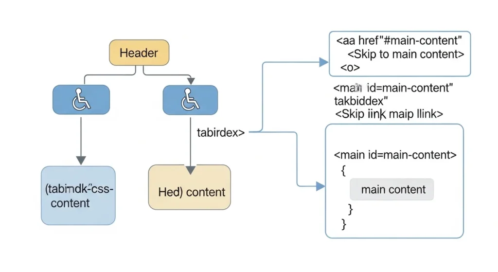
Color, Contrast, and Visual Accessibility
Not everyone perceives color the same way. About 8% of men and 0.5% of women
have some form of color vision deficiency. And even users with perfect vision struggle
with low contrast text.
WCAG Contrast Requirements
| Content Type | AA Level | AAA Level |
|---|---|---|
| Normal text (under 18pt) | 4.5:1 | 7:1 |
| Large text (18pt+ or bold 14pt+) | 3:1 | 4.5:1 |
| UI components and icons | 3:1 | N/A |
| Decorative elements | No requirement | N/A |
Never Use Color as the Only Indicator
<!-- Wrong colorblind users can't tell which fields are required -->
<style>
  .required-label { color: red; }
</style>
<label class="required-label">Email</label>

<!-- Correct uses color AND a text indicator -->
<label>
  Email
  <span class="required" aria-label="required">*</span>
</label>
<p class="hint">Fields marked with * are required</p>
The same principle applies to:
- Form validation (don’t just turn the border red add an icon or text)
- Data charts (don’t use color alone to distinguish data sets)
- Status indicators (use icons + text + color together)
Free Contrast Checking Tools
- WebAIM Contrast Checker webaim.org/resources/contrastchecker
- Colour Contrast Analyser Desktop app by TPGi
- Chrome DevTools Built-in contrast ratio in the color picker
- Figma A11y plugins Check contrast while designing
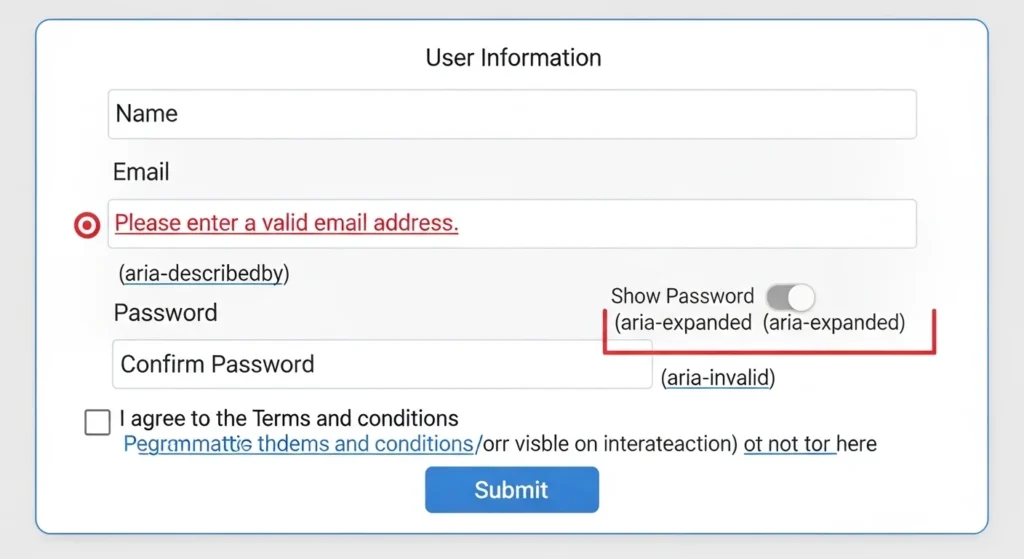
Accessible Forms: Where Most Websites Fail
Forms are the most interaction-heavy part of most websites and they’re consistently
the most inaccessible.
The Complete Accessible Form Pattern
<form novalidate>
  <!-- Always link labels to inputs -->
  <div class="form-group">
    <label for="full-name">
      Full Name
      <span aria-hidden="true" class="required-star">*</span>
    </label>
    <input
      type="text"
      id="full-name"
      name="full-name"
      autocomplete="name"
      required
      aria-required="true"
      aria-describedby="name-error"
    >
    <span
      id="name-error"
      role="alert"
      class="error-message"
      aria-live="polite"
    ></span>
  </div>

  <!-- Group related inputs with fieldset + legend -->
  <fieldset>
    <legend>Preferred Contact Method</legend>
    <label>
      <input type="radio" name="contact" value="email"> Email
    </label>
    <label>
      <input type="radio" name="contact" value="phone"> Phone
    </label>
  </fieldset>

  <button type="submit">Submit Application</button>
</form>
Form Accessibility Checklist
Every form on your website should pass this checklist:
- Every input has an associated
<label>(usingforandid) - Required fields are marked with both visual indicator and
aria-required - Error messages are linked to inputs via
aria-describedby - Error messages use
role="alert"for screen reader announcement - Related inputs are grouped with
<fieldset>and<legend> autocompleteattributes help users with motor disabilities- Placeholder text is not used as a replacement for labels
- Success messages are announced via
aria-live
Testing Your Website for Accessibility
Building accessible code is only half the job. You also need to test it with
real tools and real users.
Automated Testing Tools
Automated tools catch about 30–40% of accessibility issues. They’re a great
starting point but can never replace manual testing.
| Tool | Type | Best For |
|---|---|---|
| axe DevTools | Browser extension | Quick audits while coding |
| Lighthouse | Chrome DevTools | Overall score + suggestions |
| WAVE | Browser extension | Visual overlay of issues |
| Deque axe-core | JavaScript library | CI/CD pipeline integration |
| IBM Equal Access | Browser extension | Enterprise-level audits |
Manual Testing Checklist
After automated testing, always check these manually:
Keyboard testing:
- Unplug your mouse. Navigate the entire page with Tab only.
- Can you reach every interactive element?
- Is the focus indicator always visible?
- Can you complete every task (forms, modals, dropdowns)?
Screen reader testing:
- Windows: NVDA (free) with Firefox or Chrome
- macOS/iOS: VoiceOver (built-in) press Cmd + F5
- Android: TalkBack (built-in)
- Does the page make sense when read aloud?
- Are all images described?
- Are dynamic updates announced?
Zoom testing:
- Zoom to 200% in browser settings
- Does content reflow cleanly without horizontal scrolling?
- Does all text remain readable?
Color testing:
- Use the Colorblindly Chrome extension to simulate color blindness
- Does all content remain understandable?
Integrate Accessibility into Your Workflow
Don’t treat accessibility as a final audit. Build it in from the start:
- Add axe-core to your Jest or Cypress test suite
- Include accessibility requirements in design handoffs
- Create an accessibility checklist for PR reviews
- Run Lighthouse in your CI/CD pipeline
- Schedule quarterly accessibility audits
Quick Reference: Accessibility Code Snippets
Here are ready-to-use patterns every developer should have bookmarked:
<!-- Visually hidden but screen-reader accessible -->
<style>
.sr-only {
  position: absolute;
  width: 1px; height: 1px;
  padding: 0; margin: -1px;
  overflow: hidden;
  clip: rect(0,0,0,0);
  white-space: nowrap;
  border: 0;
}
</style>

<!-- Icon button with accessible label -->
<button aria-label="Close dialog">
  <svg aria-hidden="true" focusable="false">...</svg>
</button>

<!-- Decorative image -->
<img src="decorative-divider.png" alt="">

<!-- Informative image -->
<img src="chart.png"
     alt="Bar chart showing 40% increase in sales from Q1 to Q4 2024">

<!-- External link indicator -->
<a href="https://example.com" target="_blank">
  Visit Example
  <span class="sr-only">(opens in new tab)</span>
</a>

<!-- Loading state -->
<button aria-busy="true" aria-disabled="true">
  <span aria-hidden="true">⟳</span>
  Processing...
</button>
Conclusion
Web accessibility isn’t a feature you add at the end it’s a quality you build in
from the beginning. And as this guide for developers has shown, most of it comes
down to good habits: semantic HTML, proper ARIA usage, keyboard support, clear
contrast, and well-labeled forms.
Here’s what you’ve learned today:
- WCAG and POUR the framework behind every accessibility decision
- Semantic HTML the most powerful accessibility tool you already have
- ARIA how to communicate with assistive technologies correctly
- Keyboard accessibility building for users who never touch a mouse
- Color and contrast designing for all types of vision
- Accessible forms the most interaction-heavy, highest-failure area
- Testing tools how to find and fix issues before real users do
The web is for everyone. That includes the 1.3 billion people who experience the
world differently and they deserve the same access to your content as anyone else.
Start with one fix today. Run the axe DevTools extension on your website
right now. It takes 30 seconds and will show you exactly where to begin. Share
this guide with your team accessibility is everyone’s responsibility.
Frequently Asked Questions (FAQs)
1. What is web accessibility and why is it important for developers?
Web accessibility means building websites that everyone can use, including people
with disabilities. For developers, it means writing semantic HTML, supporting keyboard
navigation, using ARIA correctly, and ensuring sufficient color contrast. It improves
UX for all users, boosts SEO, and helps avoid legal liability.
2. What is WCAG and what level should I aim for?
WCAG (Web Content Accessibility Guidelines) is the international standard for web
accessibility. There are three levels A, AA, and AAA. Most developers should target
WCAG 2.1 Level AA it’s what most legal requirements reference and what
enterprise clients typically require.
3. How do I test my website for accessibility issues?
Start with automated tools like axe DevTools or Google Lighthouse for a quick scan.
Then test manually unplug your mouse and navigate with just the keyboard, and test
with a screen reader like NVDA (Windows) or VoiceOver (Mac/iOS). Automated tools
catch about 30–40% of issues; manual testing catches the rest.
4. Is web accessibility required by law?
In many countries, yes. In the USA, the ADA applies to websites. The EU’s European
Accessibility Act, the UK’s Equality Act, and Australia’s Disability Discrimination
Act all have digital implications. Several major companies have faced lawsuits for
inaccessible websites.
5. Does fixing accessibility improve SEO?
Yes — significantly. Semantic HTML, proper heading structure, image alt text,
descriptive link text, and fast load times all improve accessibility AND SEO. Google’s
crawler works similarly to a screen reader, so accessible sites are generally easier
for search engines to understand and rank.