
Learn CSS Grid Layout tutorial step by step from basics to advanced layouts. Build real responsive designs faster than ever. Perfect for beginners and developers.
Struggling to build clean, responsive layouts with CSS? You’re not alone and CSS Grid is the answer you’ve been waiting for.
In this CSS Grid tutorial, we’ll walk through everything you need to know about CSS Grid Layout from the very first line of code to building real-world, responsive web pages. Whether you’re a total beginner or brushing up your skills, this guide has you covered.
No fluff. No confusion. Just practical, easy-to-follow steps.
What Is CSS Grid Layout?
CSS Grid is a two-dimensional layout system built right into CSS. It lets you control both rows and columns at the same time something older methods like Flexbox or floats simply can’t do.
Think of it like a spreadsheet for your webpage. You define the structure, and the browser fills it in perfectly.
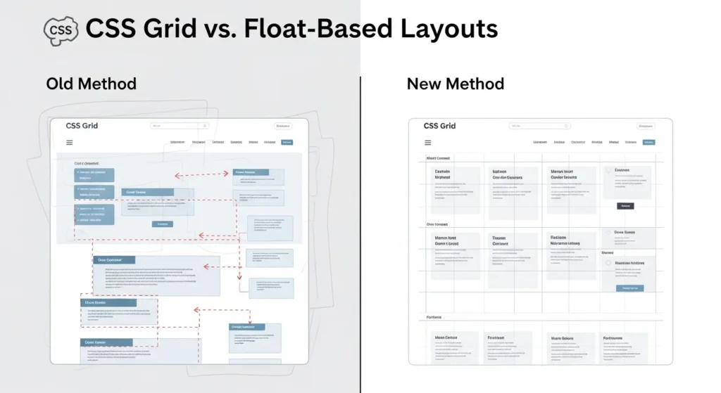
Why CSS Grid Changed Web Design Forever
Before CSS Grid, developers relied on hacks float-based grids, Bootstrap columns, and complex positioning tricks.
CSS Grid made all of that unnecessary. Now, with just a few lines of CSS, you can:
- Create multi-column page layouts
- Build responsive designs without media query overload
- Align items precisely in both directions
- Overlap elements intentionally
It’s not just easier it’s more powerful.
CSS Grid Tutorial: Setting Up Your First Grid
Let’s start with the basics. To activate CSS Grid, you only need one line:
.container {
  display: grid;
}
That’s it. Now every direct child of .container becomes a grid item.
Defining Columns and Rows
Use grid-template-columns and grid-template-rows to define your layout:
.container {
  display: grid;
  grid-template-columns: 200px 200px 200px;
  grid-template-rows: 100px 100px;
}
This creates a 3-column, 2-row grid. Simple, right?
The fr Unit Your New Best Friend
Instead of fixed pixels, use fr (fractional unit) for flexible, responsive grids:
grid-template-columns: 1fr 2fr 1fr;This means the middle column takes twice the space of the others. Flexible and clean.
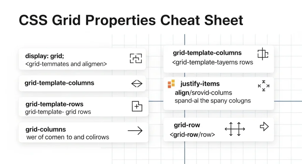
CSS Grid Properties You Must Know
Here’s a breakdown of the most important CSS Grid properties:
Container Properties
| Property | What It Does |
|---|---|
display: grid | Activates grid layout |
grid-template-columns | Defines column sizes |
grid-template-rows | Defines row sizes |
gap | Adds spacing between items |
grid-template-areas | Names sections of the grid |
justify-items | Aligns items horizontally |
align-items | Aligns items vertically |
Item Properties
| Property | What It Does |
|---|---|
grid-column | Spans item across columns |
grid-row | Spans item across rows |
justify-self | Horizontal align for one item |
align-self | Vertical align for one item |
grid-area | Assigns item to a named area |
How to Use grid-template-areas (The Visual Way)
This is one of the most satisfying features of CSS Grid. You can literally draw your layout in CSS:
.container {
  display: grid;
  grid-template-areas:
    "header header header"
    "sidebar main main"
    "footer footer footer";
}

header  { grid-area: header; }
aside   { grid-area: sidebar; }
main    { grid-area: main; }
footer  { grid-area: footer; }
Your page layout is now described in plain text. This makes your CSS incredibly readable and easy to maintain.
Building a Responsive CSS Grid Layout
Here’s where the magic really happens. CSS Grid makes responsiveness almost effortless.
Using repeat() and auto-fill
.container {
  display: grid;
  grid-template-columns: repeat(auto-fill, minmax(250px, 1fr));
  gap: 20px;
}
This single snippet creates a fully responsive card grid no media queries needed. Cards automatically wrap to the next row when the screen gets smaller.
When to Add Media Queries
Even with CSS Grid’s flexibility, sometimes you need specific breakpoints:
@media (max-width: 768px) {
  .container {
    grid-template-columns: 1fr;
  }
}
Use this to stack everything into one column on mobile.

CSS Grid vs Flexbox: Which One Should You Use?
This is one of the most asked questions in web development and the honest answer is: both, but for different things.
| Feature | CSS Grid | Flexbox |
|---|---|---|
| Dimensions | 2D (rows + columns) | 1D (row OR column) |
| Best for | Page layouts | Component alignment |
| Content flow | Grid-first | Content-first |
| Browser support | Excellent | Excellent |
Use Grid when you’re designing the overall page structure.
Use Flexbox when you’re aligning items inside a component like a nav bar or a card.
They’re not rivals they’re teammates.
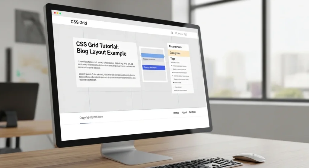
Real-World CSS Grid Example: Blog Layout
Let’s build a simple but realistic blog layout:
.blog-layout {
  display: grid;
  grid-template-columns: 1fr 300px;
  grid-template-rows: auto 1fr auto;
  grid-template-areas:
    "header  header"
    "content sidebar"
    "footer  footer";
  gap: 24px;
  max-width: 1200px;
  margin: 0 auto;
}
<div class="blog-layout">
<header>Site Header</header>
<main>Main Content</main>
<aside>Sidebar</aside>
<footer>Footer</footer>
</div>Clean. Readable. Fully responsive when combined with a media query.
Pro Tips for CSS Grid Mastery
Here are some tips that most tutorials skip:
- Use
gapinstead ofmarginit’s cleaner and more predictable - Name your grid lines for complex layouts:
[col-start] 1fr [col-end] - Use
grid-auto-rows: minmax(100px, auto)to prevent content from overflowing short rows - Chrome DevTools has a Grid Inspector use it to visualize your grid in real time
- Don’t mix
gridandinline-blockon the same container it causes weird bugs place-items: centeris a shortcut for centering both horizontally and vertically
Conclusion
CSS Grid is one of the most powerful tools in a web developer’s toolkit and now you know how to use it.
In this CSS Grid tutorial, you’ve learned:
- What CSS Grid is and why it matters
- How to set up rows, columns, and gaps
- How to use
frunits,auto-fill, andgrid-template-areas - The difference between CSS Grid and Flexbox
- How to build a real blog layout
The best way to master CSS Grid? Build something today. Take the blog layout example, open your code editor, and make it your own. Every layout you build makes the next one faster.
Bookmark this guide and share it with a developer friend it might just save them hours of frustration.
Frequently Asked Questions (FAQs)
1. What is CSS Grid used for?
CSS Grid is used to create two-dimensional web layouts controlling both rows and columns at the same time. It’s ideal for building full page structures like headers, sidebars, content areas, and footers.
2. Is CSS Grid better than Flexbox?
Neither is strictly “better” they solve different problems. CSS Grid is best for overall page layouts (2D), while Flexbox excels at aligning items within a single row or column (1D). Most modern projects use both.
3. Is CSS Grid easy for beginners?
Yes! CSS Grid is beginner-friendly once you understand a few core concepts like grid-template-columns, gap, and fr units. This tutorial is designed to take you from zero to confident in one read.
4. Does CSS Grid work in all browsers?
CSS Grid has excellent browser support it works in all modern browsers including Chrome, Firefox, Safari, and Edge. Over 97% of global users are on browsers that fully support it.
5. How do I make a responsive grid without media queries?
Use repeat(auto-fill, minmax(250px, 1fr)) as your grid-template-columns value. This automatically adjusts the number of columns based on the available screen width no media queries required.