
What if your website could move, breathe, and feel alive without writing a single line of JavaScript?
CSS animations are one of the most powerful (and underused) tools in a web developer’s toolkit. Whether you want a smooth button hover, a full-screen loading spinner, or a dramatic hero entrance, CSS animations can do it all cleanly, efficiently, and beautifully.
In this guide, you’ll learn exactly how to create stunning animations with CSS from your first transition to advanced @keyframes magic. No frameworks. No libraries. Just pure CSS.
What Are CSS Animations? (And Why Should You Care?)
CSS animations allow HTML elements to change their style over time smoothly and automatically.
Instead of relying on JavaScript for every little movement, CSS handles the logic right in your stylesheet. This means faster load times, cleaner code, and a better experience for your users.
There are two main tools CSS gives you:
- Transitions – For simple A-to-B state changes (like hover effects)
- @keyframes Animations For complex, multi-step sequences
Let’s explore both.
Getting Started with CSS Transitions
CSS transition is the easiest way to add animation to your site.
It smoothly changes a property from one value to another triggered by an event like :hover.
Basic Syntax
element {
  transition: property duration timing-function delay;
}
Example: Smooth Button Hover
.btn {
  background-color: #3498db;
  color: white;
  padding: 12px 24px;
  transition: background-color 0.3s ease;
}

.btn:hover {
  background-color: #2ecc71;
}
When the user hovers over .btn, the color gently shifts from blue to green in 0.3 seconds. Simple. Clean. Effective.
Key Transition Properties
| Property | What It Does |
|---|---|
property | Which CSS property to animate |
duration | How long the animation lasts |
timing-function | Speed curve (ease, linear, ease-in, etc.) |
delay | Wait time before animation starts |
Mastering CSS @keyframes Animations
If transitions are baby steps, @keyframes is the full sprint.
With @keyframes, you define exact checkpoints of an animation giving you full creative control over every stage.
Basic Syntax
@keyframes animationName {
  0%   { /* start state */ }
  50%  { /* mid state */ }
  100% { /* end state */ }
}

.element {
  animation: animationName duration timing-function iteration-count;
}
Example: Pulsing Glow Effect
@keyframes pulse {
  0%   { box-shadow: 0 0 0 0 rgba(52, 152, 219, 0.7); }
  70%  { box-shadow: 0 0 0 15px rgba(52, 152, 219, 0); }
  100% { box-shadow: 0 0 0 0 rgba(52, 152, 219, 0); }
}

.card {
  animation: pulse 2s infinite;
}
This creates a ripple-glow effect that loops forever. Perfect for call-to-action buttons or live status indicators.
How to Create Stunning Animations with CSS 5 Must-Know Techniques
Ready to level up? Here are five techniques every developer should know.
Fade In on Page Load
@keyframes fadeIn {
  from { opacity: 0; transform: translateY(20px); }
  to   { opacity: 1; transform: translateY(0); }
}

.hero-text {
  animation: fadeIn 1s ease forwards;
}
This slides text up and fades it in a classic and elegant page entry effect.
Infinite Spinning Loader
@keyframes spin {
  to { transform: rotate(360deg); }
}

.loader {
  width: 40px;
  height: 40px;
  border: 4px solid #eee;
  border-top-color: #3498db;
  border-radius: 50%;
  animation: spin 0.8s linear infinite;
}
A clean loading spinner using only CSS. No images, no JavaScript.
Bouncing Notification Badge
@keyframes bounce {
  0%, 100% { transform: translateY(0); }
  50%       { transform: translateY(-8px); }
}

.badge {
  animation: bounce 1s ease infinite;
}
Draws user attention without being annoying. Great for alerts and CTAs.
Typewriter Text Effect
@keyframes typing {
  from { width: 0; }
  to   { width: 100%; }
}

@keyframes blink {
  50% { border-color: transparent; }
}

.typewriter {
  white-space: nowrap;
  overflow: hidden;
  border-right: 3px solid #333;
  width: fit-content;
  animation: typing 3s steps(30, end), blink 0.7s step-end infinite;
}
This famous effect makes text appear as if it’s being typed in real-time.
Gradient Background Shift
@keyframes gradientShift {
  0%   { background-position: 0% 50%; }
  50%  { background-position: 100% 50%; }
  100% { background-position: 0% 50%; }
}

.animated-bg {
  background: linear-gradient(270deg, #ff6b6b, #feca57, #48dbfb, #ff9ff3);
  background-size: 400% 400%;
  animation: gradientShift 6s ease infinite;
}
A flowing, colorful background popular in modern landing pages.
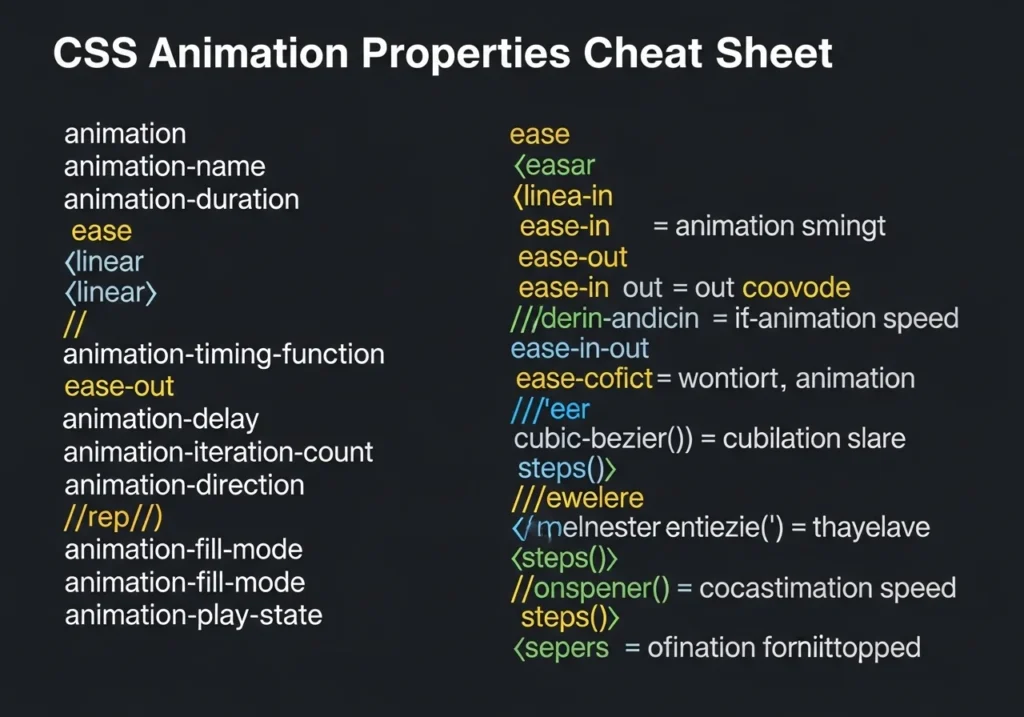
CSS Animation Properties Full Reference
Here’s a handy cheat sheet of the animation shorthand:
.element {
  animation-name: myAnim;
  animation-duration: 1s;
  animation-timing-function: ease-in-out;
  animation-delay: 0.2s;
  animation-iteration-count: infinite;
  animation-direction: alternate;
  animation-fill-mode: forwards;
  animation-play-state: running;
}
What Does Each Do?
animation-nameName of your@keyframesblockanimation-durationHow long one cycle lastsanimation-timing-functionSpeed curve (ease,linear,cubic-bezier)animation-delayPause before startinganimation-iteration-countHow many times (1,3,infinite)animation-directionDirection (normal,reverse,alternate)animation-fill-modeWhat happens before/after (forwards,backwards,both)animation-play-statePause or run (running,paused)
CSS Transform The Secret Weapon of Animation
You can’t talk about CSS animation without talking about transform.
It’s what makes elements move, scale, rotate, and flip without affecting layout.
Common Transform Functions
transform: translateX(50px);    /* Move horizontally */
transform: translateY(-20px);   /* Move vertically */
transform: scale(1.2);          /* Scale up 20% */
transform: rotate(45deg);       /* Rotate 45 degrees */
transform: skewX(15deg);        /* Skew on X axis */
Combine multiple transforms like this:
transform: translateY(-10px) scale(1.05) rotate(2deg);
This is the recipe behind those satisfying card hover lifts you see everywhere.
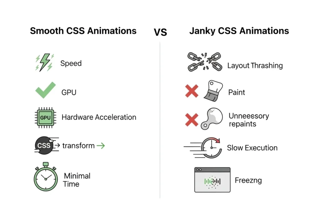
Performance Tips for Smooth CSS Animations
Beautiful animations mean nothing if they make your site lag.
Follow these rules to keep things buttery smooth:
- Animate
opacityandtransformThese are GPU-accelerated and never cause repaints - Avoid animating
width,height,margin,top,leftThese trigger expensive layout recalculations - Use
will-change: transformto hint at browser optimization (sparingly) - Use
prefers-reduced-motionto respect accessibility preferences
@media (prefers-reduced-motion: reduce) {
  * {
    animation: none !important;
    transition: none !important;
  }
}
This turns off animations for users who have motion sensitivity. It’s not optional it’s responsible design.
Real-World Use Cases for CSS Animations
Still wondering when to use animations? Here are practical scenarios:
- E-commerce Subtle hover effects on product cards increase click-through rate
- Dashboards Animated counters and progress bars make data feel dynamic
- Mobile Apps Smooth transitions between states improve perceived speed
- Portfolios Entry animations create a memorable first impression
- Marketing Pages Scroll-triggered reveals keep visitors engaged longer
Conclusion
CSS animations are one of the most satisfying skills to learn as a web developer. They’re powerful, flexible, and when done right completely invisible to the user (in the best way possible).
Here’s what you now know how to do:
- Use CSS transitions for smooth, simple state changes
- Build complex animations with @keyframes
- Apply transforms to move, scale, and rotate elements
- Write performance-friendly animations that don’t slow your site
- Respect user preferences with
prefers-reduced-motion
The best part? You don’t need any JavaScript, libraries, or frameworks. Just your CSS file and a creative eye.
Start small. Add a fade-in to your hero section. Give your buttons a smooth hover. Then experiment. The more you play, the better you get.
Frequently Asked Questions (FAQs)
Can I create stunning animations with CSS alone without JavaScript?
Yes, absolutely. CSS transitions and @keyframes animations cover the majority of animation needs hover effects, page entry animations, loaders, and more. JavaScript is only needed for complex logic-based or scroll-triggered animations.
What is the difference between CSS transitions and CSS animations?
CSS transition handles simple two-state changes triggered by an event (like :hover). CSS @keyframes animations are self-running and support multiple stages, loops, and timing control making them ideal for complex, independent animations.
Are CSS animations bad for performance?
Not if you use them correctly. Animating opacity and transform is extremely efficient because they’re handled by the GPU. Avoid animating properties like width, height, or margin as these cause layout recalculations and can cause janky animations.
How do I stop CSS animations from affecting users with motion sensitivity?
Use the prefers-reduced-motion media query to disable or reduce animations for users who have this accessibility preference enabled in their OS settings. It’s a web accessibility best practice.
What are the best CSS animation tools and resources for beginners?
Some excellent tools include:
- Animista (animista.net) Visual CSS animation generator
- CSS Tricks Animation Guide In-depth reference
- Cubic-bezier.com Custom easing curve builder
- Animate.css Ready-to-use animation class library