
Learn how to build a responsive website in 2026 with this beginner-friendly
guide. Master CSS, Flexbox, Grid, and modern tools to create sites that look
great on every device!
Introduction
More than 60% of all web traffic now comes from mobile devices.
If your website doesn’t adapt to different screen sizes, you’re losing
visitors and Google will rank you lower for it.Build a Responsive Website.
Building a responsive website is no longer optional. It’s the
standard. And the good news? In 2026, it’s easier than ever to
build a responsive website that looks stunning on a phone,
tablet, and desktop all with the same code.Build a Responsive Website.
This guide walks you through everything: from core concepts to
real code, modern tools, and pro tips that actually work.Build a Responsive Website.

What Is a Responsive Website?
A responsive website automatically adjusts its layout, images,
and content to fit any screen size from a 27-inch monitor to a
4-inch smartphone.Build a Responsive Website.
It doesn’t create separate mobile and desktop versions. One codebase
handles everything. That’s what makes it efficient, modern, and
Google-approved.Build a Responsive Website.
Why Responsiveness Matters in 2026
- Mobile-first indexing Google ranks the mobile version of
your site first - Better user experience visitors stay longer on sites that
work well on their device - Higher SEO rankings responsive design is a confirmed
Google ranking factor - More conversions easier navigation = more clicks,
sign-ups, and sales - Wider reach your site works for everyone, everywhere,
on any device
How to Build a Responsive Website: Core Concepts First
Before you write a single line of code, you need to understand
three foundational ideas. These are the building blocks of every
responsive website ever built.Build a Responsive Website.
1. The Viewport Meta Tag
This tiny line of HTML tells the browser how to scale your page
on different devices. Without it, your responsive CSS won’t work
properly.Build a Responsive Website.
<meta name="viewport" content="width=device-width, initial-scale=1.0">Always place this inside your <head> tag. Every responsive
website needs it no exceptions.
2. Fluid Layouts with Percentages
Instead of fixed pixel widths, use percentages so elements
resize naturally.Build a Responsive Website.
/* Fixed breaks on small screens */
.container {
width: 960px;
}
/* Fluid adapts to any screen */
.container {
width: 90%;
max-width: 1200px;
margin: 0 auto;
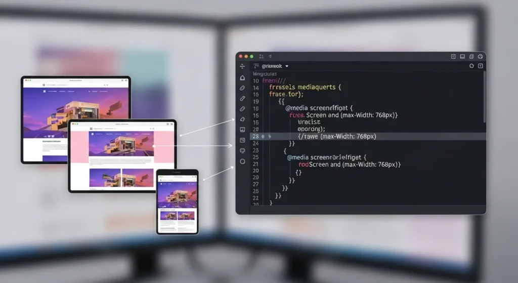
}3. Media Queries The Heart of Responsive Design
Media queries let you apply different CSS styles at different
screen sizes. This is how you control what the layout looks like
on mobile vs. desktop.Build a Responsive Website.
/* Default: Mobile styles */
.card {
  width: 100%;
  padding: 16px;
}

/* Tablet and above */
@media (min-width: 768px) {
  .card {
    width: 48%;
  }
}

/* Desktop and above */
@media (min-width: 1024px) {
  .card {
    width: 30%;
  }
}
Pro Tip Always design mobile-first. Start with styles
for small screens, then use media queries to add complexity for
larger screens. It’s cleaner and faster.Build a Responsive Website.
Step-by-Step: How to Create a Responsive Website Layout
Now let’s put it all together. Here’s a practical, step-by-step
approach to building a fully responsive webpage from scratch.Build a Responsive Website.
Set Up Your HTML Structure
Start with clean, semantic HTML. Good structure makes responsive
styling much easier.
<!DOCTYPE html>
<html lang="en">
<head>
  <meta charset="UTF-8">
  <meta name="viewport" content="width=device-width, initial-scale=1.0">
  <title>My Responsive Website</title>
  <link rel="stylesheet" href="style.css">
</head>
<body>
  <header class="site-header">...</header>
  <nav class="site-nav">...</nav>
  <main class="content-grid">...</main>
  <footer class="site-footer">...</footer>
</body>
</html>
Use semantic tags like <header>, <nav>, <main>, <section>,
and <footer>. They help with both accessibility and SEO.
Build a Responsive Navigation Bar
The nav bar is usually the first thing that breaks on mobile.
Here’s a clean approach using Flexbox:
.site-nav {
  display: flex;
  justify-content: space-between;
  align-items: center;
  padding: 1rem 5%;
  background: #1a1a2e;
}

/* Stack nav links on mobile */
@media (max-width: 768px) {
  .site-nav {
    flex-direction: column;
    gap: 12px;
  }
}
Create a Responsive Grid with CSS Grid
CSS Grid is the most powerful layout tool available in 2026.
Use it for your main content area.
.content-grid {
  display: grid;
  grid-template-columns: repeat(auto-fit, minmax(280px, 1fr));
  gap: 24px;
  padding: 40px 5%;
}
This single block of CSS creates a grid that:
- Shows 1 column on mobile
- Shows 2 columns on tablet
- Shows 3+ columns on desktop
No media queries needed. auto-fit and minmax handle it all
automatically.
Make Images Responsive
Images are the most common reason layouts break on mobile.
Fix this with two lines of CSS:
img {
  max-width: 100%;
  height: auto;
  display: block;
}
For modern performance, use the HTML <picture> element to serve
different image sizes for different devices:
<picture>
  <source media="(min-width: 1024px)" srcset="hero-desktop.jpg">
  <source media="(min-width: 768px)"  srcset="hero-tablet.jpg">
  <img src="hero-mobile.jpg" alt="Responsive hero image">
</picture>
This dramatically improves load speed especially on mobile.
And page speed is a direct Google ranking factor.
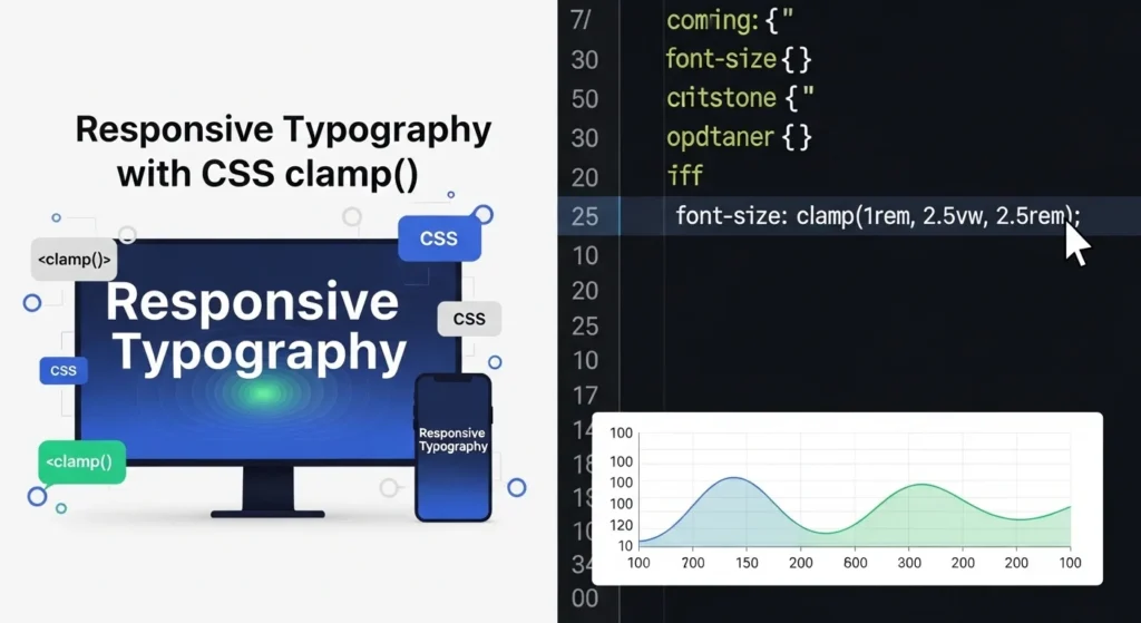
Use Responsive Typography
Text that’s too small on mobile or too large on desktop ruins the
reading experience. Use clamp() for fluid typography that scales
automatically:
h1 {
  font-size: clamp(1.8rem, 5vw, 3.5rem);
}

p {
  font-size: clamp(1rem, 2.5vw, 1.2rem);
  line-height: 1.7;
}
clamp(min, preferred, max) the font grows with the screen but
never goes below the minimum or above the maximum. Clean and
elegant.
Best Tools to Build a Responsive Website in 2026
You don’t have to build everything from scratch. These tools
save serious time without sacrificing quality.
Frameworks & Libraries
| Tool | Best For | Learning Curve |
|---|---|---|
| Tailwind CSS | Utility-first rapid development | Low–Medium |
| Bootstrap 5 | Pre-built responsive components | Low |
| CSS Grid + Flexbox | Custom layouts, no dependencies | Medium |
| Bulma | Lightweight, flexbox-based | Low |
Design & Prototyping Tools
- Figma Design your layout visually before coding
- Adobe XD Great for wireframing responsive breakpoints
- Responsively App Preview your site on 15+ screen sizes at once
Performance & Testing Tools
- Google PageSpeed Insights Check mobile performance score
- BrowserStack Test your site on real devices
- Chrome DevTools Built-in responsive design tester
(pressCtrl+Shift+M)
Common Responsive Design Mistakes to Avoid
Even experienced developers make these. Learn them early and
save yourself hours of debugging.
- Forgetting the viewport meta tag your whole responsive
setup won’t work without it - Using fixed pixel widths always prefer
%,rem,vw, orclamp() - Designing desktop-first always start mobile, scale up
- Ignoring touch targets buttons should be at least
44px × 44px for fingers - Not testing on real devices emulators lie; always
check on an actual phone - Oversized images compress and serve correctly sized
images for each breakpoint - Tiny font sizes minimum 16px for body text on mobile
Responsive Website Checklist Before You Launch
Use this before publishing any website. Print it, save it, pin it.
- Viewport meta tag added to every page
- All images have
max-width: 100%andheight: auto - Tested on mobile, tablet, and desktop screen sizes
- Navigation works and is usable on small screens
- Font sizes are readable without zooming on mobile
- Buttons and links are large enough for touch
- Google PageSpeed score is 80+ on mobile
- No horizontal scrollbar on any screen size
- Forms are easy to fill out on mobile
- Footer links are accessible on all devices

Internal Linking Suggestions
Place these internal links naturally within your content to
improve SEO flow and user engagement:
- “CSS Flexbox vs Grid: Which One Should You Use?”
→ Link from Step 3 (CSS Grid section) where both are mentioned - “How to Optimize Website Speed for Google in 2026”
→ Link from Step 4 (responsive images) near the page speed mention - “Best Free CSS Frameworks for Web Developers in 2026”
→ Link from the Tools section near the Tailwind/Bootstrap comparison
Conclusion
Building a responsive website in 2026 comes down to a handful
of core skills and once you have them, you’ll never go back to
fixed-width layouts.
Here’s your quick recap:
- Always add the viewport meta tag
- Use fluid layouts with
%,rem, andclamp() - Master media queries, Flexbox, and CSS Grid
- Make images and typography responsive from the start
- Test on real devices before launching
- Use modern tools like Tailwind CSS and Responsively App
Responsive design isn’t just about looking good on mobile. It’s
about respecting your users giving everyone, on every device,
the best possible experience.
Start with one page. Apply the checklist. Test it on your phone. That first responsive layout you build will change how you think about the web forever.
Frequently Asked Questions (FAQs)
What is a responsive website and why is it important?
A responsive website automatically adjusts its layout and content
to fit any screen size phone, tablet, or desktop. It’s important
because most web traffic comes from mobile devices, and Google
uses mobile-friendliness as a ranking factor.
How long does it take to build a responsive website?
A simple responsive website can be built in 1 to 3 days if
you know HTML and CSS. A full multi-page responsive site with
custom design typically takes 1 to 4 weeks depending on
complexity and experience.
Do I need to learn JavaScript to create a responsive website?
Not necessarily. You can build a fully responsive website using
only HTML and CSS (Flexbox, Grid, and media queries). JavaScript
becomes useful for interactive elements like hamburger menus,
sliders, and modals.
What is the difference between responsive and adaptive design?
Responsive design uses fluid layouts that smoothly adjust to
any screen size. Adaptive design creates fixed layouts for
specific screen sizes (like 480px, 768px, 1024px). Responsive
is generally preferred in 2026 because it handles the huge variety
of modern device sizes better.
Is Tailwind CSS good for building responsive websites?
Yes Tailwind CSS is one of the best tools for responsive design
in 2026. Its mobile-first utility classes (like md:, lg:) make
adding responsive breakpoints extremely fast and intuitive without
writing custom media queries.