Unlock the power of heatmaps in 2025. Our guide shows how to visualize complex data simply, revealing user behavior and hidden patterns with color-coded clarity
Have you ever looked at a giant spreadsheet and felt your eyes glaze over? Rows and rows of numbers, columns of data… it’s enough to make anyone’s brain shut down. You know the answers are in there somewhere, but finding them feels like searching for a needle in a haystack.
What if you could see the story your data is trying to tell?
What if patterns, problems, and opportunities jumped off the screen in vibrant, easy-to-understand color?
That’s the magic of a heatmap. It’s one of the most powerful, yet intuitively simple, ways to understand complex information. In this guide, we’re going to break down everything you need to know about heatmap technology. We’ll move from the basic “what is it?” to the “how can I use it to make smarter decisions?” By the end, you’ll see your data in a whole new light—literally.
What is a Heatmap? (No Jargon, I Promise!)
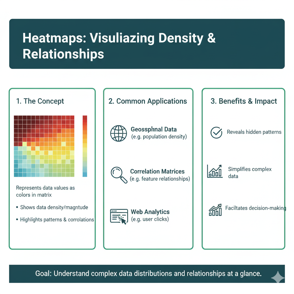
Let’s get straight to it. A heatmap is a data visualization tool that uses color to represent values. Instead of forcing you to read numbers, it shows you where the “hot” and “cold” spots are in your data.
Think about the weather app on your phone. When you look at a weather map, you don’t see a list of temperatures for every single town. You see a map of the country colored in blues, greens, yellows, and reds. You instantly know that the red areas are hot, the blue areas are cold, and the yellows are somewhere in between. You’ve understood a massive amount of data in a single glance.
That’s a heatmap.
The Core Idea: Warmer colors (like red, orange, and yellow) typically represent higher values or more intense activity. Cooler colors (like blue and green) represent lower values or less activity.
The Supermarket Analogy: Your First Heatmap
Imagine you’re the manager of a grocery store. You want to know which aisles are the most popular. You could stand and count people all day, but that would be tedious.
Now, imagine you have a special camera that tracks everyone’s movement. At the end of the day, it gives you a map of your store. The floors are colored based on how many people walked there:
- Bright Red: The produce section and the dairy aisle. These are your “hot” zones, packed with customers.
- Orange/Yellow: The cereal and snack aisles. Still popular, but not as busy.
- Light Blue: The international foods aisle. It gets some traffic, but not a ton.
- Dark Blue: The corner with the pet food. A “cold” zone that sees very few visitors.
This map is a heatmap. It instantly tells you where customers are spending their time. You don’t need to see the exact number of people; the colors give you the story. This is the fundamental power of visualizing data this way.
Why Your Brain Loves Heatmaps: The Science of Simplicity
Our brains are wired for visual information. We process images 60,000 times faster than text. When you present data in a table, your brain has to work hard to decode each number, compare them, and find patterns. A heatmap does that heavy lifting for you.
It taps into our pre-attentive processing—the part of your brain that understands things like color, size, and orientation without you having to consciously think about it. You don’t need to “read” a heatmap; you just understand it.
The 5 Most Common Types of Heatmaps (And What They’re Used For)
“Heatmap” is a general term, but there are specific types designed for different jobs. Let’s explore the ones you’re most likely to encounter.
1. Website Click Heatmaps
This is probably the most famous type. A website heatmap shows you where visitors are clicking, tapping, and scrolling on your web pages.
- What it looks like: A semi-transparent layer of color over your website. Red areas got the most clicks, blue areas got the fewest.
- Real-Life Example: You launch a new product page with a big, green “Buy Now” button. After a week, you check the heatmap and see a surprising red spot on an image next to the button. People think the image is clickable! This shows you that the design is confusing users. You can then fix it and likely increase sales.
- Key Question it Answers: “What are my visitors actually doing on my site?”
2. Eye-Tracking Heatmaps
This is the cool, high-tech cousin of the click heatmap. It uses special hardware to track where people’s gazes fall on a screen or a physical object.
- What it looks like: Similar to a click map, but it shows where people looked, not just where they clicked. The “hottest” spots are where eyes lingered the longest.
- Real-Life Example: A cereal company uses an eye-tracking heatmap to test a new box design. They discover that nobody is looking at the “Now with 50% Less Sugar!” badge because it’s placed in a cold, blue zone. They move it to a red-hot area, and suddenly, the message gets seen.
- Key Question it Answers: “What captures people’s attention first, and what are they ignoring?”
3. Geographic (Geo) Heatmaps
This is your weather map example. It displays data based on physical location.
- What it looks like: A map of a city, country, or the world, colored to show the density or value of something.
- Real-Life Examples:
- Real Estate: A map showing red areas where home prices are highest and blue areas where they are more affordable.
- Ride-Sharing: A map showing red zones where ride demand is high, helping drivers know where to go.
- Public Health: A map tracking the spread of a flu virus, with red counties indicating high infection rates.
- Key Question it Answers: “How is my data distributed across different locations?”
4. Matrix Heatmaps (Correlation Heatmaps)
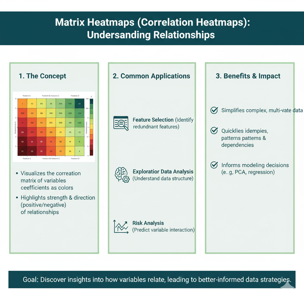
This is a powerhouse for data analysts. It’s perfect for showing the relationship between two different sets of things.
- What it looks like: A grid of squares, like a chessboard. Each square’s color represents the relationship or correlation between the item on its row and the item on its column.
- Real-Life Example: A gym owner wants to know which services their members use together. They create a heatmap where the rows and columns are things like “Yoga Class,” “Personal Training,” “Swimming Pool,” and “Weight Room.”
- A red square where “Yoga Class” and “Meditation Class” meet shows a strong connection—people who do one often do the other.
- A blue square where “Swimming Pool” and “Personal Training” meet might show little relationship.
- This helps the gym create better membership bundles and class schedules.
- Key Question it Answers: “How do different variables relate to each other?”
5. Scroll Depth Heatmaps
This is a specific type for websites that shows how far down a page your visitors are scrolling.
- What it looks like: Your webpage is colored from top to bottom. The top is usually red (seen by everyone), and the color cools down as you go further down. A solid blue line at a certain point shows where most people stopped scrolling.
- Real-Life Example: You write a long, important blog post. The scroll heatmap reveals that 80% of readers never scroll past the halfway point. This tells you that your content might be getting boring, or your key message is buried too deep. You can then shorten the post or move your call-to-action higher up.
- Key Question it Answers: “Are people seeing the important content at the bottom of my page?”
How to Read a Heatmap in 60 Seconds
It’s simple. Just follow these three steps:
- Find the Legend. Every heatmap has a legend—a small guide that tells you which colors correspond to which values. It might be a gradient bar from blue to red, or it might list specific colors. Always look for this first.
- Identify the Hot Spots. Scan for the red, orange, and yellow areas. These are your areas of highest value, most activity, or greatest intensity. Ask yourself: “What is happening here? Why is this so ‘hot’?”
- Notice the Cold Spots. Now, look for the blue and green areas. These are your lowest values or least activity. Ask yourself: “Why is this area ‘cold’? Is this a problem? Is this what I expected?”
That’s it! The story of your data lies in the contrast between the hot and the cold.
A Practical Guide: Creating Your First Heatmap
You don’t need to be a data scientist to create a heatmap. Let’s walk through the process using a simple, relatable example: figuring out the best time to post on social media.
Step 1: Define Your Goal
What question do you want to answer? Our question is: “On which days and at what times do my Instagram posts get the most engagement?”
Step 2: Gather Your Data
You need data for the two things you want to compare. In this case:
- Thing 1: Days of the week (Monday, Tuesday, Wednesday, etc.)
- Thing 2: Hours of the day (8 AM, 9 AM, 10 AM, etc.)
- The Value: Average number of likes and comments (engagement).
You can export this data from Instagram Insights or a social media tool, or even compile it manually in a spreadsheet for a few weeks.
Step 3: Choose Your Tool
For a matrix heatmap like this, you can use:
- Google Sheets or Microsoft Excel: They have built-in heatmap functionality called “Conditional Formatting.”
- Online Tools: Sites like Hotjar or Crazy Egg for website click maps.
- Analytics Platforms: Tools like Tableau or Google Data Studio (Looker Studio) for more advanced visualizations.
Let’s use Google Sheets because it’s free and easy.
Step 4: Build and Format
- Set up your spreadsheet. Put days of the week as rows and hours of the day as columns.
- Fill in the cells with your average engagement numbers.
- Select all the cells with your numbers.
- Go to
Format>Conditional formatting. - In the sidebar, under “Format rules,” choose “Color scale.”
- Pick a color scale. The classic “Minpoint – White, Midpoint – Yellow, Maxpoint – Red” works great.
- Click “Done.”
Instantly, your spreadsheet will transform. You’ll see red squares showing the high-engagement times (e.g., Wednesday at 7 PM) and blue squares for the low-engagement times (e.g., Saturday at 4 AM).
Step 5: Analyze and Act
Now, read your heatmap. Those red squares are your golden hours. You’ve just used a heatmap to make a data-driven decision about your social media strategy. You can now schedule your most important posts for those “hot” times.
Top 5 Mistakes to Avoid When Using Heatmaps
It’s easy to get excited and misinterpret what you’re seeing. Steer clear of these common pitfalls.
1. Ignoring the Sample Size
A heatmap based on 10 visitors is meaningless. One person’s weird behavior can skew the whole thing. Make sure you collect data from a statistically significant number of users (e.g., hundreds or thousands) before making big decisions.
2. Forgetting Context
A red spot on a website heatmap is just a fact. The why is the insight. Maybe people are clicking there because they love that element, or maybe they’re clicking there because it looks like a button but isn’t, and they’re frustrated! Always combine heatmap data with other sources, like user recordings or feedback surveys.
3. Misreading the Colors
Remember that the colors are relative. A “cold” blue area might still be getting some clicks. It’s only a problem if you wanted that area to be hot. Focus on the contrast between what you expect to be hot and what actually is hot.
4. Treating All Users the Same
New visitors behave very differently from returning customers. A heatmap that mixes them all together can be misleading. Use segmentation in your tools to see separate heatmaps for different user groups.
5. Thinking It’s a Magic Bullet
A heatmap is a fantastic diagnostic tool, but it’s not the cure. It tells you where a problem is, but not always how to fix it. It’s the starting point for a hypothesis, which you then need to test (e.g., with an A/B test).
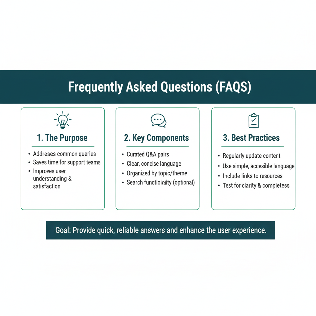
Frequently Asked Questions (FAQs)
Q1: Are heatmaps difficult or expensive to set up for my website?
Not at all! For click and scroll maps, tools like Hotjar and Crazy Egg offer free or low-cost plans for small websites. You usually just have to copy and paste a small snippet of code into your website’s header, and it starts collecting data automatically. It’s one of the easiest analytics tools to implement.
Q2: Can heatmaps track individual people? Is it an invasion of privacy?
Good question! Reputable heatmap tools are designed with privacy in mind. They aggregate data and do not track personally identifiable information (PII). They record what is clicked and where, but not who clicked it in a way that can be traced back to a specific person. They are also compliant with regulations like GDPR when configured correctly. Always check the privacy policy of your chosen tool.
Q3: What’s the biggest “aha!” moment you’ve seen from a heatmap?
One of the most common ones is the “false bottom” discovery. Website owners often have a beautiful footer with contact info and links. A scroll heatmap frequently reveals a solid blue line just above the footer, meaning almost no one ever sees it. This moment makes them realize they need to move their most important links and calls-to-action much higher on the page.
Q4: How long do I need to run a heatmap to get useful data?
It depends on your website traffic. For a high-traffic site (thousands of visitors a day), you might only need a few days. For a low-traffic site (a few hundred visitors a week), you might need to run it for 2-4 weeks to collect enough data to be statistically reliable. The goal is to capture a representative sample of your typical audience.
Q5: Can I use heatmaps on a mobile app?
Absolutely! The principle is the same. Most advanced analytics SDKs for mobile apps (like Firebase) include heatmap functionality or similar touch-point analysis. It’s incredibly valuable for understanding how users interact with your app’s interface and finding UX pain points on a small screen.
Your World, in Color
We started this journey staring at that overwhelming spreadsheet, feeling stuck. Now, you have a key to unlock it.
A heatmap is more than just a pretty picture; it’s a translation device. It takes the cold, hard language of numbers and translates it into the warm, intuitive language of color. It helps you see the invisible patterns, confirm your hunches, and challenge your assumptions. It turns the complex into the simple.
Think about what you can do now. You can look at your website and finally understand why people aren’t clicking the “Buy Now” button. You can plan your social media posts with confidence, knowing exactly when your audience is most engaged. You can make a real-world decision, like where to open a new store, backed by the clear visual evidence of a geographic heatmap.
This isn’t about fancy jargon or complicated software. It’s about a fundamental shift in how you see information. It’s about asking better questions—”Where is the heat?” and “Why is it there?”—and getting clearer answers.
So, the next time you’re faced with a wall of data, don’t just stare at it. Don’t get lost in the grid. Visualize it. Find the heat. Your data has a powerful story to tell—and now, you have the perfect tool to listen.
Go find your first insight.