Want a mobile-friendly website that ranks on Google and keeps visitors hooked? Discover the best practices every site owner needs to know in 2025.
Your phone is probably within arm’s reach right now. And so is your next customer’s.
Over 63% of all web traffic comes from mobile devices today. If your website isn’t built for mobile users, you’re essentially slamming the door on most of your visitors before they even step inside.
A mobile-friendly website isn’t just about making things look pretty on a small screen. It’s about speed, usability, readability, and giving people a reason to stay. Google knows this, which is exactly why mobile-friendliness is now one of its top ranking factors.
In this guide, you’ll learn exactly what makes a mobile-friendly website work, what’s killing your mobile experience right now, and the practical steps you can take today to fix it. No jargon. No fluff. Just real, actionable advice.
Let’s get into it.

What Is a Mobile-Friendly Website (And Why It Matters More Than Ever)?
A mobile-friendly website is one that looks great, loads fast, and works smoothly on smartphones and tablets, not just on desktop computers.
Think of it this way: a desktop website is like a full-size restaurant menu. A mobile-friendly website is like the same menu but designed to fit in your hand, easy to read, easy to scroll, and easy to order from.
Google officially switched to mobile-first indexing back in 2021. That means Google now crawls and ranks the mobile version of your site first. Your desktop version is secondary.
So if your mobile experience is broken, your rankings suffer. It’s that simple.
What Mobile-Friendliness Actually Includes
- Fast loading time (under 3 seconds on 4G)
- Text that’s readable without zooming
- Buttons large enough to tap with a thumb
- No horizontal scrolling
- Images that resize automatically
- Easy-to-use navigation menus
Best Practices for Building a Mobile-Friendly Website
This is the heart of it. Let’s walk through each major best practice so you know exactly what to focus on.
Start With Responsive Design
Responsive design is the foundation of every mobile-friendly website. It means your layout automatically adjusts to fit any screen-size phone, tablet, or widescreen monitor.
You don’t build three separate websites. You build one smart website that adapts itself.
How to do it:
- Use CSS media queries to change layouts at different screen widths
- Set images to
max-width: 100%so they never overflow their container - Use relative units like
%, “em” and “rem”eminstead of fixedpxvalues - Follow the mobile-first approach: design for small screens first, then scale up
Make It Load Fast, Like, Really Fast
Speed is not optional on a mobile-friendly website. It’s survival.
Google’s own research shows that 53% of mobile users abandon a site that takes more than 3 seconds to load. Three seconds. That’s less time than it takes to read this sentence.
Quick speed wins:
- Compress your images using tools like Squoosh, TinyPNG, or ShortPixel
- Switch to WebP format; it’s 30% smaller than JPEG with the same quality
- Enable lazy loading with
loading="lazy"an image tags - Use a CDN (Content Delivery Network) like Cloudflare files load from a server near your visitor
- Minify CSS and JavaScript to strip out unnecessary characters
- Remove unused plugins and scripts; every extra script adds loading time
Target benchmark: Aim for a Google PageSpeed Insights score above 90 on mobile.
Use readable typography.
You’d be surprised how many websites have beautiful fonts that are completely unreadable on a 5-inch screen.
For a mobile-friendly website, typography isn’t just aesthetics; it’s function.
Typography rules for mobile:
- Base font size: At least 16px for body text. Don’t go below 14px.
- Line height: Set it to 1.5–1.75 for comfortable reading
- Line length: Aim for 50–70 characters per line; this naturally works on narrow screens
- Contrast: Text should meet WCAG’s minimum 4.5:1 contrast ratio against its background
- Font choice: Use clean, tested web fonts. Avoid decorative fonts for body copy.
Design Touch-Friendly Tap Targets
On a phone, your visitor isn’t using a precise mouse pointer. They’re using their thumb, which is wide, slightly inaccurate, and easily frustrated.
Every button, link, and interactive element on your mobile-friendly website needs to be large enough and spaced far enough apart to tap comfortably.
Google’s recommendation: Tap targets should be at least 48×48 pixels with 8 px of spacing between them.
Common mistakes to avoid:
- Small text links crammed into a paragraph
- Buttons that are only 24–30px tall
- Dropdown menus that activate on hover (doesn’t work on touch)
- Icons without labels that users have to guess at
“Tap target size guide for designing a mobile-friendly website.”
Simplify Your Mobile Navigation
A navigation bar with six dropdown menus works on desktop. On mobile, it’s a maze.
Great navigation on a mobile-friendly website is about making it dead simple for someone to find what they need with one or two taps.
Popular mobile navigation patterns:
| Pattern | Best For |
|---|---|
| Hamburger menu | Sites with many pages |
| Bottom tab bar | Apps with 3–5 main sections |
| Sticky top bar | Simple sites with few key pages |
| Priority+ pattern | Showing top items, hiding the rest |
Quick tips:
- Include a visible search bar; mobile users search more when browsing on phones
- Always have a clear path back to the homepage
- Keep your navigation labels short and obvious
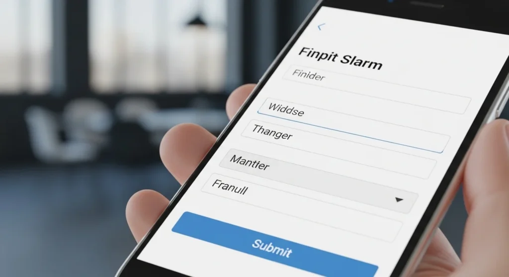
Optimize Forms for Thumbs and Touchscreens
Nobody wants to fill out a 12-field form on a phone keyboard. Forms are where mobile experience goes to die unless you design them thoughtfully.
Mobile form best practices:
- Use the right trigger to
numbertrigger the correct keyboard automatically - Add
autocompleteattributes so browsers can fill fields for users - Make input fields at least 44 px tall easy to tap
- Keep labels above the input field, not inside it as a placeholder (placeholders disappear when typing)
- Show inline error messages right next to the field with the problem
- Use a single-column layout; side-by-side fields are cramped on mobile
Add the Viewport Meta Tag (Don’t skip this).
This is the most technical item on this list and also one of the easiest to fix.
Without the viewport meta tag, your mobile-friendly website won’t actually render correctly on mobile devices, even if your CSS is perfect.
Add this single line inside your <head> section:
<meta name="viewport" content="width=device-width, initial-scale=1">
This tells browsers to use the device’s actual screen width and display at a 1:1 scale.
What NOT to do: Don’t add user-scalable=no this; it prevents users from zooming in, which is an accessibility violation and just bad UX.
Avoid Intrusive Pop-Ups
Google penalizes websites that use pop-ups that block content on mobile. They call them “intrusive interstitials,” and they will tank your mobile search rankings if you use them badly.
What Google flags as intrusive:
- Pop-ups that appear immediately when a user lands on the page from search
- Full-screen overlays that block the main content
- “Accept to continue” screens that aren’t legally required
What’s fine:
- Cookie consent banners (legally required in many countries)
- Small banners at the top or bottom of the screen
- Pop-ups triggered after 60+ seconds or on exit intent
- Age verification gates
“Good versus bad pop-up design on a mobile-friendly website”
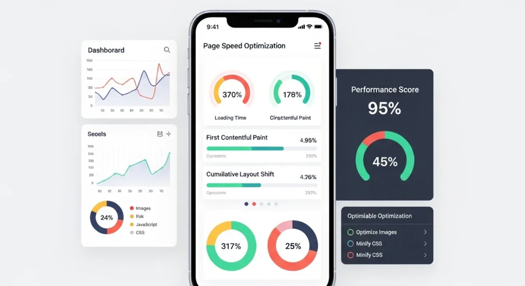
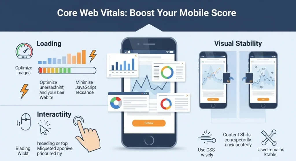
Score Well on Core Web Vitals
Google’s Core Web Vitals are three specific metrics that measure real-world user experience. They’re now a direct SEO ranking signal, and they’re measured specifically for mobile.
| Metric | What It Measures | Target |
|---|---|---|
| LCP (Largest Contentful Paint) | How fast the main content loads | Under 2.5 seconds |
| INP (Interaction to Next Paint) | How fast the page responds to taps | Under 200ms |
| CLS (Cumulative Layout Shift) | How much content jumps around | Under 0.1 |
How to check yours: Run your site through Google’s free PageSpeed Insights at [URL]. It gives you a score, flags issues, and tells you exactly what to fix.
Test on Real Devices Regularly
Emulators are helpful. Real devices tell the truth.
The only way to really know how your mobile-friendly website performs is to test it on actual phones, not just Chrome DevTools.
Testing checklist:
- [ ] Test on at least one iPhone and one Android device
- [ ] Test on an older, slower device (many users aren’t on the latest iPhone)
- [ ] Test on a slow 3G connection (throttle in DevTools)
- [ ] Run Google’s Mobile-Friendly Test
- [ ] Check PageSpeed Insights for mobile score
- [ ] Walk through the site as a first-time visitor with fresh eyes

Common Mobile Website Mistakes to Avoid
Even experienced developers fall into these traps. Watch out for:
- Fixed-width layouts that cause horizontal scrolling on phones
- Autoplay video with sound universally hated on mobile
- Hover-only interactions that don’t work on touchscreens
- Flash or unsupported plugins completely broken on most mobile browsers
- Relying on color alone to communicate information (accessibility issue)
- Forgetting to test forms: broken mobile forms kill conversions silently
- Not setting image dimensions causes layout shift (CLS) issues
Conclusion
Here’s the truth: building a mobile-friendly website is no longer optional. It’s the price of entry for any business or creator that wants to be found online in 2025.
The good news? You don’t need to overhaul everything at once. Start with the highest-impact fixes:
- Add the viewport meta tag if you haven’t
- Run PageSpeed Insights and fix the top 3 issues
- Check your font size and tap target sizes on a real phone
- Simplify your mobile navigation
- Test, then test again
Every improvement you make to your mobile experience is a direct investment in better SEO, higher engagement, and more conversions. Your visitors are already on their phones. Make sure your website is ready to meet them there.
Ready to audit your site? Run it through Google’s free Mobile-Friendly Test and PageSpeed Insights today; both take under 60 seconds and give you a clear action list.
FAQs About Mobile-Friendly Websites
Q1: How do I know if my website is mobile-friendly?
The fastest way is to use Google’s free Mobile-Friendly Test tool. Enter your URL, and it tells you instantly whether your page passes and flags any specific issues. You can also open your site on an actual phone and check whether everything fits, loads quickly, and is easy to tap.
Q2: Does having a mobile-friendly website help with Google rankings?
Yes, significantly. Google uses mobile-first indexing, meaning it primarily evaluates and ranks the mobile version of your site. A well-optimized mobile-friendly website with good Core Web Vitals scores will generally rank higher than a competitor’s site that isn’t mobile-optimized, especially for searches made on phones.
Q3: What is the difference between a responsive website and a mobile-friendly website?
A responsive website uses flexible CSS layouts that adapt to any screen size; it’s a technical approach. A mobile-friendly website is a broader term that includes responsive design plus good performance, readable text, usable navigation, and a smooth touch experience. Responsive design is the most common and recommended way to achieve mobile-friendliness, but responsiveness alone doesn’t guarantee a great mobile experience.
Q4: How fast should a mobile website load?
Google recommends that the Largest Contentful Paint (LCP), meaning the main visible content, loads in under 2.5 seconds. Research consistently shows that pages loading in over 3 seconds lose more than half their mobile visitors. For a practical target, aim for a full page load under 3 seconds on a standard 4G connection.
Q5: Can I make my existing website mobile-friendly without rebuilding it?
Often, yes. Many mobile issues can be fixed without a full rebuild:
- Add the viewport meta tag if it’s missing
- Switch to a responsive theme or template (especially easy on WordPress)
- Compress and resize images
- Increase font sizes in your CSS
- Adjust button padding and spacing
- Remove or replace hover-only interactions
A full rebuild is only necessary if your site uses very outdated technology (like fixed-width tables for layout) or if the mobile experience is fundamentally broken.