What if you could build a beautiful, mobile-ready, stunning websites in just a few hours without
writing hundreds of lines of CSS from scratch?
That’s exactly what Bootstrap makes possible. Whether you’re a beginner or a seasoned
developer, the Bootstrap framework gives you the tools to create stunning, professional
websites faster than ever before. In this guide, we’ll walk you through everything from
setup to advanced tips so you can start building with confidence.
What Is Bootstrap and Why Should You Use It?
Bootstrap is the world’s most popular open source CSS framework. It was originally created
by developers at Twitter and has since become the go-to tool for frontend web development.
Why developers love it:
- Ready to use UI components (buttons, cards, navbars, modals)
- Fully responsive grid system built in
- Cross-browser compatible out of the box
- Massive community and documentation
- Free and open source
How to Set Up Bootstrap in Your Project
Getting started with Bootstrap is surprisingly simple. You don’t even need to install
If anything, you can load it straight from a CDN.
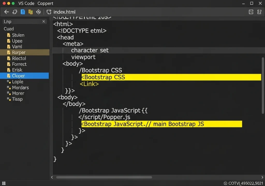
Using the CDN (Easiest Way)
Add these lines inside your HTML file:
<!-- Bootstrap CSS -->
<link href="https://cdn.jsdelivr.net/npm/bootstrap@5.3.0/dist/css/bootstrap.min.css"
      rel="stylesheet">

<!-- Bootstrap JS Bundle -->
<script src="https://cdn.jsdelivr.net/npm/bootstrap@5.3.0/dist/js/bootstrap.bundle.min.js">
</script>
That’s it. You’re ready to build.
Install via npm (for advanced users).
npm install bootstrapThen import it into your main JS or SCSS file.
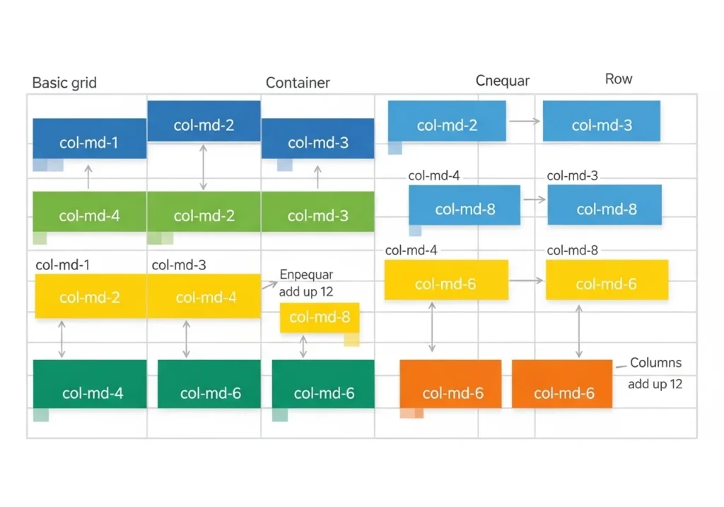
Understanding the Bootstrap Grid System
The Bootstrap grid system is the foundation of every great Bootstrap website design.
It divides your page into 12 columns, letting you control exactly how your layout looks
on any screen size.
How It Works
<div class="container">
  <div class="row">
    <div class="col-md-6">Left Column</div>
    <div class="col-md-6">Right Column</div>
  </div>
</div>
Breakpoint cheat sheet:
| Class Prefix | Screen Size |
|---|---|
col- | Extra small (< 576 px) |
col-sm- | Small (≥576px) |
col-md- | Medium (≥768px) |
col-lg- | Large (≥992px) |
col-xl- | Extra large (≥1200px) |
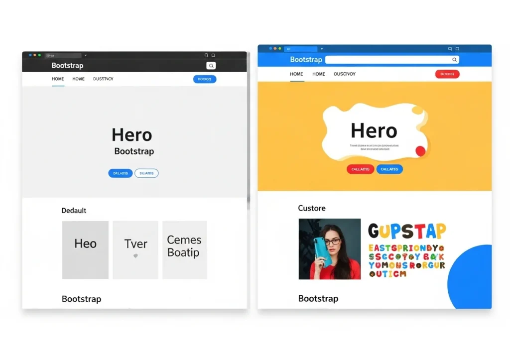
Create Stunning Websites Using Bootstrap Components
This is where the magic really happens. Bootstrap comes loaded with pre-built components
that make your site look polished without heavy custom CSS.
Navigation Bar
A responsive navbar is just a few lines away:
<nav class="navbar navbar-expand-lg navbar-dark bg-dark">
  <div class="container">
    <a class="navbar-brand" href="#">MyWebsite</a>
    <button class="navbar-toggler" type="button" data-bs-toggle="collapse"
            data-bs-target="#navbarNav">
      <span class="navbar-toggler-icon"></span>
    </button>
    <div class="collapse navbar-collapse" id="navbarNav">
      <ul class="navbar-nav ms-auto">
        <li class="nav-item"><a class="nav-link" href="#">Home</a></li>
        <li class="nav-item"><a class="nav-link" href="#">About</a></li>
        <li class="nav-item"><a class="nav-link" href="#">Contact</a></li>
      </ul>
    </div>
  </div>
</nav>
Hero Section (First Impression Matters)
Your hero section is the first thing visitors see. Make it count:
<section class="bg-primary text-white text-center py-5">
  <div class="container">
    <h1 class="display-4 fw-bold">Welcome to My Awesome Site</h1>
    <p class="lead">Built with Bootstrap — fast, responsive, and beautiful.</p>
    <a href="#" class="btn btn-light btn-lg mt-3">Get Started</a>
  </div>
</section>
Cards for Content Display
What Are Cards in Web Design?
Web design mein cards chhote rectangular containers hote hain jinke andar ek specific content hota hai, jaise
- Image
- Title
- Short description
- Button or link
Har card ek separate piece of information ko represent karta hai. Is wajah se users ko page par content scan karna bohot easy ho jata hai.
Why Cards Are Important for Content Display
Cards layout use karne ke kuch important benefits hain:
1. Better User Experience
Cards information ko small blocks mein divide kar dete hain, jis se users ko content samajhna easy ho jata hai.
2. Mobile-Friendly Design
Cards responsive hote hain, yani mobile, tablet aur desktop sab devices par easily adjust ho jate hain.
3. Clean and Modern Look
A card-based layout website ko modern aur professional look deta hai.
4. Easy Content Organization
Agar aapke paas bohat zyada articles ya products hain, to cards unko organized tareeke se show karte hain.
Where Cards Are Commonly Used
Cards ka use websites ke different sections mein hota hai, jaise:
- Blog posts list
- Product listings
- Portfolio sections
- News articles
- Course platforms
For example, Bootstrap framework’s pre-built card components provide karta hai jo developers ko responsive layouts banana easy bana dete hain.
Cards are perfect for blogs, portfolios, or product listings:
<div class="card" style="width: 18rem;">
  <img src="..." class="card-img-top" alt="...">
  <div class="card-body">
    <h5 class="card-title">Card Title</h5>
    <p class="card-text">Short description goes here.</p>
    <a href="#" class="btn btn-primary">Read More</a>
  </div>
</div>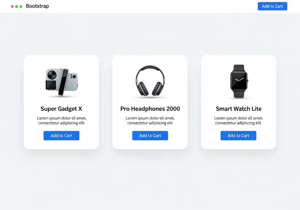
Is Bootstrap free to use commercially?
Out of the box, Bootstrap is great, but custom styling takes your Bootstrap website design to the next level.
Override with Custom CSS
Create a custom.css file and load it after Bootstrap:
<link rel="stylesheet" href="custom.css">Then override variables:
:root {
  --bs-primary: #ff6b6b;
  --bs-font-sans-serif: 'Poppins', sans-serif;
}
Use Bootstrap Themes
Using Bootstrap themes is a smart way to design modern and responsive websites quickly. Bootstrap themes provide ready-made layouts, components, and styles that help developers build professional-looking websites without starting from scratch. These themes are fully responsive, meaning they automatically adjust to different screen sizes like mobile, tablet, and desktop. By using Bootstrap themes, developers can save time, maintain design consistency, and easily customize elements such as navigation bars, cards, and buttons. Overall, Bootstrap themes make website development faster, easier, and more efficient for beginners and professionals alike. Sites like Bootswatch offer free, beautiful Bootstrap themes you can plug in instantly.
Just swap the Bootstrap CSS link with your chosen theme URL.
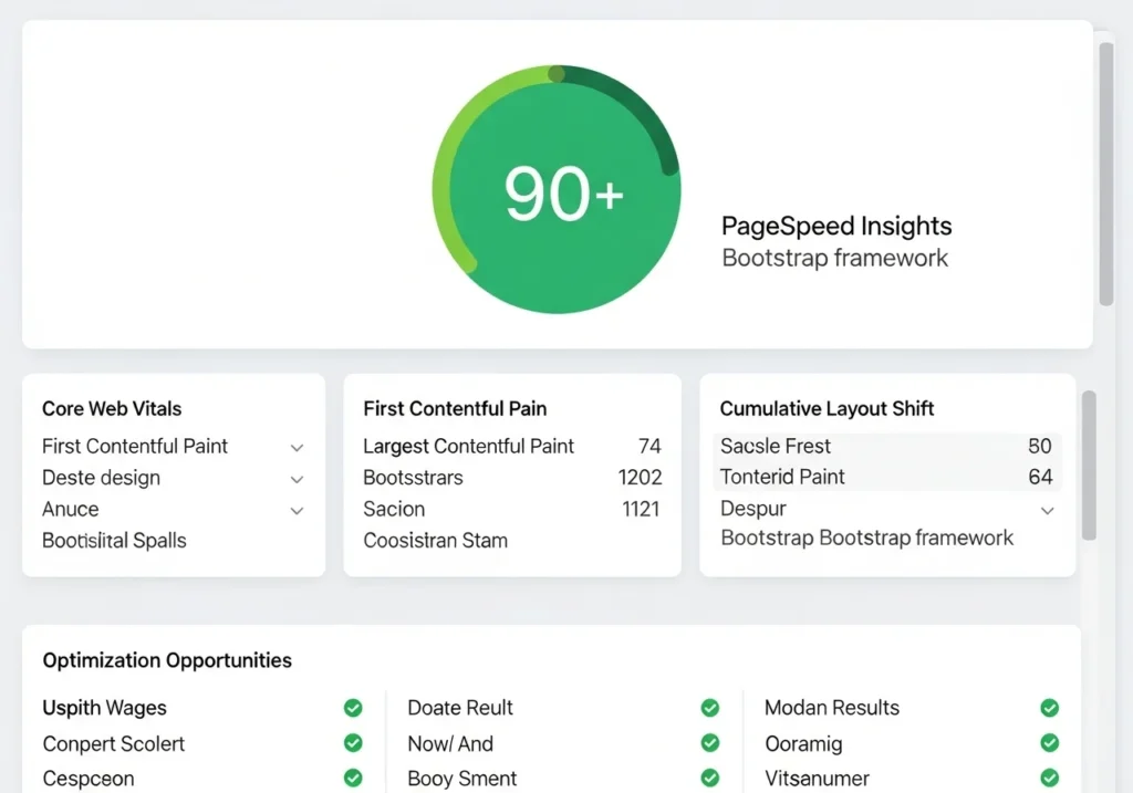
Tips to Make Your Bootstrap Site SEO-Friendly
Building a pretty site isn’t enough; it also needs to rank on Google.
Top SEO tips for Bootstrap websites:
- Use semantic HTML tags (
<header>,<main>,<footer>,<article>) - Add descriptive
alttext to all images - Keep page load speed fast minimize unused Bootstrap components
- Use proper H1 → H2 → H3 heading hierarchy
- Add meta titles and descriptions to every page
- Make sure your site passes the Google Mobile-Friendly Test
Real World Bootstrap Website Examples
Need inspiration? Here are types of websites commonly built with Bootstrap:
- Portfolio websites Clean, grid-based layouts showcasing work
- E-commerce storefronts Product cards, filters, and checkout flows
- Business landing pages Hero sections, testimonials, pricing tables
- Blog platforms Article cards, sidebars, pagination
- Admin dashboards Tables, charts, and data management panels
Each of these benefits from Bootstrap’s responsive grid and pre-built components.
saving dozens of hours of development time.
Conclusion
Bootstrap truly is one of the most powerful tools in a web developer’s toolkit. From the
flexible grid system to ready-made components, it helps you create stunning websites
without reinventing the wheel every time.
Whether you’re building your first portfolio or a full business site, the Bootstrap
A framework gives you a solid, professional foundation to work from.
Ready to start building? Open your code editor, paste in the Bootstrap CDN link, and
Create your first layout today. You’ll be amazed how quickly a beautiful website comes
together.
Frequently Asked Questions (FAQs)
1. Is Bootstrap still worth learning in 2025?
Absolutely. Bootstrap 5 is actively maintained, widely used, and a top skill listed in
web development job postings. It’s especially great for rapidly building responsive,
professional-looking websites.
2. Can I use Bootstrap with React or Vue?
Yes! There are official packages like React-Bootstrap and BootstrapVue that
Integrate Bootstrap components as native framework components.
3. Does Bootstrap slow down my website?
Only if you load the entire library when you don’t need it. You can use Bootstrap’s
custom build tool to include only the components your project actually uses, keeping
Your site is fast.
4. What’s the difference between Bootstrap 4 and Bootstrap 5?
Bootstrap 5 dropped jQuery dependency, introduced a new utility API, improved the grid
with CSS Grid support options, and added new components like Offcanvas and Accordion
updates. Always use Bootstrap 5 for new projects.
5. Is Bootstrap free to use commercially?
Yes. Bootstrap is released under the MIT License, meaning it’s 100% free for
personal and commercial projects with no restrictions.