Let’s be real: CSS can be a joy, and it can also drive you absolutely crazy. You spend 20 minutes trying to center a div, or you ship a layout that looks perfect on your laptop but completely falls apart on someone’s phone. Sound familiar? That’s exactly why mastering a solid set of 10 CSS tips can change the way you write styles forever.
Whether you’re just starting out or you’ve been building websites for years, there’s always something new to learn or a better way to do something old. These 10 CSS tip picks aren’t random; they’re practical, battle tested, and they’ll save you real time on real projects.
By the end of this article, you’ll walk away with a cleaner, smarter approach to CSS and probably a few “oh wow, I didn’t know that!” moments too. Let’s jump into 10 CSS tips.
TIP 01: Use CSS Custom Properties (Variables) Everywhere
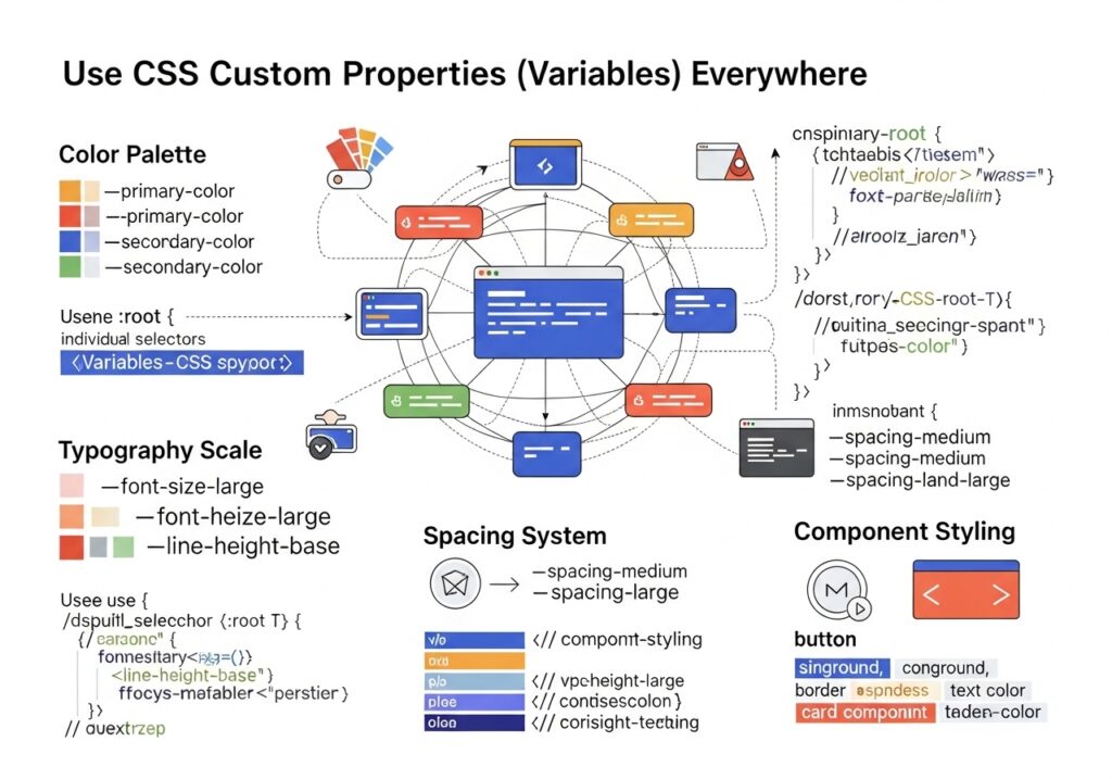
This is one of the most powerful and, honestly, most underused CSS tips you’ll ever pick up. CSS Custom Properties, also called CSS variables, let you store values in one place and reuse them throughout your entire stylesheet. 10 CSS Tips.
Think about it: how many times have you typed the same hex color, like, #c84b11 in 30 different places? Then your client says, “Oh actually, can we change that orange to teal?” And you have to hunt down every single instance. That’s 10 Painful CSS Tips.
How to Define and Use CSS Variables
/* Define variables in :root so they're globally available. */
:root {
  --color-primary: #c84b11;
  --color-text: #1a1208;
  --font-size-base: 1rem;
  --spacing-md: 1.5rem;
}

/* Use them anywhere */
.button {
  background-color: var(--color-primary);
  padding: var(--spacing-md);
  font-size: var(--font-size-base);
}
Now if you ever need to change your primary color, you update it in one place, and it changes everywhere. This is a massive time-saver on large projects.
Master Flexbox for One-Dimensional Layouts
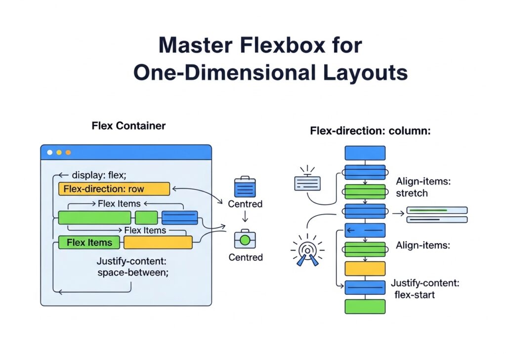
If you still use float hacks to align elements, this CSS tip is for you. Flexbox was designed exactly for these layout problems, and once you understand it, you’ll never go back.
Flexbox is one-dimensional, meaning it handles either a row or a column at a time. It’s perfect for navigation bars, card rows, button groups, and any layout where items need to sit side by side or stack cleanly.
The Classic “Center Everything” Problem Solved
/* Center a div horizontally AND vertically */
.container {
  display: flex;
  justify-content: center;  /* horizontal axis */
  align-items: center;     /* vertical axis */
  height: 100vh;
}
That’s literally it. Three lines. No negative margins, no transform tricks, no tears.
Key Flexbox Properties to Know
- justify-content controls alignment along the main axis (row = horizontal)
- align-items controls alignment on the cross axis (row = vertical)
- flex-wrap: wrap lets items wrap to the next line instead of shrinking
- gap adds spacing between flex items without using margin hacks
- flex-grow tells an item how much it should expand to fill available space
Real-World Use
Building a navigation bar where the logo is on the left and links are on the right? Use display: flex; justify-content: space-between; on the nav element. Done in seconds.
TIP 03: Use CSS Grid for Two-Dimensional Layouts
Where Flexbox handles rows or columns individually, CSS Grid handles both at once. It’s your tool for full-page layouts, dashboard grids, image galleries, and anything that needs rows and columns to work together.
This is one of those 10 CSS tips that beginners often skip because Grid feels intimidating at first. But trust me, once you use it on a real layout, you’ll be hooked.
/* 3-column responsive layout */
.grid-container {
  display: grid;
  grid-template-columns: repeat(3, 1fr);
  gap: 24px;
}

/* Make it responsive without a media query! */
.grid-container {
  grid-template-columns: repeat(auto-fit, minmax(250px, 1fr));
}
That last snippet repeat(auto-fit, minmax(250px, 1fr)) is genuinely magic. It creates as many columns as will fit, and each column is at least 250px wide. No JavaScript. No media queries. Fully responsive by itself.
When to Use What
Use Flexbox for components (navbars, buttons, card internals). Use a grid for page-level structure (header, sidebar, main, and footer). Both are great; they just solve different problems.
TIP 04: Write Mobile-First Media Queries
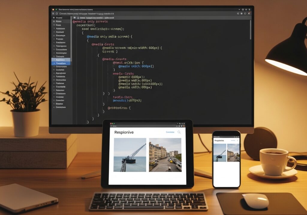
Here’s a CSS tip that changes your whole workflow: Stop designing for desktop and then trying to “fix” it for mobile. Flip it. Start with mobile styles, then add styles for larger screens.
Why? Because mobile traffic makes up over 60% of web usage globally. Writing mobile-first means your base styles are lightweight and clean, which is also better for performance.
Desktop-First vs Mobile-First: The Difference
| Approach | How It Works | Verdict |
|---|---|---|
| Desktop-first | Write big styles and override for small screens using max-width | More CSS, harder to maintain |
| Mobile-first | Write small styles and enhance for large screens using min-width | Leaner, easier, better performance |
/* Mobile first: base styles */
.card {
  width: 100%;
  padding: 16px;
}

/* Tablet and up */
@media (min-width: 768px) {
  .card {
    width: 48%;
  }
}

/* Desktop and up */
@media (min-width: 1200px) {
  .card {
    width: 30%;
  }
}
Clean, readable, and logical. Your CSS reads like a progression from small to large, which is exactly how most people consume the web today.
TIP 05: Use the clamp() Function for Fluid Typography
Here’s one of the most underrated CSS tips of recent years: functions. It lets you set a minimum value, a preferred value, and a maximum value all in one line.
This is especially powerful for font sizes. Instead of writing a bunch of media queries just to make your heading smaller on mobile, you let the browser figure it out smoothly.
/* Old way — clunky */
h1 { font-size: 2rem; }
@media (min-width: 768px) { h1 { font-size: 3rem; } }
@media (min-width: 1200px) { h1 { font-size: 4rem; } }

/* New way — elegant */
h1 {
  font-size: clamp(2rem, 5vw, 4rem);
}
Translation: never smaller than 2rem, never larger than 4rem, and ideally 5vw (5% of viewport width) in between. The heading scales fluidly with the screen. Zero media queries needed.
Also Works For
You can use it clamp() for padding, margins, widths, and anything that benefits from fluid scaling. It’s one of those CSS tips and tricks that feels like a cheat code once you start using it.
TIP 06 Understand the Box Model (Seriously)
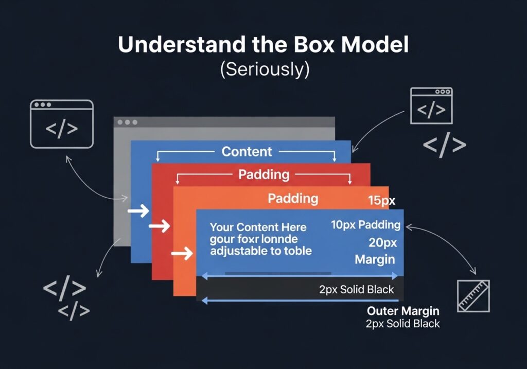
Let’s talk about something that trips up beginners and even some intermediate developers: the CSS box model. Every single element on the page is a box. That box has content, padding, border, and margin.
The problem? By default, when you set it width: 300px on an element, that’s just the content area. Add 20px of padding on each side, and suddenly your element is 340px wide. That kind of surprise causes layouts to break in unexpected ways.
Fix It with box-sizing: border-box
/* Apply this globally — do it first in every project */
*, *::before, *::after {
  box-sizing: border-box;
}
With border-box padding, the border is included in the element’s total width and height. So it width: 300px means 300 px total, including padding. No surprises. No broken layouts.
This is such a fundamental CSS tip that most professional CSS resets and frameworks include it by default. If you don’t have it in your projects yet, add it right now.
Quick Reference
- content-box (default): width = content only
- border-box (recommended): width = content + padding + border
TIP 07: Use and :has() Selectors
Modern CSS has some incredibly powerful pseudo-class selectors that most developers haven’t fully explored yet. This CSS tip group alone can drastically reduce the amount of CSS you write.
:is() Grouping Selectors Cleanly
/* The old way */
h1 a, h2 a, h3 a, h4 a {
  color: inherit;
}

/* The modern way */
:is(h1, h2, h3, h4) a {
  color: inherit;
}
:where() is the same as :is() but zero specificity.
The difference has zero specificity, making it easier to override later. Great for base styles and resets where you don’t want to accidentally win specificity battles.
:has() The “Parent Selector” We Always Wanted
/* Style a card differently if it contains an image */
.card:has(img) {
  padding-top: 0;
}

/* Style a label when its input is checked */
label:has(input:checked) {
  font-weight: bold;
  color: green;
}
:has() is genuinely game-changing. For years, CSS had no way to select a parent based on its children. Now it does. Browser support is excellent across all modern browsers as of 2025–2026. This ranks high among the 10 CSS tips that feel like superpowers.
TIP 08 Avoid Overusing !important
Every developer has been there. Your style isn’t applying, you’re frustrated, you slap !important it on, and it works. Problem solved, right? Not quite.
Overusing !important is like using duct tape to fix a leaky pipe. It works in the moment, but over time your codebase turns into a chaotic mess where nothing is predictable and debugging becomes a nightmare.
Why It Happens (and How to Fix It)
Most of the time, you reach for it !important because of a specificity conflict. One selector is more specific than another and wins. Understanding that is the real fix.
| Selector | Specificity Score |
|---|---|
* (universal) | 0-0-0 |
p (element) | 0-0-1 |
.class | 0-1-0 |
#id | 1-0-0 |
style="..." (inline) | 1-0-0-0 |
!important | Nuclear |
The better approach is to write more specific selectors, restructure your CSS, or use CSS custom properties. Save !important for genuine edge cases like overriding third-party styles you can’t touch.
Rule of Thumb
If you’re using !important more than once or twice in a project, that’s a sign your CSS architecture needs a rethink. This CSS tip could save future you hours of debugging.
TIP 09 Use CSS Transitions and Animations Wisely
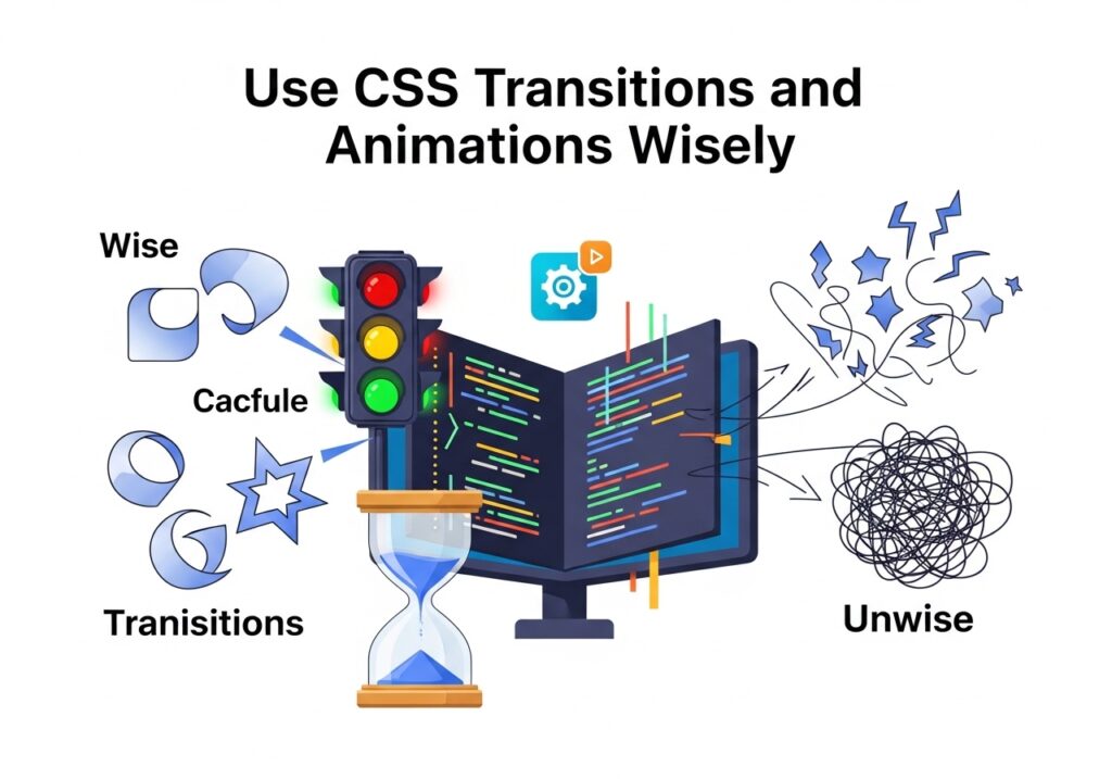
Smooth animations make your UI feel polished and professional. But too many animations make it feel slow and annoying. The trick is knowing when and how to use them, and this CSS tip is all about that balance.
Transitions: The Quick Win
/* Smooth button hover without JavaScript */
.button {
  background: #c84b11;
  transition: background 0.2s ease, transform 0.15s ease;
}

.button:hover {
  background: #a33a0e;
  transform: translateY(-2px);
}
That tiny animation translateY(-2px) on hover gives the button a satisfying “lift” effect. It takes two lines of CSS and makes a huge perceptual difference.
Animate the Right Properties
Not all CSS properties are equal when it comes to animation performance. Properties like transform these opacity are GPU-accelerated and silky smooth. Properties like… and left trigger expensive layout recalculations.
- Animate:
transform,opacity,filter - Avoid animating:
width,height,margin,padding,top,left
Accessibility Note
Always respect user preferences. Some people experience motion sickness from animations. Use @media (prefers-reduced-motion: reduce) to disable or tone down animations for those users. This is not optional; it’s good practice.
@media (prefers-reduced-motion: reduce) {
  *, *::before, *::after {
    animation-duration: 0.01 ms !important;
transition-duration: 0.01 ms! important;
  }
}
TIP 10: Organize Your CSS with a Naming Convention
The last of our 10 CSS tips might seem simple, but it’s the one that separates beginner CSS from production-level CSS. When your project grows, disorganized styles become a maintenance nightmare. A naming convention gives your CSS a structure that everyone on the team can follow.
BEM: Block Element Modifier
BEM is the most widely used CSS naming convention. Here’s how it works:
- Block the standalone component (
.card) - Element a part of the block
.card__title,.card__image) - Modifier a variation of the block or element
.card--featured)
/* BEM in action */
.card { border: 1px solid #ddd; border-radius: 8px; }
.card__title { font-size: 1.25rem; font-weight: bold; }
.card__image { width: 100%; display: block; }
.card--featured { border-color: #c84b11; box-shadow: 0 4px 16px rgba(0,0,0,.15); }
With BEM, you can look at any class name and immediately understand where it belongs and what it does. No more hunting through files to figure out what .blue-box2-v3 is supposed to be done.
Other Approaches Worth Knowing
- SMACSS Scalable and Modular Architecture for CSS
- OOCSS: Object-Oriented CSS
- Utility first like Tailwind CSS, where classes describe single behaviors
The best convention is the one your team actually follows. Even if you pick something slightly imperfect, being consistent is infinitely better than every developer doing their own thing.
BONUS: 5 More Quick CSS Tips Worth Knowing

We couldn’t stop at just 10 CSS tips without sharing a few quick extras that can make your day-to-day coding smoother:
- Use
aspect-ratioto lock an element’s proportions:aspect-ratio: 16 / 9; - Use
gapinstead of margins inside Flex/Grid containers. It’s cleaner and more predictable. - Use it
min-height: 100svhinstead of100vhon mobile to handle browser chrome properly. - Use
object-fit: coveron images inside fixed-size containers to prevent stretching or squishing. - Use
scroll-behavior: smoothithtmlfor smooth scrolling on anchor links, one line, a big UX improvement.
Frequently Asked Questions
What are the most important CSS tips for beginners?
Start with understanding the box model and always setting it box-sizing: border-box globally. Then learn Flexbox properly before jumping to Grid. Using CSS custom properties from day one will also save you a lot of pain as projects grow. These foundational CSS tips give you a solid base for everything else.
Should I learn Flexbox or CSS Grid first?
Learn Flexbox first; it handles most day-to-day layout challenges and is simpler to grasp. Once you’re comfortable with it, move on to Grid. In real projects, you’ll use both together: Grid for the overall page layout, Flexbox for individual components. Both are covered in our 10 CSS tips guide above.
How do I make my website responsive without writing too many media queries?
Two approaches really help here. First, write mobile-first CSS so you’re only adding styles as screen size increases. Second, use modern CSS techniques like those clamp() for font sizes, minmax() in Grid, and Flexbox. These create fluidity without extra breakpoints. As highlighted in our 10 CSS tips list, these reduce complexity dramatically.
Is it okay to use CSS frameworks like Bootstrap or Tailwind instead of writing custom CSS?
Absolutely, frameworks are great for speeding up development. But it’s still important to understand CSS fundamentals. If you don’t know what it display: flex does, debugging a Tailwind layout becomes much harder. Use frameworks, but don’t skip learning the core CSS concepts they’re built on.
How do I improve CSS performance on my website?
Start by only animating, avoid excessive nesting in your selectors, and remove unused CSS using tools like PurgeCSS. Loading only the fonts and styles you actually need makes a noticeable difference. Following the 10 CSS tips in this guide, especially the animation and organization tips, directly improves performance too.
What is CSS specificity, and why does it matter?
CSS specificity determines which style rule “wins” when multiple rules apply to the same element. Understanding it helps you write predictable styles and avoid reaching for them. ID selectors beat class selectors, which beat element selectors. Once you internalize the specificity system, you’ll debug CSS conflicts in seconds instead of minutes.
What’s the difference between CSS transitions and CSS animations?
Transitions are simple; they animate a change from one state to another (like hover states). Animations are more powerful; they let you define multiple keyframes, loop indefinitely, run automatically, and do complex multi-step sequences. Use transitions for simple UI interactions and @keyframes animations for more intricate visual effects.
Wrapping It Up
There you have it, a complete guide to the 10 CSS tips every web developer should have in their toolkit. Let’s do a quick recap of what we covered:
You learned how CSS variables make your codebase easier to manage, how Flexbox and Grid solve layout problems elegantly, and why mobile-first is the smart default. You picked up clamp() on fluid typography, the box-sizing fix that prevents layout surprises, and powerful modern selectors like :has() that which used to require JavaScript. You now know why to use !important sparingly, how to animate efficiently, and why a naming convention like BEM keeps your CSS sane as projects grow.
These aren’t just isolated tricks; they’re habits. The more you practice these 10 CSS tip strategies, the more natural they become. You’ll start writing CSS that’s cleaner, faster, more maintainable, and genuinely a pleasure to work with.