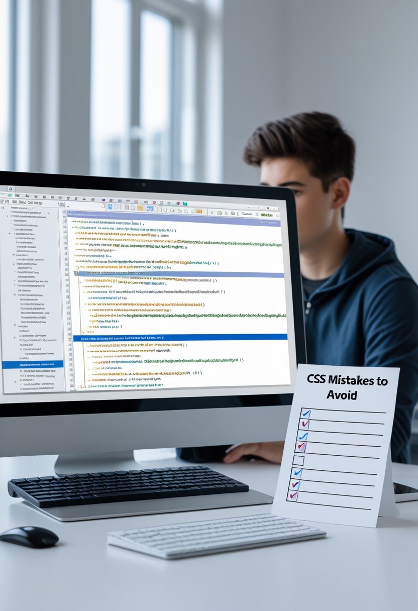

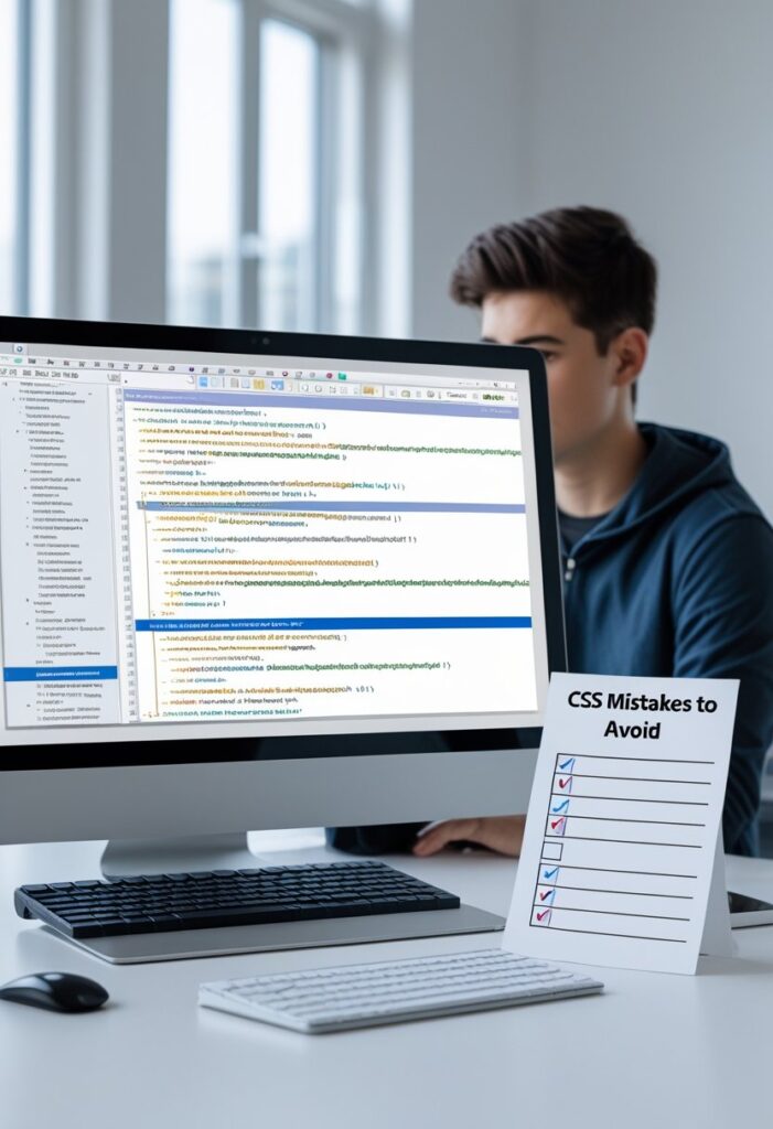
So, you’ve finally dipped your toes into the world of web design. You’ve got your HTML structure down—nice, semantic paragraphs, and shiny buttons. Now comes the fun part: making it look good with CSS.
1. Forgetting to Reset or Normalize CSS
Picture this: You’ve just written 200 lines of beautiful CSS. You save your file and open it in Chrome. It looks perfect. Out of curiosity, you open it in Firefox. Suddenly, there are weird gaps around your header, and the spacing looks totally off. What happened?
The Problem: Browser Default Styles
If you don’t account for this, your website will look different depending on where you view it. As a novice, you might waste hours tweaking margins, only to find the fix breaks it in another browser.
The Fix: Use a Reset or Normalize
You have two options here.
First, you can use a CSS Reset. This strips all default styling away. Margins become zero, paddings become zero, and list items lose their bullets. You start from a completely blank slate.
* {
    margin: 0;
    padding: 0;
    box-sizing: border-box;
}
Second, you can use Normalize.css. This doesn’t remove all styles; instead, it makes default styles consistent across all browsers. It’s a bit more forgiving for beginners.
The fix is simple: at the very top of your main CSS file, either paste a small reset or link to Normalize.css. It’s the first step to a stress-free styling life.
2. Overusing !important
The Problem: The Specificity War or Common CSS Mistakes Novices Make
CSS works on a principle called “specificity.” The more specific a selector is, the higher priority it has. When you use !important, you are essentially yelling at the browser to ignore the rules of specificity.
The Fix: Learn Specificity
Instead of reaching for the hammer, learn how to use the screwdriver.
- Use classes: Instead of targeting
div p a, just give the link a class like.nav-link. It’s cleaner and easier to override later. - Order matters: If two rules have the same specificity, the one that comes last in the stylesheet wins.
- Stack selectors: If you really need to override something, be more specific. Instead of
button { color: red !important; }, try.header .cta-button { color: blue; }.
3. Using Pixels (px) for Font Sizes
When you first start writing CSS, pixels make sense. The world uses pixels—screen sizes are measured in pixels, images are measured in pixels. So, you set your body font-size to 16px and your h1 to 32px.
The Problem: Accessibility Issues
Pixels are an absolute unit. That means they do not scale. Imagine a user who has poor eyesight. In their browser settings, they have set the default font size to “Large” (usually around 20px or 24px). If your entire website is locked in with pixels, your text will ignore their settings. You are essentially telling the user, “I know better than you about how to read this site,” which is terrible for accessibility.
The Fix: Embrace Relative Units (rem)
The solution is to use relative units, specifically rem.
1remis equal to the font size of the root element (the<html>tag). By default, that is usually16px.
So, if you set your p to 1rem, it will be 16px. If you set your h1 to 2rem, it will be 32px. But here’s the magic: if the user changes their default browser font size to 20px, your 1rem automatically becomes 20px, and your 2rem becomes 40px. Everything scales perfectly.
/* Good */
body {
    font-size: 1rem; /* Usually 16px */
}

h1 {
    font-size: 2.5rem; /* Usually 40px */
}

/* Not so good */
body {
    font-size: 16px;
}

h1 {
    font-size: 40px;
}
Use pixels for borders or box shadows if you must, but for font sizes, go with rem. Your users will thank you.
4. Not Understanding the “Box Model”
Every single element on a web page is a rectangular box. The CSS Box Model dictates how we calculate the size of that box. Novices often get tripped up here.
The Problem: Width + Padding + Border = Unexpected Width
You want a sidebar that is exactly 300px wide. So, you write:
.sidebar {
    width: 300px;
    padding: 20px;
    border: 5px solid black;
}
You check your browser, and the sidebar is actually 350px wide! You panic. You did the math wrong? No, you forgot how the box model works.
By default, in CSS, the width property sets the width of the content area. The padding and border are added on top of that width. So, 300px + 20px (left padding) + 20px (right padding) + 5px (left border) + 5px (right border) = 350px.
The Fix: box-sizing: border-box;
This single property is a lifesaver. When you set box-sizing: border-box; on an element, the width you set includes the padding and border.
With border-box, if you set width: 300px; and add 20px of padding, the browser will automatically squeeze the content area to 260px to keep the total width at 300px.
It’s so universally useful that most developers put this on every element from the start:
* {
    box-sizing: border-box;
}
Apply this, and your math will suddenly make sense again.
5. Writing Messy, Unorganized Code
Imagine trying to find a specific shirt in a room where all your clothes are just thrown on the floor. That’s what it’s like to debug CSS that has no structure. You write a rule for the header, then a rule for the footer, then jump back to a random button style, then another header rule.
The Problem: The “Where Did I Put That?” Syndrome
Six months later (or even six days later), you need to change the color of all your links. You have to scroll through 1000 lines of CSS, trying to remember where you put them. It wastes time and leads to mistakes where you write the same rule twice.
The Fix: Adopt a Logical Structure
Organization doesn’t happen by accident. You need to be intentional.
/* === Base Styles === */
body { ... }
a { ... }

/* === Header / Navigation === */
.header { ... }
.nav { ... }

/* === Main Content === */
.blog-post { ... }
.sidebar { ... }

/* === Footer === */
.footer { ... }- Group by function: Keep all the styles related to the header together.
- Follow the page flow: Write your styles in the order the elements appear on the page. Start with the body, then the header, then the main content, then the footer.
A tidy stylesheet is a happy stylesheet. It makes you look professional and saves your sanity.
6. Forgetting About Mobile Responsiveness
This is a huge one. You build a gorgeous website on your 27-inch monitor. Everything is perfectly aligned. You proudly send the link to your friend, who opens it on their iPhone. You get a screenshot back: the text is tiny, the images are huge, and the navigation menu is just a jumbled mess of links stacked awkwardly.
The Problem: Designing Only for Desktop
In 2024, more than half of web traffic comes from mobile devices. If your site doesn’t work on a phone, you are alienating the majority of your audience. Google also penalizes sites that aren’t mobile-friendly in search results.
The Fix: Start with Mobile-First Design
Change your mindset. Instead of starting with a giant desktop layout and squeezing it down to mobile (which is really hard), start with the mobile layout first and scale up.
- Use a viewport meta tag: Make sure this is in your HTML
<head>.
<meta name="viewport" content="width=device-width, initial-scale=1.0">- Embrace Flexbox and Grid: These modern layout tools make responsiveness much easier.
- Media Queries are your friend: Add breakpoints to adjust your layout for larger screens.
/* Base styles for mobile */
.container {
    width: 100%;
    padding: 15px;
}

/* Styles for tablets and up */
@media (min-width: 768px) {
    .container {
        width: 750px;
        margin: 0 auto;
    }
}

/* Styles for desktops and up */
@media (min-width: 1024px) {
    .container {
        width: 980px;
    }
}
Always test your site by dragging your browser window to different sizes.
7. Over-Specific Selectors
When you’re learning, it’s easy to get specific because you want to make sure you’re targeting the right thing. You might end up with selectors that look like this:
body div#wrapper div.container div.content article p span.highlight {
    color: red;
}
The Problem: It’s Fragile and Unnecessary
The Fix: Keep Selectors Short and Independent
Aim for selectors that are just one or two levels deep.
- Use classes for everything: Classes are the perfect level of specificity. They are reusable.
- Avoid chaining tags: Instead of
div.container, just use.container. You know it’s a div, the browser doesn’t need the extra hint. - Write reusable code: The goal is to write a class once and use it anywhere.
The long selector above should be rewritten as simply:
.highlight {
    color: red;
}
Clean, simple, and it works everywhere.
8. Using float for Layouts
If you look at some old tutorials, you’ll see people using float: left; to create columns. They wrap everything in a “clearfix” hack to make the parent container not collapse. It works, but it’s a hack.
The Problem: Floats Weren’t Made for Layout
The float property was originally designed to allow text to wrap around an image (like in a newspaper). Using it to build entire website grids is like using a spoon to dig a swimming pool. It’s possible, but it’s the wrong tool for the job, and it leads to all sorts of weird side effects (like containers collapsing and elements overlapping).
The Fix: Use Flexbox or CSS Grid
Modern CSS has given us amazing tools specifically for layout.
- Flexbox: Perfect for one-dimensional layouts. Need a navigation bar where the links are spaced out evenly? Need to center a box vertically and horizontally? Use Flexbox. It’s designed for distributing space along a single row or column.
- CSS Grid: Perfect for two-dimensional layouts. Need a complex magazine-style layout with a header, sidebar, main content, and footer? Grid is your best friend. You define rows and columns and place items exactly where they need to go.
If you’re building a new site today, there is almost no reason to use float for layout anymore. Embrace Flexbox and Grid. They are easier, more powerful, and actually make sense.
9. Ignoring Vendor Prefixes
So, you learned about CSS Grid. You built a cool layout using display: grid; and gap: 20px;. It looks fantastic in your browser. But you show it to a friend who uses an older version of Safari, and the layout is completely broken.
The Problem: Browser Implementation Lag
When a new, cool CSS feature comes out, different browsers adopt it at different speeds. Sometimes, they implement the feature early but with a temporary prefix. So, for a while, you might need to use -webkit- (for Chrome, Safari) or -moz- (for Firefox) to make sure the feature works everywhere.
The Fix: Use Autoprefixer or Check Compatibility
You don’t need to memorize all the prefixes. That would be a nightmare.
- Use a tool: If you are using a code editor like VS Code, you can install extensions that automatically add prefixes for you.
- Use a build process: Tools like PostCSS with Autoprefixer are standard in professional web development. They look at your CSS and add the necessary prefixes based on which browsers you need to support.
- Check Can I Use: The website “caniuse.com” is your best friend. Search for a CSS property (like
gap), and it will tell you exactly which browsers support it and if prefixes are needed.
10. Not Using Shorthand Properties
CSS offers shorthand properties that let you set multiple values at once. Novices often write long, repetitive code without realizing they could do it in one line.
The Problem: Bloated and Repetitive Code
Look at this code for margins:
.box {
    margin-top: 10px;
    margin-right: 15px;
    margin-bottom: 20px;
    margin-left: 15px;
}
It works, but it’s 4 lines long. Now look at the shorthand version:
.box {
    margin: 10px 15px 20px 15px;
}
Much cleaner, right? The same applies to padding, border, background, font, and many others.
The Fix: Learn the Common Shorthands
It takes a little memory work, but it makes your CSS so much cleaner.
- Margin/Padding (Clockwise): The values go in clockwise order: Top, Right, Bottom, Left.
margin: 10px 15px 20px 15px;
- Two Values: If you put two values, the first sets Top/Bottom and the second sets Right/Left.
margin: 10px 15px;(Top/Bottom = 10px, Left/Right = 15px)
- Background:
/* Long way */
.hero {
    background-image: url('image.jpg');
    background-repeat: no-repeat;
    background-position: center;
}

/* Short way */
.hero {
    background: url('image.jpg') no-repeat center;
}
Using shorthand keeps your stylesheets lean, which is easier to read and faster for the browser to load.
Frequently Asked Questions (FAQs)
Q1: What is the best way to learn CSS without making these mistakes?
Practice, practice, practice. But also, code review. Look at the source code of websites you admire (right-click -> Inspect). See how they structure their CSS. You’ll learn a ton just by seeing how professionals solve problems.
Q2: My CSS changes aren’t showing up when I refresh the page. Why?
This is a classic. First, check if you saved the file. Second, do a “hard refresh” (Ctrl+Shift+R on Windows, Cmd+Shift+R on Mac). Your browser might be loading an old cached version of the stylesheet. If that doesn’t work, double-check that your HTML file is actually linked to the correct CSS file path.
Q3: Should I use a CSS Framework like Bootstrap or Tailwind as a beginner?
It depends. Frameworks can help you build things fast. However, I recommend spending a few months learning raw CSS first. If you jump straight to a framework, you might never learn how CSS actually works. Learn the fundamentals, then use a framework to speed up your workflow.
Q4: How do I center a div?
This is the meme of web development. The answer depends on the context, but the most common modern way using Flexbox is:
.parent {
    display: flex;
    justify-content: center; /* Centers horizontally */
    align-items: center; /* Centers vertically */
    height: 100vh; /* Give the parent some height */
}
The child div will now be perfectly centered in the parent.
Q5: What does “cascading” actually mean in Cascading Style Sheets?
It refers to the way styles are applied. Styles “cascade” down from the top of your file to the bottom. If you define a style for p at the top, and then redefine the same property for p later in the file, the later one wins. It also refers to the hierarchy of styles: browser defaults < external stylesheets < internal stylesheets < inline styles.
Conclusion
Look, making mistakes in CSS is a rite of passage. I’ve made every single one of these mistakes, probably more than once. The key is not to be perfect on day one, but to understand why something broke so you can fix it better next time.
We covered a lot of ground today. We talked about the importance of resetting browser defaults and why you should put the !important hammer away. We learned why rem is better than px for accessibility and how the box model actually calculates width. We discussed keeping your code organized, designing for mobile first, and ditching float for modern layouts like Flexbox and Grid.
Remember, writing CSS is a conversation between you and the browser. The more you understand the rules of the language—the box model, specificity, and cascading—the easier it becomes to make the browser do exactly what you want.
So, go ahead and open up that project you’ve been working on. Take a look with fresh eyes. Do you see any of these mistakes hiding in your code? If you do, don’t feel bad. Fix them. That’s how you go from a novice to a pro. Happy coding
