Master Plotly in just 10 minutes! Our beginner-friendly guide shows you how to create stunning interactive charts with easy Python code. No experience needed
Ever feel like your data is… boring? You spend all this time analyzing numbers, finding amazing insights, and then you present it in a static Excel chart. Your audience nods politely, but their eyes glaze over. The magic of your discovery just doesn’t come across.
What if you could create charts that people can play with? Charts where you can hover, zoom, and click to uncover the story hidden in the data?
That’s the power of Plotly.
And here’s the best part: you don’t need to be a professional programmer or a data scientist to use it. In the next 10 minutes, I’m going to show you exactly how to use Plotly to turn your boring data into stunning, interactive visuals that will make your presentations, reports, and websites unforgettable. Let’s dive in!
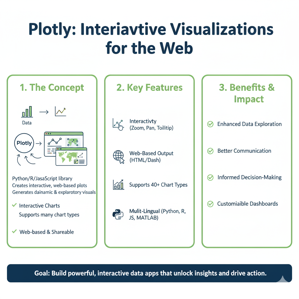
What is Plotly, Anyway? (And Why Should You Care?)
In simple terms, Plotly is a powerful, open-source library for creating interactive graphs. Think of it as super-powered Excel charts on steroids, but for Python (and R, and JavaScript).
Why is this a big deal? Because static charts are a one-way street. You show, they see. Interactive charts from Plotly are a two-way conversation. Your audience can explore the data themselves.
Here’s a quick taste of what Plotly can do:
- Hover Effects: Hover your mouse over a data point to see its exact value. No more squinting at axis labels!
- Zoom and Pan: Found an interesting spike? Zoom in for a closer look.
- Click to Filter: Click on a legend item to show or hide a data series.
- Download as Image: Let your audience save the chart as a PNG for their own reports.
The Car Dashboard Analogy
Imagine you’re looking at your car’s dashboard. A static chart is like a printed photograph of your speedometer. It shows you were going 55 mph at that moment. An interactive Plotly chart is like the real dashboard. You can see your current speed, but you can also check your fuel gauge, see your RPM, and get warning lights. It’s a living, interactive system. That’s the difference we’re talking about.
Getting Started: Your First 2-Minute Setup
Before we make beautiful charts, we need to get Plotly on your computer. It’s a one-time setup that takes less than two minutes.
Step 1: Install Plotly
Open your command prompt (Windows) or terminal (Mac/Linux). Type the following command and press Enter:
bash
pip install plotly
If you’re using a Jupyter Notebook (which I highly recommend for learning), you’re all set! If you’re working in a standalone Python script, you might also want to install pandas for handling data:
bash
pip install plotly pandas
Step 2: The “Hello, World!” of Plotly
Let’s create the simplest possible interactive chart to see it in action. Open your Python environment and type these five lines:
python
import plotly.express as px

# Create simple data
data = {'Fruits': ['Apples', 'Oranges', 'Bananas'], 'Sales': [45, 25, 60]}

# Create the chart
fig = px.bar(data, x='Fruits', y='Sales', title="Fruit Sales")

# Show it!
fig.show()
Boom! You should see a bar chart pop up in your web browser. Hover over the bars. See how the numbers appear? Try clicking on the legend if there was one. You’ve just made your first interactive chart with Plotly!
The Magic of Plotly Express: Your New Best Friend
You’ll notice we used import plotly.express as px. This is your secret weapon. Plotly Express is a high-level interface for Plotly that makes creating common charts incredibly simple, often with just one line of code.
Think of Plotly Express as the “easy button” for data visualization.
Creating Your First Real-World Chart
Let’s use a more realistic example. Imagine you’re a sales manager and you want to visualize sales over time.
python
import plotly.express as px
import pandas as pd

# Create a small dataset
data = pd.DataFrame({
    'Month': ['Jan', 'Feb', 'Mar', 'Apr', 'May', 'Jun'],
    'Sales': [1000, 1200, 800, 1500, 2000, 1800],
    'Region': ['North', 'North', 'South', 'South', 'North', 'South']
})

# Create an interactive line chart
fig = px.line(data, x='Month', y='Sales', color='Region',
              title="Monthly Sales by Region")
fig.show()
In this one px.line() command, we told Plotly:
- Use
dataas our source. - Put
Monthon the X-axis. - Put
Saleson the Y-axis. - Color the lines by
Region(automatically creating a legend!). - Give it a title.
Now you have a professional-looking, multi-line chart. Hover over the lines. Click “North” or “South” in the legend to hide/show each region. See how easy it is to explore the story?
5 Essential Charts You’ll Master in Minutes
Let’s run through the most common chart types. You’ll use these for 90% of all your data visualization tasks.
1. The Bar Chart: For Simple Comparisons
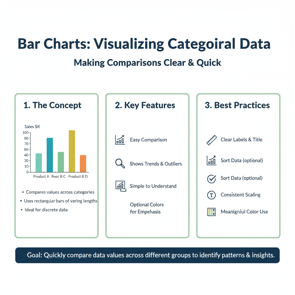
When to use: Comparing quantities across different categories (e.g., sales by product, votes by candidate).
python
# Using our fruit data from before
fig = px.bar(data, x='Fruits', y='Sales', title="Fruit Sales")
fig.show()
Pro Tip: For a horizontal bar chart, just swap the x and y arguments: y='Fruits', x='Sales'.
2. The Line Chart: For Tracking Trends Over Time
When to use: Showing trends, movements, or changes over a continuous period (e.g., stock prices, website traffic, temperature).
python
# We already did this one above! It's that common.
fig = px.line(data, x='Month', y='Sales', color='Region')
fig.show()
3. The Scatter Plot: For Finding Relationships
When to use: Seeing if there’s a relationship or correlation between two variables (e.g., height vs. weight, advertising spend vs. revenue).
python
# Let's create new data for this
correlation_data = pd.DataFrame({
    'Advertising_Spend': [100, 200, 300, 400, 500],
    'Revenue': [150, 300, 350, 500, 550]
})

fig = px.scatter(correlation_data, x='Advertising_Spend', y='Revenue',
                 title="Does More Spending Mean More Revenue?",
                 trendline="ols") # ols adds a trendline!
fig.show()
Hover over the points. That trendline was added automatically by Plotly to help you see the pattern. Powerful, right?
4. The Histogram: For Understanding Distributions
When to use: Showing how your data is spread out. What’s the most common value? What’s the range? (e.g., distribution of exam scores, age of customers).
A histogram is one of the most powerful, yet misunderstood, charts. While a bar chart compares different categories, a histogram shows you the distribution of a single continuous variable.
What is a Distribution, Really?
Imagine you’re a teacher who just graded 100 exams. You have a list of scores. You could calculate the average, but that only tells you one thing. A histogram answers much more interesting questions:
- What was the most common score?
- Was the test too easy (scores clustered at the high end) or too hard (scores clustered at the low end)?
- How wide was the spread? Were all scores close to the average, or were they all over the place?
A histogram visualizes this by grouping your data into “bins” and counting how many data points fall into each bin.
Deep Dive into the Code
Let’s break down the example from the article line by line.
python
# Import the NumPy library, which is great for generating sample data and numerical operations.
import numpy as np

# Set a 'random seed'. This ensures that the 'random' numbers we generate are the same every time we run the code.
# It's like fixing the starting point for randomness, which is essential for reproducible examples.
np.random.seed(42)

# Generate our fake exam score data.
# np.random.normal() draws random samples from a "normal" (bell-curve) distribution.
# The three numbers we give it are:
#   1. loc (the mean): 70 (the center of our distribution)
#   2. scale (the standard deviation): 10 (how spread out the data is)
#   3. size: 1000 (how many data points to create)
exam_scores = np.random.normal(70, 10, 1000)

# Now, create the histogram with Plotly Express.
# We pass it the 'exam_scores' data.
# 'nbins=20' tells Plotly to split the data range into 20 equally sized buckets.
# The title is self-explanatory.
fig = px.histogram(exam_scores, nbins=20, title="Distribution of Exam Scores")

# Display the interactive chart.
fig.show()
What You’ll See and Do:
When you run this code, you’ll see a classic bell-shaped curve. The x-axis shows the range of exam scores (from around 40 to 100), and the y-axis shows the count of students who achieved scores in each range.
- Hover: Hover over any bar. The hover box might say something like “Bin: 67.5 to 70” and “Count: ~75”. This means about 75 students scored between 67.5 and 70.
- The Power: You instantly grasp that most students scored in the 60-80 range (the tall bars in the middle), while very few scored below 50 or above 90 (the short bars on the ends).
Real-World Application: Customer Analysis
Let’s move beyond test scores. Imagine you run an e-commerce site.
python
import plotly.express as px
import pandas as pd

# Simulate customer age data for a trendy clothing store
# We'll use a slightly different distribution that skews younger
ages = np.random.normal(28, 8, 1000) # Mean age 28, standard deviation 8

# Create the histogram
fig = px.histogram(x=ages, nbins=15,
                   title="Distribution of Customer Ages",
                   labels={'x': 'Customer Age', 'y': 'Number of Customers'})

# Customize the layout for clarity
fig.update_layout(bargap=0.1) # Puts a small gap between the bars for readability
fig.show()
The Business Insight: This chart instantly reveals that your core customer base is in their mid-20s. This is invaluable! It tells your marketing team, “Focus your social media ads on platforms popular with 20-30 year olds.” It tells your buyers, “Stock clothing that appeals to a younger demographic
python
# Let's simulate exam scores
import numpy as np
np.random.seed(42) # This just makes sure we get the same "random" numbers each time
exam_scores = np.random.normal(70, 10, 1000) # 1000 scores, average 70, standard deviation 10

fig = px.histogram(exam_scores, nbins=20, title="Distribution of Exam Scores")
fig.show()
You can instantly see that most students scored around 70, with fewer students getting very high or very low scores.
5. The Pie Chart: For Showing Proportions (Use Sparingly!)
When to use: Showing parts of a whole. Best for simple proportions with a few categories.
The pie chart is the most famous chart in the world, but also the most criticized by data visualization experts. Why? Because the human brain is not very good at accurately comparing the angles or areas of slices, especially when they are similar in size.
When Should You Actually Use a Pie Chart?
Use a pie chart only when these conditions are met:
- You are showing parts of a whole (percentages that add up to 100%).
- You have a very small number of categories (ideally 2-5).
- The differences between the slices are large and obvious.
- Your main goal is a simple, high-level impression, not precise comparison.
Deep Dive into the Code
Let’s expand on the simple fruit example.
python
import plotly.express as px

# Our fruit sales data
data = {'Fruits': ['Apples', 'Oranges', 'Bananas', 'Grapes', 'Berries'],
        'Sales': [45, 25, 60, 30, 20]}

# Create the pie chart
# 'names' defines the categories (the slices)
# 'values' defines the size of each slice
fig = px.pie(data, names='Fruits', values='Sales',
             title="Q2 Fruit Sales: Market Share")

# Display the chart
fig.show()
Interacting with Your Pie Chart:
- Hover: Hover over any slice to see the exact sales number and the percentage of the total.
- Click the Legend: This is a powerful feature. Click on a fruit name in the legend to remove that slice from the pie. Click it again to add it back. This lets you isolate and focus on specific parts of the data.
A Better Alternative: The Donut Chart
A slight variation of the pie chart, the donut chart, is often perceived as more modern and less cluttered. The empty center can be used to display a key metric.
python
# Create a donut chart by setting 'hole'
fig = px.pie(data, names='Fruits', values='Sales',
             title="Q2 Fruit Sales: Market Share",
             hole=0.4) # A hole of 0.4 creates a 40% empty space in the middle.

# Let's add the total sales in the center using an annotation
total_sales = sum(data['Sales'])
fig.update_layout(
    annotations=[dict(text=f'Total<br>${total_sales}', x=0.5, y=0.5, font_size=20, showarrow=False)]
)

fig.show()
When to Use a Bar Chart Instead
If you break any of the rules for pie charts (e.g., you have 7 categories, or the slices are very similar in size), use a bar chart. It is always easier for the human eye to compare the length of bars than the area of pie slices.
Example of a Bad Pie Chart Scenario:
Let’s say you have sales data for 7 different product categories, and the shares are all between 10% and 20%.
python
# Data that is poorly suited for a pie chart
complex_data = {'Category': ['Cat A', 'Cat B', 'Cat C', 'Cat D', 'Cat E', 'Cat F', 'Cat G'],
                'Market_Share': [15, 18, 12, 16, 14, 19, 6]}

# The confusing pie chart
fig_pie = px.pie(complex_data, names='Category', values='Market_Share', title="Market Share (Confusing Pie)")
fig_pie.show()

# The clear bar chart
fig_bar = px.bar(complex_data, x='Category', y='Market_Share', title="Market Share (Clear Bar)")
fig_bar.show()
python
fig = px.pie(data, names='Fruits', values='Sales', title="Market Share of Fruits")
fig.show()
Warning: Data visualization experts often advise against pie charts because it’s hard for the human eye to compare the size of slices. Use them carefully, and never with more than 5-6 slices!
Level Up: 3 Pro Tips to Make Your Charts Shine
You’ve got the basics. Now, let’s make your charts look professional and polished.
Tip 1: Tame Your Titles and Labels
Default labels are often boring. Make them clear and descriptive.
python
fig = px.bar(data, x='Fruits', y='Sales', title="Q2 Fruit Sales Performance")

# Customize the labels
fig.update_layout(
    xaxis_title="Fruit Type",
    yaxis_title="Sales (in USD)",
    font=dict(size=12)
)

fig.show()
Tip 2: Master the Hover Text
The hover box is prime real estate. You can control exactly what information appears.
python
# Add a "Profit" column to our data
data['Profit'] = [20, 15, 30]

fig = px.bar(data, x='Fruits', y='Sales',
             hover_data=['Profit'], # This adds Profit to the hover box
             title="Sales with Profit Info")

# You can even customize the hover template (a bit more advanced)
fig.update_traces(hovertemplate='<b>%{x}</b><br>Sales: $%{y}<br>Profit: $%{customdata[0]}')

fig.show()
Now when you hover, you’ll see the fruit name, sales, and profit.
Tip 3: Save and Share Your Masterpieces
You can save any Plotly chart as an HTML file. This is amazing because the file is a single, standalone webpage that keeps all its interactivity! You can email it, post it on a website, or share it with anyone.
python
fig.write_html("my_awesome_chart.html")
You can also save it as a static image (PNG, JPEG) for reports.
python
fig.write_image("my_static_chart.png")
Your 10-Minute Practice Project
Let’s bring it all together. Your mission is to recreate the following scenario.
Scenario: You are tracking the performance of two teams, “Alpha” and “Beta,” over four quarters.
- Create the Data:pythonquarters = [‘Q1’, ‘Q2’, ‘Q3’, ‘Q4’] performance_data = pd.DataFrame({ ‘Quarter’: quarters + quarters, # List repeated twice ‘Revenue’: [100, 150, 170, 200, 80, 110, 160, 190], ‘Team’: [‘Alpha’]*4 + [‘Beta’]*4 # Creates [‘Alpha’,’Alpha’,’Alpha’,’Alpha’,’Beta’,’Beta’,’Beta’,’Beta’] })
- Create a Line Chart: Use
px.line()to plot both teams’ revenue over the quarters. Color by team. - Add a Title and Clear Labels: Use
fig.update_layout()to set a title like “Team Performance 2024” and clear axis titles. - Save it: Save the chart as an interactive HTML file called
team_performance.html.
Go ahead, try it! The solution is at the end of the article, but no peeking until you’ve given it a shot.
Frequently Asked Questions (FAQs)

Q1: Is Plotly really free to use?
Yes! The core Plotly library for Python is open-source and completely free. There is a paid, enterprise version called Plotly Dash for building full-blown analytical web apps, but for creating and sharing interactive charts, the free version is more than powerful enough.
Q2: I’m stuck with an error! Where can I get help?
The Plotly community is huge and helpful. The best place to go is the official Plotly Community Forum. You can also find thousands of examples on the Plotly website.
Q3: Can I use Plotly in my Jupyter Notebook?
Absolutely! In fact, it’s one of the most popular ways to use Plotly. The charts will render directly in the notebook, fully interactive. It’s a fantastic environment for data exploration.
Q4: How is Plotly better than Matplotlib or Seaborn?
Matplotlib and Seaborn are great and have been the standard for years. However, they create static images. Plotly’s killer feature is interactivity. It creates a much more engaging experience for your audience. It’s also generally easier to create complex charts with fewer lines of code using Plotly Express.
Conclusion: You’re Now a Plotly Pro!
Look at how much you’ve accomplished in just 10 minutes. You’ve gone from zero to creating:
- Interactive bar charts and line graphs.
- Insightful scatter plots with trendlines.
- Professional-looking histograms and pie charts.
- Polished visuals with custom labels and hover data.
You’ve learned the secret sauce: Plotly Express. This one tool will handle most of your charting needs with stunning simplicity.
The static chart era is over. You now have the power to create data experiences that invite exploration, tell compelling stories, and make your insights impossible to ignore. So, open your Python editor, grab a dataset, and start building. The world is waiting to see your data in a whole new, interactive light.
python
import plotly.express as px
import pandas as pd

# 1. Create the Data
quarters = ['Q1', 'Q2', 'Q3', 'Q4']
performance_data = pd.DataFrame({
    'Quarter': quarters + quarters,
    'Revenue': [100, 150, 170, 200, 80, 110, 160, 190],
    'Team': ['Alpha']*4 + ['Beta']*4
})

# 2. Create the Line Chart
fig = px.line(performance_data, x='Quarter', y='Revenue', color='Team')

# 3. Add Titles and Labels
fig.update_layout(title="Team Performance 2024",
                  xaxis_title="Business Quarter",
                  yaxis_title="Revenue (in Thousands)")

# 4. Save it
fig.write_html("team_performance.html")

# Show it (optional, for viewing in a notebook)
fig.show()