
Master chart design in 2025: transform raw data into stunning, persuasive visuals. Our guide reveals professional techniques for clear, impactful data storytelling
Have you ever sat through a presentation completely lost? The speaker clicks to a slide packed with a complicated chart. They start talking about data points and trends, but all you see is a messy rainbow of colors and confusing lines. Your eyes glaze over, and you’ve completely tuned out.
We’ve all been there. It’s not that the data wasn’t important. It’s that the chart design failed.
Now, imagine a different scenario. The presenter shows a single, clean graph. In two seconds, you understand the main point. The story in the numbers is crystal clear. You’re engaged, you’re learning, and you’re impressed.
That’s the power of mastering chart design. It’s not about making things “pretty.” It’s about making things understood. In our data-driven world, the ability to transform raw, boring numbers into compelling visual stories is a superpower. Whether you’re a student, a business professional, a blogger, or a community leader, this skill will make you a more effective communicator.
This guide will walk you through the entire process. We’ll move from choosing the right chart to applying simple design principles that make your visuals impossible to ignore. Let’s turn you from a data novice into a chart design pro.
What is Chart Design, Really? (It’s Not Just Picking Colors)
Let’s start with the basics. Chart design is the art and science of visually representing data. It’s the thoughtful process of selecting the right type of chart and then designing it for maximum clarity and impact.
Think of it like being a translator. Your raw data is one language—full of numbers and technical terms. Your audience speaks another—the language of visuals and stories. Good chart design is the act of translation. It ensures the true meaning of your data isn’t just preserved; it’s enhanced.
A well-designed chart does three things:
- It makes complex information simple to grasp.
- It reveals patterns and insights that are hidden in a spreadsheet.
- It persuades and motivates your audience to take action.
The Supermarket Analogy
Imagine you’re the manager of a grocery store. You have a spreadsheet showing sales of 100 different products last week. How do you find out what’s selling best?
You could stare at the list of numbers. Or, you could create a simple bar chart. In an instant, the top-selling products would stand out as the tallest bars. You’d see the “losers” as the shortest ones. That visual, designed correctly, gives you instant, actionable insight. That’s effective chart design in action.
Why Bother? The Power of Getting Chart Design Right
You might think, “A chart is a chart. What’s the big deal?” The difference between poor and excellent chart design is the difference between confusion and clarity, between being ignored and being influential.
1. It Builds Trust and Credibility
A sloppy, confusing chart makes you look unprepared. A clean, professional chart makes you look competent and trustworthy. It shows you respect your audience’s time and intelligence.
2. It Drives Better Decisions
When people understand the data quickly and correctly, they can make smarter decisions. A misread chart can lead to costly mistakes. Good chart design ensures everyone is on the same page, looking at the same clear story.
3. It Saves Everyone Time
You spend less time explaining what your charts mean. Your audience spends less time trying to decipher them. Everyone wins.
4. It Makes Your Message Memorable
People are far more likely to remember a visual story than a list of numbers. A powerful chart can be the one thing your audience remembers from your entire presentation.
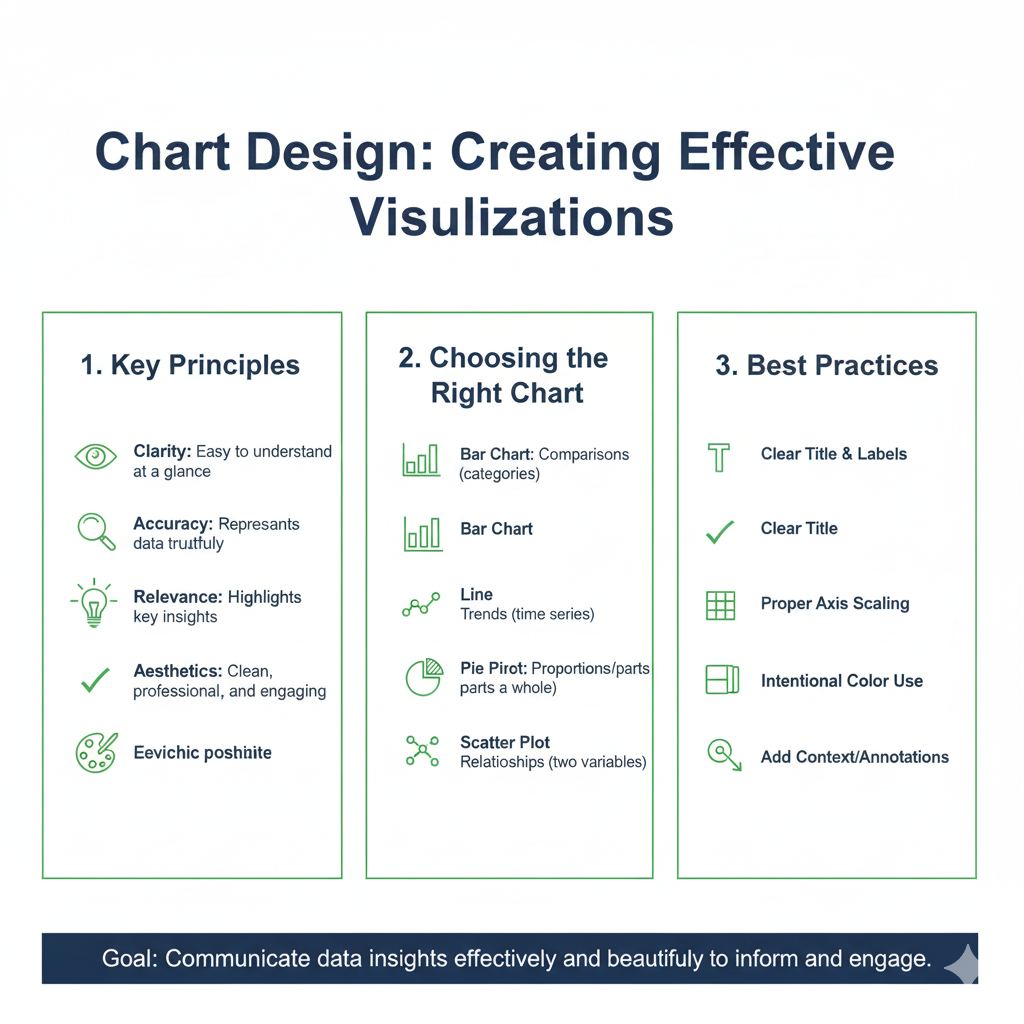
Step 1: Choosing the RIGHT Chart Type (The Most Important Decision)
This is where most people go wrong right from the start. They just pick a chart that looks cool. But every chart type has a job. You need to match the chart to your data’s story.
Ask yourself this key question first: “What is the main point I want to make with this data?”
Your answer will lead you to the right chart. Let’s break down the most common types.
H3: For Comparing Categories
Use these when you want to show differences between things, like sales by region or votes by candidate.
Bar Chart: Your go-to, all-star chart.
- Use it for: Comparing many categories. Ranking items (e.g., best-selling products).
- Pro Tip: Sort your bars from highest to lowest to make comparisons even easier. This is often called a “sorted bar chart” and is a hallmark of good chart design.
- Example: A bar chart comparing revenue generated by different marketing channels (Social Media, Email, Search Ads).
Column Chart: Very similar to a bar chart, but the bars are vertical.
- Use it for: Comparing a few categories (less than 6-7). Showing data over short time periods (e.g., sales by month in a single quarter).
- Example: A column chart showing the number of new customers acquired each month from January to June.
H3: For Showing Trends Over Time
Use these to display how something has changed over hours, days, years, etc.
Line Chart: The king of trend data.
- Use it for: Showing continuous data over time. Revealing trends, cycles, and patterns. Comparing multiple trends on the same chart (e.g., website traffic from different sources over a year).
- Pro Tip: Don’t use a line chart for non-time-based categories. It implies a connection and flow that isn’t there.
- Example: A line chart tracking the daily closing price of a stock over the past 12 months.
H3: For Showing Parts of a Whole
Use these to illustrate how individual components contribute to a total.
Pie Chart: Use with Caution!
- Use it for: Showing simple proportions for 2-5 categories where the parts clearly add up to 100%.
- The Danger: It’s very hard for the human eye to accurately compare the sizes of different slices, especially if they are similar. This is a common chart design pitfall.
- Rule of Thumb: If you have more than 5 slices, use a bar chart instead. It’s much more precise.
- Example: A pie chart showing the market share of a company (e.g., 60% us, 25% Competitor A, 15% Others).
Donut Chart: A modern take on the pie chart.
- Use it for: The same situations as a pie chart, but it feels less cluttered. The empty center can be used to display a key number (like the total sum).
- Example: A donut chart showing a project’s budget allocation, with the total project budget in the center.
H3: For Showing Relationships
Use these to see if there’s a connection between two different variables.
Scatter Plot:
- Use it for: Answering the question, “Does variable A relate to variable B?” It helps you spot correlations, clusters, and outliers.
- Example: A scatter plot comparing advertising spend (on the x-axis) to sales revenue (on the y-axis) to see if more spending leads to more revenue.
H3: For Showing Distribution
Use these to see how your data is spread out. What’s the range? Where do most values cluster?
Histogram:
- Use it for: Showing the distribution of a single continuous variable. It looks like a bar chart, but the bars touch because they represent a range of values.
- Example: A histogram showing the distribution of exam scores for a class of 100 students. You can quickly see if the scores clustered around a B or were all over the place.
Step 2: The 7 Pillars of Killer Chart Design
You’ve picked the right chart type. Now, let’s make it stunningly clear. Follow these seven principles, and your charts will instantly look professional.
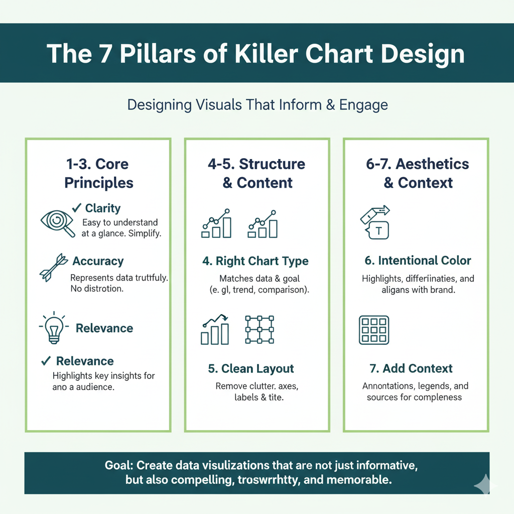
Pillar 1: Declutter – Less is Always More
This is the golden rule of chart design. Every single element on your chart should have a job. If it doesn’t, remove it.
- Remove heavy gridlines: Use subtle, light grey lines or remove them entirely. They create visual noise.
- Kill the chartjunk: Avoid 3D effects, shadows, and unnecessary backgrounds. They distort the data and add zero value.
- Simplify the axis labels: Do you need six decimal places? Probably not. Round numbers are easier to read.
Before: A bar chart with dark gridlines, a gradient background, and 3D effects.
After: The same chart with white background, light grey gridlines, and flat, solid-colored bars. The data is now the star.
Pillar 2: Use Color with a Purpose
Color is your most powerful tool, but it’s often misused. Don’t use color just to make the chart colorful.
- Highlight, don’t decorate: Use a bold color to draw attention to the most important data point or bar. Make everything else a neutral grey or a muted color.
- Use intuitive colors: For profit/loss, use green and red. For stop/start, use red and green. Be mindful of cultural associations and color blindness (avoid red/green as the only differentiator).
- Limit your palette: Stick to 2-3 main colors. Use shades of the same color for different categories in a single series.
Pillar 3: Write Crystal-Clear Titles and Labels
Your audience should not have to guess what they are looking at.
- Use action titles: Instead of “Sales Q1,” write “Q1 Sales Exceeded Target by 15%.” The title should state the main finding.
- Label data directly: Instead of forcing people to look back and forth between a legend and the data, label the lines or bars directly. This is a game-changer for clarity.
- Explain your axes: Make sure the x-axis and y-axis are clearly labeled with what they represent and the units (e.g., “chart design Revenue (in $USD)”).
Pillar 4: Prioritize the Data
The most important part of your chart should be the most visually prominent.
- Thicken the trend line: In a line chart, make the main line thick and bold.
- Increase the bar size: In bar charts, ensure the bars are wide enough to be easily compared.
- Use spatial positioning: Place the key insight in the top-left corner, where the eye naturally starts.
Pillar 5: Maintain Consistency
If you have multiple charts in a report or presentation, they should feel like a family.
- Use the same color scheme: If “Product A” is blue in one chart, it should be blue in all the others.
- Use the same fonts: Stick to one or two clean, sans-serif fonts (like Arial, Helvetica, or Calibri) throughout.
- Use the same style: If you remove gridlines from one chart, remove them from all.
Pillar 6: Be 100% Honest
Your chart design must represent the data truthfully. Misleading charts destroy trust.
- Start your y-axis at zero: For bar and column charts, this is crucial. Truncating the axis (starting it at a higher number) can dramatically exaggerate small differences.
- Use appropriate scales: Don’t manipulate the axis intervals to make a trend look more dramatic than it is.
- Don’t cherry-pick data: Represent the full, honest picture.
Pillar 7: Know Your Audience
A chart for a scientific journal chart design will look different from a chart in a social media post.
- For executives: Keep it high-level. Focus on the big picture and key takeaways.
- For technical experts: You can include more detail, confidence intervals, and statistical annotations.
- For the general public: Simplify drastically. Use more icons and less jargon.
A Real-Life Makeover: From Messy to Masterful
Let’s see these principles in action.
Scenario: Sarah wants to show her boss how website traffic from different sources has changed over the past year.
The “Before” Chart:
- Chart Type: A 3D pie chart for each month (12 separate charts!).
- Design: Each pie is a rainbow of colors. The legend is hard to match to the slices. It’s impossible to see any trend over time. The boss is confused.
The “After” Chart:
- Chart Type: A single line chart.
- Design:
- Clarity: Each traffic source (Organic Search, Social Media, Email) has its own line.
- Color: Each line is a distinct color. The most important source (Organic Search) is a bold blue. The others are muted greys or softer colors.
- Title: “Organic Search Drives 50% Growth in Website Traffic.”
- Direct Labeling: The lines are labeled directly at the end of the chart, eliminating the need for a legend.
- Decluttered: Light grey gridlines, clean white background.
In one glance, the boss can see that Organic Search (the thick blue line) is trending steeply upward, while Social Media (a thin green line) chart design is flat. The story is told. Sarah gets the budget she asked for.
Your Toolkit: Easy Tools for Great Chart Design
You don’t need expensive software to apply these principles.
- Microsoft Excel / Google Sheets: The classics. They have all the basic chart types and, with some tweaking (removing clutter, adjusting colors), you can create excellent charts.
- Google Data Studio (Looker Studio): Free and powerful. Perfect for creating interactive dashboards and beautifully designed reports that connect to live data.
- Canva: Fantastic for beginners. Offers beautiful, pre-designed chart templates that you can customize with your data. Great for social media and presentations.
- Tableau Public: A free version of the chart design industry-leading tool. Steeper learning curve, but incredible for creating complex, interactive visualizations.
Frequently Asked Questions (FAQs)
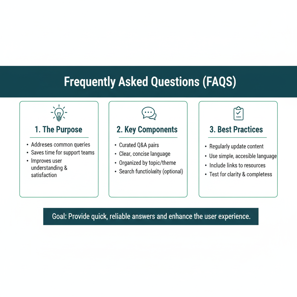
Q1: I’m not a designer. Can I really make my charts look good?
Yes, absolutely! Good chart design is about logic and clarity, not artistic talent. If you can follow the simple rules of decluttering, using color purposefully, and writing clear labels, you are 90% of the way there. The tools do the rest.
Q2: What is the single biggest mistake people make?
Overcomplicating things. The “everything but the kitchen sink” approach. They add every feature the software offers. Remember, your goal is to communicate, not to impress people with all the buttons you can click. Simplicity is the ultimate sophistication in chart design.
Q3: How many data points are too many for a single chart?
There’s no magic number, but if your chart looks crowded and is hard to read, it has too many. For line charts, if you have more than 4-5 lines, consider breaking it into multiple charts. For bar charts, if you have more than 10-15 bars, see if you can group smaller categories into an “Other” segment.
Q4: Are pie charts ever okay to use?
Yes, but sparingly. They are acceptable for showing very simple proportions (2-3 slices) where the difference between slices is obvious. For any serious data analysis or comparison, a bar chart is almost always a better choice.
Q5: Where can I find inspiration for good chart design?
Follow data visualization experts on sites like Twitter and LinkedIn. Look at publications like The New York Times, The Economist, and FiveThirtyEight—they employ world-class data journalists whose chart design is top-notch. Notice how clean and clear their visuals are.
Go Forth and Design!
Mastering chart design is a journey, not a destination. It starts with a simple mindset shift: see yourself not just as a number-cruncher, but as a storyteller.
Your data has a story to tell. It’s hiding in that spreadsheet, waiting for you to set it free. By choosing the right chart and designing it with clarity and purpose, you give that story a voice. You turn noise into meaning, and confusion into conviction.
So, the next time you’re about to paste a default chart into a presentation, pause. Ask yourself: “What is my one key message?” Then, use the principles in this guide. Declutter. Highlight. Simplify. You’ll be amazed at the difference it makes.
Now, open up that spreadsheet and start creating visuals that don’t just show data—they speak to people.
