Transform complex data into actionable insights with our 2025 guide to dashboards. Learn to create effective visualizations that drive smarter business decisions
You know that feeling of being overwhelmed? Like you’re drowning in a sea of numbers, spreadsheets, and reports? You’re staring at rows and rows of data, but you can’t see the story it’s trying to tell. Trust me, we’ve all been there.
What if you had a co-pilot? A tool that could take all that chaos and turn it into a simple, visual story you can understand at a single glance. That’s exactly what a dashboard does.
Think of it like the dashboard in your car. You don’t need to open the hood to see how fast you’re going, how much fuel you have left, or if your engine is overheating. A quick look at your speedometer, fuel gauge, and warning lights gives you all the information you need to drive safely and efficiently.
A data dashboard does the same thing for your business, your projects, or your website. It’s your personal command center for making smarter decisions, faster. In this guide, we’re going to break down everything you need to know about dashboard creation. We’ll go from the basic “what is it?” to the “how do I build an amazing one?” so you can start turning your complex data into crystal-clear insights.
What is a Dashboard, Really? (Beyond the Fancy Charts)
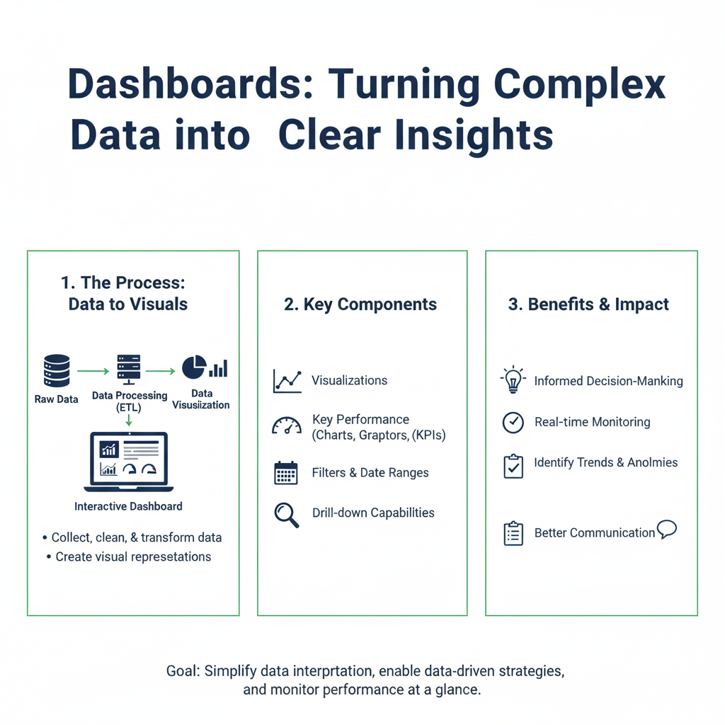
Let’s get super simple. A dashboard is a visual display of your most important information. It consolidates and arranges numbers, metrics, and key data points onto a single screen. It’s designed to be understood at a glance.
The whole point is to answer your most pressing questions quickly:
- Is my marketing campaign working?
- Are sales up or down this month?
- How is our website performing?
- Are our projects on track and on budget?
A dashboard pulls data from different places—like your website analytics, your customer database, your sales software—and puts it all in one spot. No more jumping between ten different apps and trying to connect the dots in your head.
The Car Dashboard Analogy: Your Quick Guide
This analogy is so helpful for understanding the value. Let’s break it down:
| Your Car’s Dashboard | Your Business Dashboard |
|---|---|
| Speedometer | Shows your current sales revenue or website traffic. It answers “How fast are we going right now?” |
| Fuel Gauge | Shows your remaining budget or inventory levels. It answers “Do we have enough to keep going?” |
| Engine Warning Light | Alerts you to a sudden drop in website visitors or a spike in customer complaints. It says “Hey, look at this problem now!” |
| GPS/Navigation | Shows your progress towards a quarterly goal. It answers “Are we on the right path to our destination?” |
You wouldn’t drive a car without a dashboard, right? It would be dangerous and inefficient. Running a business or a project without one is just as risky.
Why You Absolutely Need a Dashboard in 2025
In today’s world, data is being created faster than ever. But data alone isn’t power. The understanding of that data is power. That’s where a dashboard comes in.
1. They Save You a Ton of Time
How many hours do you spend each week pulling reports from different systems, copying data into spreadsheets, and formatting it just to see what’s going on? A dashboard automates all of that. The data updates automatically, giving you back precious hours to focus on actually solving problems, not just finding them.
2. They Make Complex Things Simple
Our brains are wired to process visuals much faster than text or numbers. A good dashboard turns a giant table of sales numbers into a simple line chart that shows the trend instantly. It’s the difference between reading a 50-page report and looking at a single, well-designed infographic.
3. They Help Everyone Get on the Same Page
When your whole team is looking at the same dashboard, you all have the same version of the truth. This stops arguments about “whose numbers are right” and lets you have more productive conversations about what the data means and what you should do next.
4. They Spot Problems Before They Become Emergencies
A well-set-up dashboard can act as an early warning system. If a key metric suddenly drops below a certain level, the dashboard can highlight it in red. This lets you jump on issues immediately, instead of finding out about them weeks later in a monthly report.
5. They Empower You to Make Confident Decisions
Gut feelings are important, but data-driven decisions are better. A dashboard gives you the evidence you need to decide where to invest your budget, which strategy to double down on, and what to change. You can move from guessing to knowing.
The Building Blocks of Every Great Dashboard
Before you start building, it’s helpful to know the pieces you’ll be working with. These are the visual components, or “widgets,” that make up a dashboard.
KPI Cards: Your Headline Numbers
A KPI (Key Performance Indicator) is a fancy term for your most important number. A KPI card is designed to showcase that number big and bold.
- What it looks like: A small box with a label, a large number, and sometimes a small comparison (like “up 5% from last month”).
- Example: A dashboard for an online store might have KPI cards for “Total Revenue,” “Number of Orders,” and “Average Order Value.”
Charts and Graphs: Telling the Data’s Story
Charts show how your data changes over time or how different pieces relate to each other.
- Line Charts: Perfect for showing trends over time. (e.g., Website visitors per day for the last 30 days).
- Bar Charts: Great for comparing different categories. (e.g., Sales by product category or by salesperson).
- Pie Charts/Donut Charts: Best for showing parts of a whole. Use them sparingly! (e.g., Market share by competitor).
- Tables: Sometimes, you just need to see the raw numbers in a clean, sortable format.
Gauges: Showing Progress Towards a Goal
Gauges are fantastic for answering one simple question: “How are we doing against our target?”
- What it looks like: It looks just like the speedometer in your car! It shows a needle pointing to a value between a minimum and a maximum.
- Example: A fundraising dashboard could have a gauge showing “Funds Raised” with a goal of $50,000.
Filters and Interactivity: Making it Your Own
A static dashboard is useful, but an interactive one is powerful. Filters let you and your viewers slice and dice the data on the fly.
- What it looks like: Dropdown menus, date pickers, or clickable elements.
- Example: You could have a dashboard for national sales. A filter at the top lets you select “Midwest Region” to instantly see all the charts and numbers update for just that area.
A Step-by-Step Guide to Building Your First Dashboard
Feeling inspired to build your own? Don’t worry, it’s not as hard as it seems. Let’s walk through the process together.
Step 1: Ask, “What Questions Do I Need Answered?”
This is the most important step. Do NOT start by picking charts! Start with the questions you have. The dashboard is the answer to those questions.
- Bad approach: “I want a pie chart on my dashboard.”
- Good approach: “I need to know which marketing channel brings in the most customers.” (This question might lead you to a bar chart, not a pie chart!).
Grab a notebook and write down 3-5 of your most burning business questions.
Step 2: Find the Data That Answers Those Questions
Now, figure out where the data to answer your questions lives. Is it in Google Analytics? Your Stripe account? A Salesforce report? A spreadsheet you update manually? Make a list of your data sources.
Step 3: Choose Your Tool
You don’t need to be a programmer to build a beautiful dashboard. There are amazing tools out there for every skill level and budget.
- For Beginners & Free Options:
- Google Data Studio (Now Looker Studio): Free, connects to almost everything (Google Sheets, Analytics, etc.), and is very user-friendly. A perfect place to start.
- Microsoft Power BI: Has a powerful free version and integrates deeply with the Microsoft/Excel world.
- For Business & Advanced Users:
- Tableau: Known for its powerful and beautiful visualizations. It has a steeper learning curve but is an industry leader.
- Domo: A comprehensive business intelligence platform.
For your first dashboard, I’d highly recommend starting with Looker Studio. It’s free and you can be up and running in an afternoon.
Step 4: Sketch It Out on Paper
Seriously, grab a pen and paper and draw a rectangle representing your screen. Where will you put the most important number? What chart will go in the top left? Sketching forces you to think about layout and hierarchy before you get lost in the tool. Put the most critical information in the top-left corner, where the eye naturally starts.
Step 5: Connect, Build, and Refine
Now, open your tool. Connect it to the data sources you identified. Start dragging and dropping your charts and KPI cards onto the canvas, following your sketch. Don’t be afraid to move things around. Your first version won’t be perfect, and that’s okay! A dashboard is a living thing that you will improve over time.
Real-Life Dashboard Examples You Can Relate To
Let’s make this concrete. Here’s what powerful dashboard examples look like in different contexts.
Example 1: The Small Online Store Dashboard
- Main Question: “Is my store profitable and growing?”
- Key Metrics:
- KPI Card: Total Revenue (This Month vs. Last Month)
- KPI Card: Number of Orders
- KPI Card: Average Order Value
- Key Charts:
- Line Chart: Daily Revenue Trend (Last 30 Days)
- Bar Chart: Top 5 Selling Products
- Pie Chart: Sales by Traffic Source (Google, Facebook, Email)
- Why it works: The owner can see their financial health and immediately know what’s driving sales in under 10 seconds.
Example 2: The Marketing Campaign Dashboard
- Main Question: “Is our new marketing campaign working and where should we spend more money?”
- Key Metrics:
- KPI Card: Total Money Spent
- KPI Card: Number of New Leads
- KPI Card: Cost Per Lead
- Key Charts:
- Bar Chart: Leads by Channel (Facebook Ads, Google Ads, LinkedIn)
- Line Chart: Website Visitors from the Campaign
- Gauge: Progress Towards Lead Goal
- Why it works: The marketing manager can instantly see which channels are delivering the cheapest leads and shift the budget accordingly.
Example 3: The Project Management Dashboard
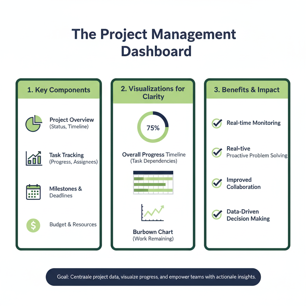
- Main Question: “Are our projects on time and on budget?”
- Key Metrics:
- KPI Card: Total Projects
- KPI Card: Projects Behind Schedule
- KPI Card: Budget Used (%)
- Key Charts:
- Bar Chart: Tasks Completed vs. Planned (by team member)
- Gantt Chart: Project Timelines and Dependencies
- Why it works: The project manager can spot delays early and see which team members might need support.
Top 7 Mistakes to Avoid (Dashboard Don’ts)
It’s easy to get excited and overcomplicate things. Here are the most common pitfalls I see.
1. The “Everything But the Kitchen Sink” Dashboard
The Mistake: Trying to put every single metric you have onto one screen.
The Fix: Be ruthless. If a metric doesn’t help answer one of your key questions from Step 1, remove it. Less is more.
2. Using the Wrong Chart Type
The Mistake: Using a pie chart to show trends over time.
The Fix: Remember: line charts for trends, bar charts for comparisons, pie charts for parts of a whole.
3. Ignoring Your Audience
The Mistake: Building a dashboard for a CEO that shows super technical, granular data.
The Fix: A CEO dashboard needs high-level strategic metrics. A technical team’s dashboard will need more detail. Build the right dashboard for the right person.
4. Forgetting Context
The Mistake: Showing a number like “$10,000 in sales” with no comparison.
The Fix: Always ask “Compared to what?” Show if that $10,000 is up 20% or down 5% from last month. That’s what makes the number meaningful.
5. Poor Visual Design
The Mistake: Using a rainbow of clashing colors, tiny fonts, and a confusing layout.
The Fix: Use a simple, consistent color palette. Use red for “bad” and green for “good” consistently. Make sure text is easy to read.
6. Letting the Data Go Stale
The Mistake: Building a beautiful dashboard that no one remembers to update.
The Fix: Use tools that connect directly to your data sources for automatic updates. If you must use a manual source like a spreadsheet, assign someone to update it regularly.
7. Not Telling a Story
The Mistake: Just throwing charts on a page without any logical flow.
The Fix: Arrange your charts to tell a story. Put the most important summary at the top left, then provide supporting details as you move down the page. Use titles and labels that guide the viewer.
Frequently Asked Questions (FAQs)
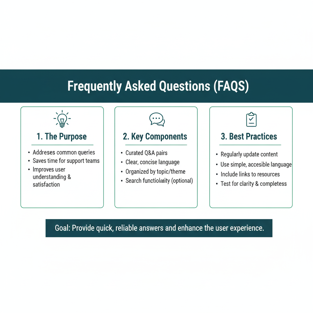
Q1: What’s the difference between a dashboard and a report?
A: A dashboard is for monitoring and giving you a quick, at-a-glance view of the present. It’s like your car’s dashboard. A report is for analysis and looking at the past in more detail. It’s like the detailed service history you get from your mechanic. Reports are often longer and are looked at periodically, while a dashboard is meant to be checked frequently.
Q2: How often should my dashboard update?
A: It depends on your needs. A social media manager might need a dashboard that updates every hour. A CEO looking at quarterly financial goals might only need it to update once a day or even once a week. Think about how quickly your data changes and how fast you need to react to it.
Q3: I’m not technical. Can I really build one?
A: Absolutely! Modern tools like Google’s Looker Studio are designed for non-technical people. They have drag-and-drop interfaces and connect to the tools you already use with just a few clicks. Start simple, and you’ll be surprised at what you can create.
Q4: What’s the one piece of advice you’d give to a first-time builder?
A: Start with a single, clear question. Don’t try to build the ultimate dashboard for your entire company on day one. Build a small, useful one that answers one important question for you or your team. Get a win, learn from it, and then build from there.
Q5: My team is resistant to using a new dashboard. How can I get them on board?
A: This is a common challenge! The best approach is to focus on how the dashboard solves their specific pain points. Instead of just announcing “we have a new dashboard,” show them how it directly makes their lives easier. For example, you could say: “Remember how we used to spend every Monday morning pulling three different reports to prepare for our team meeting? This new dashboard automatically combines all that information and updates in real-time.” Start with a small pilot group, gather their feedback, and let them become your champions. When people see the dashboard saving them time and effort, they’re much more likely to adopt it willingly.
Your Data, Decoded
Remember that feeling of being overwhelmed we talked about at the beginning? A well-designed dashboard is the antidote. It’s your map and compass in a world of data. It transforms noise into knowledge and confusion into clarity.
You don’t need a fancy title or a huge budget to start. You just need a little curiosity and a willingness to ask, “What is this data really trying to tell me?”
So, take that first step. Grab a notebook, write down one question you wish you could answer faster, and open up a free tool. Before you know it, you’ll be the one turning complex data into clear, powerful insights. Happy building