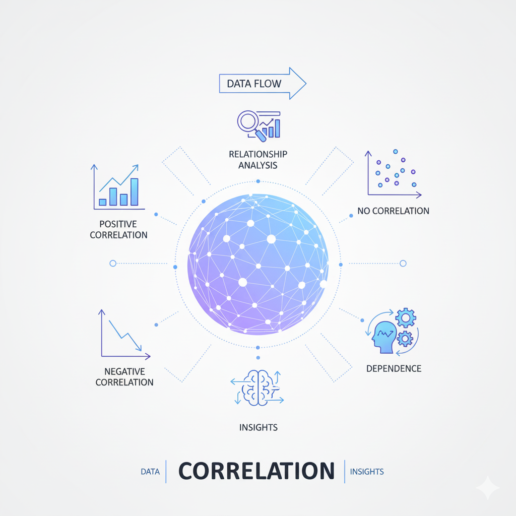
Introduction: The Pervasive Power and Pitfalls of Correlation
Correlation stands as one of the most widely used and frequently misunderstood statistical concepts in data analysis. From business intelligence and scientific research to public policy and everyday decision-making, correlation coefficients provide a seemingly straightforward measure of relationship between variables. However, this apparent simplicity belies a complex reality—correlation analysis is fraught with potential misinterpretations and methodological errors that can lead to costly mistakes and flawed conclusions. The famous maxim “correlation does not imply causation” represents just the tip of the iceberg when it comes to the challenges of proper correlation analysis.
The widespread availability of statistical software has made calculating correlation coefficients deceptively easy, enabling users with limited statistical training to generate numbers that appear authoritative but may be fundamentally misleading. A 2023 survey of published research across multiple disciplines found that approximately 40% of studies using correlation analysis contained at least one major methodological error or misinterpretation. These mistakes range from technical violations of statistical assumptions to profound conceptual misunderstandings about what correlation actually measures and what conclusions it can support.
This comprehensive guide examines the most common mistakes in correlation analysis and provides practical strategies for avoiding them. We’ll explore technical errors in calculation and interpretation, conceptual misunderstandings about the nature of correlation, and contextual factors that can distort correlation results. Whether you’re a data scientist building predictive models, a researcher testing hypotheses, or a business analyst exploring relationships in data, understanding these pitfalls will help you conduct more rigorous correlation analysis and draw more reliable conclusions from your data.
Fundamental Misunderstandings About Correlation
Confusing Correlation with Causation
The most famous and frequently repeated mistake in correlation analysis is the confusion of correlation with causation. While most analysts intellectually understand that correlation doesn’t prove causation, this understanding often fails to translate into practice when interpreting results. The human brain is naturally wired to infer causal relationships from observed patterns, making this error particularly persistent even among experienced analysts.
The Problem: When two variables show strong, there’s a natural tendency to assume that changes in one variable cause changes in the other. However, alone cannot establish causation because:
- Both variables might be influenced by a third, unmeasured variable (confounding)
- The direction of causation might be reversed from what’s assumed
- The relationship might be entirely coincidental, especially with large datasets where spurious correlations are common
Real-World Example: A classic example is the strong between ice cream sales and drowning deaths. While these variables correlate strongly, ice cream consumption doesn’t cause drowning. Instead, both are influenced by a third variable—hot weather—that increases both ice cream purchases and swimming activity.
How to Avoid:
- Always consider alternative explanations for observed correlations
- Look for potential confounding variables that might influence both variables
- Use directed acyclic graphs (DAGs) to map out potential causal relationships
- Remember that establishing causation requires additional evidence beyond correlation, such as randomized experiments, temporal precedence, or mechanistic understanding
Misunderstanding What Correlation Measures
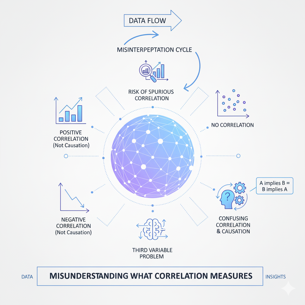
Many analysts fundamentally misunderstand what coefficients actually measure, leading to misinterpretation of results. Specifically measures the strength and direction of a linear relationship between two continuous variables, but this precise meaning is often lost in application.
The Problem: Analysts frequently make these specific misunderstandings:
- Assuming correlation measures any relationship rather than specifically linear relationships
- Believing that low correlation means no relationship exists
- Thinking that correlation coefficients represent the percentage of relationship explained
- Misinterpreting the magnitude of correlation coefficients without context
Mathematical Clarification: The Pearson coefficient (r) measures the degree to which two variables vary together relative to how they vary separately. The formula is:
r = Σ[(xᵢ – x̄)(yᵢ – ȳ)] / √[Σ(xᵢ – x̄)² Σ(yᵢ – ȳ)²]
This measures linear relationship specifically—nonlinear relationships can have zero correlation despite strong patterns.
How to Avoid:
- Always visualize relationships with scatterplots before calculating correlation
- Understand that correlation only captures linear relationships
- Remember that correlation values are context-dependent—what constitutes a “strong” correlation varies by field
- Use complementary measures like R-squared for variance explanation
Ignoring the Difference Between Correlation Types
Many analysts use Pearson’s coefficient by default without considering whether it’s appropriate for their data type or relationship structure. Different correlation measures are designed for different situations, and using the wrong one can lead to misleading results.
The Problem: Using Pearson’s r when:
- Variables are not continuous and normally distributed
- The relationship is monotonic but not linear
- Data contains outliers that disproportionately influence results
- The variables have different measurement scales
Alternative Correlation Measures:
- Spearman’s rank correlation: Measures monotonic relationships (when one variable increases, the other tends to increase or decrease, but not necessarily at a constant rate)
- Kendall’s tau: Another rank-based measure that’s more robust to outliers
- Point-biserial correlation: For relationships between continuous and binary variables
- Phi coefficient: For relationships between two binary variables
How to Avoid:
- Examine variable distributions before selecting a correlation measure
- Use Spearman or Kendall correlation for ordinal data or when normality assumptions are violated
- Consider robust correlation measures when outliers are present
- Match the correlation measure to your data type and research question
Technical and Methodological Errors
Violating Statistical Assumptions
Correlation analysis relies on several statistical assumptions that, when violated, can produce misleading results. Many analysts apply correlation measures without verifying these underlying assumptions.
Key Assumptions for Pearson Correlation:
- Linearity: The relationship between variables is linear
- Continuous variables: Both variables are measured on continuous scales
- Normality: Variables should be approximately normally distributed
- Homoscedasticity: Constant variance of errors across values
- Independence: Observations are independent of each other
Consequences of Violation:
- Non-linear relationships: Pearson correlation will underestimate relationship strength
- Non-normal distributions: Can affect the accuracy of p-values and confidence intervals
- Heteroscedasticity: Can make correlation coefficients less reliable
- Non-independent data: Can artificially inflate correlation significance
How to Avoid:
- Create scatterplots to check for linearity and homoscedasticity
- Use normality tests or Q-Q plots to check distribution assumptions
- For time series data, check for autocorrelation that violates independence
- Consider data transformations or alternative correlation measures when assumptions are violated
The Ecological Fallacy in Correlation Analysis
The ecological fallacy occurs when analysts draw conclusions about individuals based on group-level correlation patterns. This mistake is particularly common in social science, epidemiology, and business analytics where data is often aggregated.
The Problem: A correlation observed at the group level (countries, companies, departments) may not hold at the individual level, and vice versa. This happens because:
- Group averages can mask within-group variability
- Compositional effects can create spurious group-level patterns
- Different causal mechanisms may operate at different levels
Real-World Example: A famous example comes from education research where a positive correlation between school funding and student performance at the state level might not hold when examining individual schools or students within states.
How to Avoid:
- Be explicit about the level of analysis (individual vs. group)
- Avoid making individual-level inferences from group-level correlations
- Use multilevel modeling when data has hierarchical structure
- Examine within-group and between-group correlations separately
Ignoring Outliers and Influential Points
Outliers can dramatically influence correlation coefficients, potentially creating the appearance of a strong relationship where none exists or masking a real relationship. Many analysts fail to check for and properly handle outliers in their correlation analysis.
The Problem: A single outlier can:
- Artificially inflate correlation coefficients
- Artificially deflate correlation coefficients
- Change the direction of apparent relationships
- Affect the statistical significance of correlations
Visual Example: A dataset with points clustered near zero with one extreme outlier can show a strong positive correlation driven entirely by that single point.
How to Avoid:
- Always create scatterplots to visually identify outliers
- Calculate correlation with and without potential outliers
- Use robust correlation measures that are less sensitive to outliers
- Report how outliers were handled in your analysis
- Consider whether outliers represent meaningful data points or measurement errors
Sample Size Issues and Overinterpretation
Both very small and very large sample sizes present challenges for interpretation that many analysts overlook. Small samples can produce unstable correlation estimates, while large samples can make trivial correlations statistically significant.
Small Sample Problems:
- Unstable estimates: Correlation coefficients from small samples have high sampling variability
- Limited power: May fail to detect meaningful correlations
- Sensitivity to outliers: A single point can dramatically change results
Large Sample Problems:
- Statistical significance without practical significance: With thousands of observations, even trivial correlations (e.g., r = 0.05) can be statistically significant
- Multiple testing issues: When examining many correlations, some will appear significant by chance alone
How to Avoid:
- For small samples, interpret correlation magnitudes cautiously and report confidence intervals
- For large samples, focus on correlation magnitude and practical significance rather than statistical significance
- Use correction methods (like Bonferroni) when testing multiple correlations
- Consider the stability of correlations across different samples or time periods
Contextual and Interpretive Errors
Ignoring Confounding Variables
Failing to account for confounding variables represents one of the most serious errors in analysis. Confounders are variables that influence both the independent and dependent variables, creating spurious or masking true relationships.
The Problem: When a confounding variable is omitted from analysis:
- Observed correlations may reflect the confounder’s influence rather than a direct relationship
- The strength and direction of correlation can be distorted
- Causal inferences become particularly unreliable
Common Confounding Scenarios:
- Time-related confounders: Many variables trend together over time
- Demographic confounders: Age, gender, or socioeconomic status often influence multiple variables
- Behavioral confounders: Lifestyle factors can create correlations between health outcomes
- Environmental confounders: Geographic or seasonal factors affect multiple variables simultaneously
How to Avoid:
- Use domain knowledge to identify potential confounders before analysis
- Collect data on potential confounding variables
- Use partial correlation to examine relationships while controlling for confounders
- Consider more advanced methods like multiple regression when confounders are present
- Be particularly cautious with time series data where many variables trend together
The Simpsons Paradox Phenomenon
Simpson’s Paradox occurs when a or trend appears in different groups of data but disappears or reverses when the groups are combined. This counterintuitive phenomenon frequently leads to erroneous conclusions in analysis.
The Problem: A correlation observed in the overall data may:
- Disappear when examining subgroups
- Reverse direction in subgroups
- Vary substantially across different subgroups
Classic Example: A famous case involved graduate school admissions where men appeared to have higher acceptance rates overall, but within most individual departments, women had equal or higher acceptance rates. The overall correlation was driven by women applying to more competitive departments.
How to Avoid:
- Always examine correlations within meaningful subgroups
- Be wary of conclusions based solely on aggregated data
- Look for lurking variables that might create Simpson’s Paradox
- Use stratified analysis or interaction terms in regression models
- Report both overall and subgroup correlations when appropriate
Range Restriction Issues
Range restriction occurs when the variability in one or both variables is artificially limited, which can dramatically affect coefficients. This problem often goes unnoticed but can lead to substantial underestimation of relationship strength.
Types of Range Restriction:
- Direct restriction: When sample selection criteria explicitly limit the range of variables
- Indirect restriction: When selection on one variable indirectly restricts range on another
- Measurement restriction: When instruments cannot capture the full range of variable values
Consequences:
- Attenuated correlations: Restricted range typically reduces correlation magnitude
- Biased estimates: Correlation coefficients don’t reflect the true relationship in the full population
- Inconsistent results: Correlations may vary dramatically across studies with different range restrictions
Common Scenarios:
- Workplace performance studies using only employed individuals
- Educational research using only students who completed a program
- Clinical studies using only patients with moderate symptom severity
How to Avoid:
- Be aware of how sampling methods might restrict variable ranges
- Use correction formulas for range restriction when possible
- Report the variability of your variables alongside correlation coefficients
- Consider whether your sample represents the full population of interest
Overreliance on Correlation Magnitude
Many analysts focus excessively on the magnitude of coefficients without considering the context, measurement reliability, or practical significance. This leads to misinterpretation of what constitutes a “strong” or “meaningful” correlation.
The Problem:
- Interpreting correlation thresholds rigidly (e.g., “r > 0.7 is strong”)
- Ignoring that correlation magnitude depends on field and context
- Failing to consider measurement error that attenuates correlations
- Overlooking practically significant small correlations
Context Matters:
- In physics, r < 0.9 might be considered weak
- In social sciences, r = 0.3 might be theoretically important
- In business contexts, even small correlations can have substantial economic impact
How to Avoid:
- Interpret correlation magnitude relative to your specific field and context
- Consider the reliability of your measurements—unreliable measures limit maximum possible correlation
- Calculate the coefficient of determination (r²) to understand shared variance
- Consider practical significance alongside statistical significance
- Use domain knowledge to evaluate whether correlation magnitudes are meaningful
Advanced Analytical Mistakes
Misinterpreting Correlation in Time Series Data
Correlation analysis with time series data presents unique challenges that are frequently overlooked. The presence of trends, seasonality, and autocorrelation can create spurious or mask true relationships.
Common Time Series Pitfalls:
- Spurious correlation: Two unrelated trending series can show strong correlation
- Autocorrelation: Violates the independence assumption of standard correlation tests
- Lead-lag relationships: Standard correlation misses relationships where one variable leads another
- Non-stationarity: Changing means or variances over time distort correlation measures
Real-World Example: Many economic time series (GDP, stock prices, consumer spending) trend upward over time, creating strong correlations between fundamentally unrelated variables.
How to Avoid:
- Check for stationarity before calculating correlations
- Use differencing or detrending to remove trends
- Consider cross-correlation functions for lead-lag relationships
- Use time series models that account for autocorrelation
- Be particularly skeptical of correlations between trending variables
The Multiple Comparisons Problem
When analysts examine many s simultaneously—as commonly happens in exploratory data analysis—the probability of finding statistically significant correlations by chance alone increases dramatically. This multiple comparisons problem is frequently ignored in practice.
The Problem: With 20 independent correlations tested at α = 0.05, the probability of at least one false positive is approximately 64%, not 5%. In big data contexts with thousands of variables, virtually all significant correlations may be false positives.
Consequences:
- False discoveries: Many “significant” correlations occur by chance
- Wasted resources: Pursuing spurious relationships
- Reduced credibility: When chance correlations don’t replicate
How to Avoid:
- Use correction methods like Bonferroni, False Discovery Rate (FDR), or Family-Wise Error Rate (FWER)
- Adjust significance thresholds based on the number of tests performed
- Use holdout samples or cross-validation to verify correlations
- Focus on effect sizes and practical significance rather than statistical significance alone
- Be transparent about the number of correlations examined
Ignoring Non-Linear Relationships
Pearson only measures linear relationships, but many real-world relationships are nonlinear. Analysts often miss important patterns by relying solely on linear measures.
Common Nonlinear Patterns:
- Quadratic relationships: U-shaped or inverted U-shaped curves
- Exponential relationships: Rapid growth or decay
- Threshold effects: Relationships that only appear above or below certain values
- Interactions: Relationships that depend on third variables
The Consequences: Strong nonlinear relationships can have near-zero Pearson correlation, leading analysts to conclude “no relationship” when important patterns exist.
How to Avoid:
- Always visualize relationships with scatterplots before calculating correlation
- Use curve-fitting to identify nonlinear patterns
- Consider correlation ratios or other measures for nonlinear relationships
- Use polynomial terms or splines in regression models
- Be open to the possibility that relationships may be complex and nonlinear
Best Practices for Rigorous Correlation Analysis
Comprehensive Analytical Approach
Visualize Before Calculating: Always create scatterplots to visually examine relationships before calculating coefficients. Visualization can reveal:
- Nonlinear patterns that correlation misses
- Outliers that disproportionately influence results
- Clustering or subgroups within the data
- Heteroscedasticity (changing variance across values)
Use Multiple Correlation Measures: Don’t rely solely on Pearson correlation. Consider:
- Spearman’s rho for monotonic relationships
- Kendall’s tau for more robust rank-based correlation
- Partial correlation to control for confounding variables
- Distance correlation for detecting nonlinear dependencies
Check Assumptions Systematically: Before interpreting correlations, verify:
- Linearity through scatterplots and residual analysis
- Normality using statistical tests or Q-Q plots
- Homoscedasticity by examining residual plots
- Independence through autocorrelation checks for time series
Contextual Interpretation Framework
Consider Practical Significance: Evaluate correlation magnitude in context:
- What constitutes an important correlation varies by field and application
- Small correlations can be practically important with large samples or high-stakes decisions
- Consider the cost of acting on versus ignoring a correlation
Examine Stability and Replicability: Don’t base conclusions on a single correlation:
- Use cross-validation to check if correlations hold in different samples
- Examine correlations across different time periods
- Look for consistency across different measurement approaches
Integrate Domain Knowledge: Use subject matter expertise to:
- Identify potential confounding variables
- Evaluate whether correlations make theoretical sense
- Determine appropriate correlation thresholds for your context
- Identify potential mechanisms that might explain correlations
Reporting and Communication Standards
Transparent Reporting: When presenting correlation results, include:
- Sample size and characteristics
- Exact correlation coefficients and confidence intervals
- Information about how outliers were handled
- Assumption checks and data transformations
- Number of correlations examined (if multiple testing occurred)
Appropriate Visualization: Use effective visualizations to communicate correlation results:
- Scatterplots with correlation coefficients
- Confidence ellipses to show relationship uncertainty
- Correlation matrices with clear formatting
- Partial regression plots for relationships controlling for other variables
Cautious Language: Use precise language that reflects what correlation actually shows:
- “Variables X and Y are correlated” rather than “X causes Y”
- “The data show a linear relationship” rather than “these variables are related”
- “After controlling for Z, the correlation is…” when using partial correlation
Conclusion: Toward More Rigorous Correlation Analysis
Correlation analysis remains a fundamental tool in the data analyst’s toolkit, but its apparent simplicity masks substantial complexity. The mistakes outlined in this guide—from fundamental confusions about what correlation measures to sophisticated errors in time series analysis—demonstrate that proper correlation analysis requires both statistical knowledge and careful practice.
The path to better analysis involves moving beyond mechanical calculation to thoughtful interpretation. This means always visualizing relationships before calculating coefficients, understanding the limitations of different correlation measures, considering context and domain knowledge when interpreting results, and maintaining appropriate skepticism about correlations—especially those that seem too good to be true or align too perfectly with preconceptions.
Perhaps most importantly, rigorous analysis requires acknowledging what correlation cannot tell us. Correlation reveals patterns and suggests relationships worth investigating further, but it rarely provides definitive answers on its own. By complementing correlation analysis with other methods—experimental designs when possible, multivariate models when appropriate, and qualitative understanding always—analysts can build more complete and reliable understanding of the relationships in their data.
In an era of increasingly accessible data analysis tools, the most valuable skill may not be the ability to calculate correlation coefficients, but the wisdom to interpret them appropriately. By avoiding these common mistakes and following the best practices outlined here, analysts can ensure that their correlation analyses provide genuine insight rather than misleading numbers.