Discover the top Data Visualization Tools every analyst must master in 2025. Learn how Tableau, Power BI, Python, and Google Data Studio transform raw data into insights.
Introduction
In the era of big data, the ability to visualize information clearly and effectively has become one of the most valuable skills in analytics. Modern organizations are generating more data than ever before — from customer transactions and social media activity to IoT sensors and business systems. Yet, data in its raw form can be overwhelming. That’s where Data Visualization Tools come in.
These tools transform complex data into clear, interactive visuals that reveal patterns, relationships, and insights at a glance. They bridge the gap between data scientists and decision-makers, turning numbers into stories that inspire action. Whether you are a data analyst, business intelligence professional, or student, mastering Data Visualization Tools is essential to stay competitive in 2025.
In this article, we’ll explore four of the most powerful and widely used Data Visualization Tools that every analyst should master: Tableau, Power BI, Python libraries (Matplotlib, Seaborn, Plotly), and Google Data Studio. Each tool offers unique capabilities, from user-friendly dashboards to advanced analytics integration. Let’s dive deep into what makes these tools indispensable in the world of data analytics.
Why Data Visualization Tools Matter
Before diving into each tool, it’s important to understand why Data Visualization Tools are at the core of modern analytics. Humans process visuals 60,000 times faster than text, meaning charts, dashboards, and infographics are not just accessories—they are necessities for comprehension and communication.
Businesses rely on Data Visualization Tools to:
- Make data-driven decisions faster.
- Identify trends and outliers instantly.
- Enhance storytelling with interactive dashboards.
- Simplify complex datasets for non-technical audiences.
- Collaborate across teams with real-time visual insights.
In short, Data Visualization Tools empower professionals to not just analyze data—but to communicate it effectively.
1. Tableau: The Gold Standard of Visual Analytics
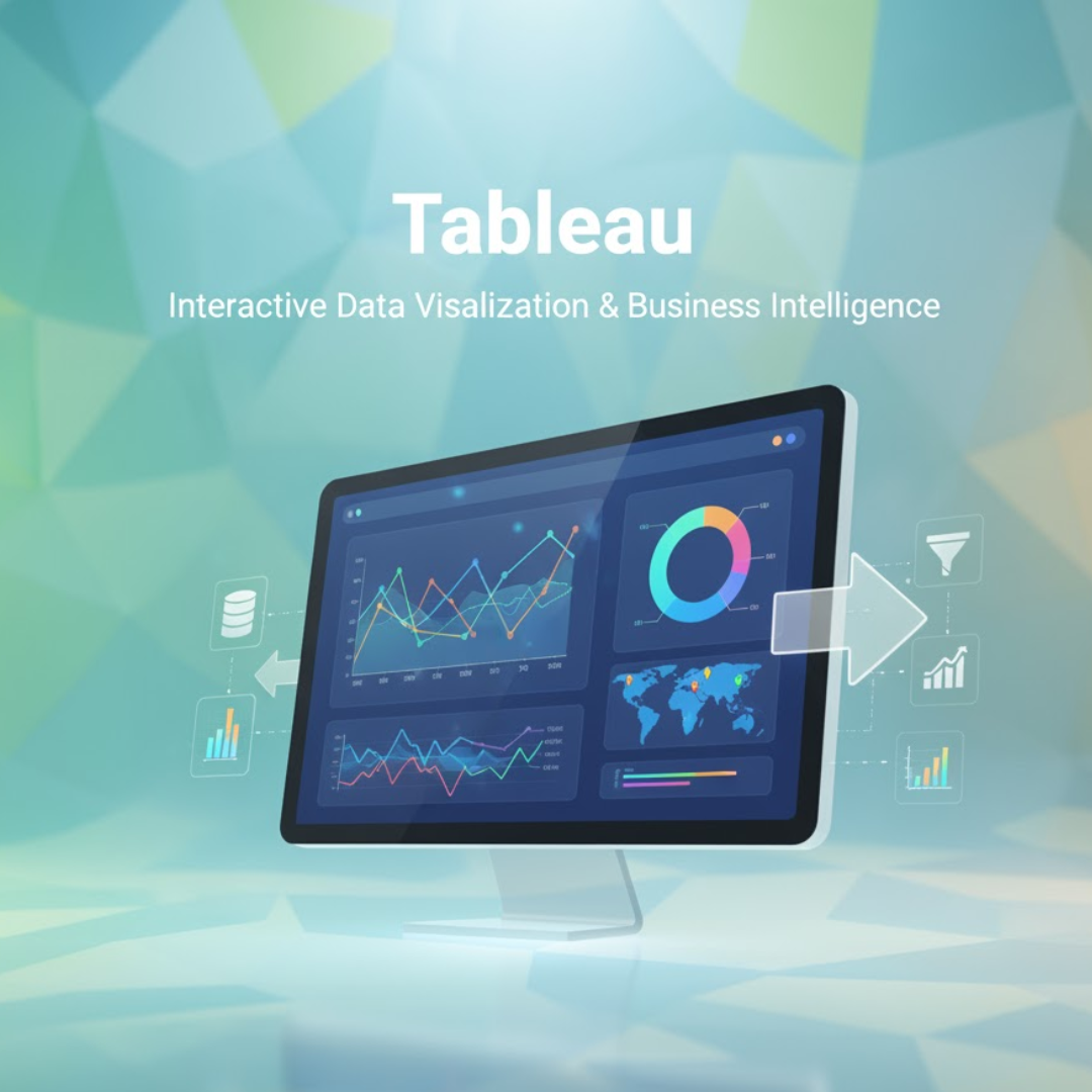
Tableau remains one of the most popular and trusted Data Visualization Tools in the analytics world. Known for its intuitive drag-and-drop interface, Tableau allows users to create stunning, interactive dashboards without extensive coding.

What Makes Tableau Powerful
Tableau’s true strength lies in its ability to handle large, complex datasets with speed and precision. It connects seamlessly to numerous data sources such as SQL databases, cloud services, Excel files, and web APIs. Users can visualize millions of rows of data while maintaining smooth interactivity.
The platform offers a wide range of visualization options—bar charts, heat maps, scatter plots, tree maps, and story dashboards—that can be customized for storytelling. Its VizQL (Visual Query Language) engine converts user actions into database queries, ensuring fast and optimized visual rendering.
Tableau in Business
Organizations such as Amazon, Deloitte, and LinkedIn use Tableau to monitor KPIs, analyze customer trends, and forecast growth. In the healthcare sector, analysts use Tableau to visualize patient outcomes, while in finance, it helps monitor transactions for fraud detection.
For data professionals, Tableau certification adds strong credibility. With its vast community and frequent updates, Tableau continues to be one of the most reliable Data Visualization Tools for enterprise-grade analytics.
2. Power BI: Microsoft’s Data Visualization Powerhouse
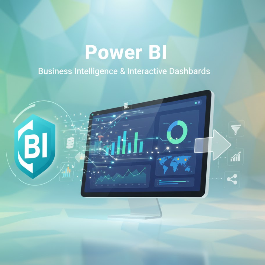
Power BI, developed by Microsoft, is another leading tool in the business intelligence ecosystem. It integrates perfectly with Excel, Azure, and Microsoft 365, making it a natural choice for enterprises already using Microsoft products.

What Sets Power BI Apart
Power BI’s main advantage is accessibility. It provides a user-friendly interface and drag-and-drop functionality similar to Tableau but at a more affordable cost. Users can connect to multiple data sources—SQL, cloud storage, APIs—and create visual reports with just a few clicks.
With AI integration, Power BI automatically detects data patterns, generates visual recommendations, and provides natural language query support (users can type “show sales growth by region” and get results instantly). This makes it one of the most intelligent Data Visualization Tools for beginners and professionals alike.
Real-World Usage
Companies like Adobe, Rolls-Royce, and Coca-Cola rely on Power BI for real-time business insights. It allows executives to access interactive dashboards on mobile devices, ensuring they’re always informed Data Visualization Tools.
Power BI’s integration with Microsoft Teams and Azure Synapse Analytics enhances collaboration, making it ideal for organizations looking for a unified analytics ecosystem.
3. Python Visualization Libraries: Matplotlib, Seaborn, and Plotly
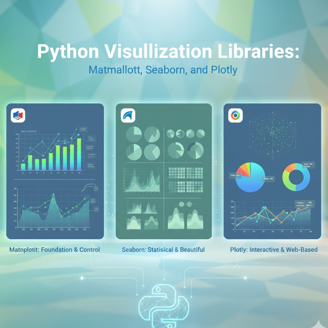
While Tableau and Power BI cater to business users, Python gives data scientists full flexibility and control over their visualizations. Python offers several Data Visualization Tools in the form of open-source libraries—Matplotlib, Seaborn, and Plotly—each serving different analytical needs.

Matplotlib
Matplotlib is the foundation of all Python-based visualizations Data Visualization Tools. It allows developers to create static, publication-quality charts with fine-grained customization. Although it requires more coding, it’s perfect for creating reproducible visuals in research and reports.
Seaborn
Seaborn builds on Matplotlib but offers a higher-level interface. It simplifies the creation of statistical plots like box plots, violin plots, and regression lines with aesthetically pleasing color palettes. Seaborn is particularly useful for exploring data distributions and relationships between variables. What makes Seaborn stand out among other Data Visualization Tools is its ability to automatically handle complex dataset structures such as time series or multi-category comparisons with minimal code. It’s also tightly integrated with Pandas DataFrames, allowing analysts to move seamlessly from data wrangling to visualization without losing context.
Plotly
Plotly takes Python visualization to the next level with interactivity. Users can create dynamic dashboards, 3D plots, and maps that respond to user input. It’s one of the best Data Visualization Tools for web-based analytics and business dashboards. Unlike static charts, Plotly empowers users to zoom, filter, and explore datasets directly within the browser, making data storytelling highly engaging. Moreover, its compatibility with Dash (a Python framework) enables developers to turn analytical visualizations into full-fledged web applications for real-time decision-making.
Why Python Visualization Tools Matter
For data scientists, mastering these Python-based Data Visualization Tools is crucial because they integrate seamlessly with machine learning workflows, allowing you to visualize model outputs, feature importance, and performance metrics—all in code.
4. Google Data Studio (Looker Studio): Free and Collaborative Visualization
Google Data Studio, recently rebranded as Looker Studio, is one of the most accessible and collaborative Data Visualization Tools available. It’s free, cloud-based, and integrates smoothly with Google products like Sheets, Analytics, BigQuery, and Ads.
Features and Benefits
Looker Studio allows users to transform data from multiple sources into fully interactive dashboards. It supports blending data from multiple Google and non-Google sources, making it an excellent choice for marketers and analysts managing multi-channel campaigns.
Its real-time collaboration capabilities allow teams to work on the same dashboard simultaneously, similar to Google Docs. Moreover, sharing insights with stakeholders is effortless—no software installation required, just share a link.
Who Uses It
Digital marketing agencies, small businesses, and freelancers often use Looker Studio to track website traffic, ad performance, and campaign ROI. With customization options and interactive filters, users can design dashboards that fit specific KPIs.
As one of the fastest-growing Data Visualization Tools, Google Data Studio provides a no-cost entry point into the world of professional analytics visualization.
Comparing the Top Data Visualization Tools
Each of these four Data Visualization Tools serves different user needs and business goals.
| Tool | Best For | Key Strengths |
|---|---|---|
| Tableau | Enterprise dashboards | Powerful visuals, scalability, integration |
| Power BI | Business analytics | Affordability, AI features, Microsoft ecosystem |
| Python (Matplotlib, Seaborn, Plotly) | Data science projects | Flexibility, coding control, advanced analytics |
| Google Data Studio | Marketing & reporting | Free, easy collaboration, cloud integration |
The right tool depends on your background and objectives. Business analysts might prefer Tableau or Power BI for their simplicity and visual polish, while data scientists lean toward Python for analytical depth.
How to Choose the Right Data Visualization Tool
When selecting from multiple Data Visualization Tools, consider the following:
- Skill Level: Beginners may find Tableau and Power BI easier, while Python suits technical users.
- Budget: Google Data Studio is free; Tableau offers enterprise pricing; Power BI is affordable for individuals.
- Integration Needs: If your data lives in Google Cloud or Azure, choose tools that integrate natively.
- End-User Goals: For stakeholder presentations, choose tools that emphasize visual storytelling.
No single solution fits all. The best approach is to master two or more Data Visualization Tools—one for business dashboards and another for custom analytical tasks.
The Future of Data Visualization Tools
As these technologies converge, visualization becomes not just a way to view data but a smart assistant that explains, alerts, and interacts. Below I explain each trend, give concrete examples and architectures, and list practical implementation tips and pitfalls.
AI-driven storytelling (auto-narratives + explanations)
What it is: systems that automatically generate human-readable narratives that accompany charts — not just labels, but short explanations: “Sales in Region A rose 12% in Q2 driven by increased conversion after Campaign X; most growth came from product Y.”
How it works (pipeline):
- analytics engine computes metrics, deltas, contributors (e.g., decomposition, attribution),
- an insight engine ranks the most meaningful changes (significance testing, effect size),
- a Natural Language Generation (NLG) module (template NLG or an LLM tuned with factual grounding) crafts readable sentences, and
- a fact-checker validates numbers versus source before publishing the narrative.
Techniques & components: contributor analysis, feature importance (SHAP), change point detection, templated NLG or small LLMs fine-tuned for factual summarization, and lightweight truth-checks (recompute referenced metrics).
Benefits: makes dashboards consumable by non-technical users, increases adoption, surfaces business-relevant insights automatically, can save analysts’ time by summarizing key signals.
Pitfalls: LLM hallucination (inventing causes), over-simplification, noisy data producing misleading narratives. Always include a “source” line (exact metric and query) and confidence scores.
Implementation tips: start with templated narratives (deterministic), then layer in LLMs for paraphrasing. Show the underlying metric query and allow users to click “explain how this was computed.”
Real-time dashboards powered by streaming data
What it is: dashboards that update in seconds (or sub-second) from streaming sources: clickstreams, telemetry, IoT sensors, logs, payment events.
Typical architecture:
Data sources → ingestion (Kafka, Kinesis) → stream processing (Flink, Spark Streaming, or lightweight stream SQL) → real-time OLAP/store (Druid, ClickHouse, Rockset) → visualization layer (live connectors, custom web dashboards).
Key capabilities: sliding windows, event time processing, late arrival handling, aggregations, stateful joins, and incremental updates to visuals.
Why it matters: enables immediate operational decisions — fraud alerts, capacity scaling, live campaign adjustments, and customer support interventions.
Performance & UX challenges: dealing with high throughput, ensuring low latency, designing charts that don’t overwhelm users (rate limiting, sampling), and handling data drift.
Implementation tips: start with a few critical KPIs in real-time (e.g., error rate, transaction volume). Use downsampling and aggregation for UI performance, and provide “playback” controls to inspect past windows.
Augmented analytics (assisted exploration + prescriptive suggestions)
What it is: analytics systems that proactively surface insights, suggest next queries, recommend relevant visualizations, and sometimes propose causal explanations or “what-if” scenarios.
How it differs from simple automation: augmented analytics goes beyond automation by combining ML, statistics, and UX to guide users — it suggests hypotheses (“look at cohort X”), shows feature importances, and can run AutoML experiments to recommend models.
Core techniques: anomaly detection, automated correlation and causality checks, AutoML for quick model building, feature importance (SHAP/LIME), counterfactual simulations, and interactive “what-if” sliders.
User benefits: saves time, helps non-technical users explore confidently, surfaces hidden patterns they might miss, and offers prescriptive next steps (e.g., “increase budget here to capture predicted demand”).
Risks & limitations: correlation ≠ causation (systems must not claim causality without proper methods), the suggestion overload — too many “insights” can distract users, and model bias in suggestions.
Implementation tips: give users control (accept or reject suggestions), show confidence and provenance for each suggested insight, and implement guardrails for causal claims (flag when only correlation is detected).
Voice and gesture control for interacting with dashboards
What it is: natural interfaces that let users query dashboards with voice (“Show last 30 days sales by product category”), or use gestures/hand motions (in meeting rooms or AR) to zoom, filter, and annotate visuals.
How it works (voice): Speech-to-text (ASR) → intent & entity detection (NLU) → translate to data query (SQL or API call) → return results → optional text-to-speech. Add dialogue management for follow-ups.
How it works (gesture): camera or device sensors detect gestures → map gestures to UI actions (zoom, pan, select) → animate visual change.
Use cases: hands-free monitoring in operations centers, meeting room exploration where stakeholders ask aloud for deeper dives, mobile use when typing is inconvenient, AR dashboards for visual analytics in fieldwork.
Challenges: accents and noise affect ASR, ambiguous queries need clarification dialogs, security and privacy concerns for voice capture, gesture accuracy varies with lighting/camera. Accessibility is a huge plus — voice interfaces can make analytics available to visually impaired users.
Implementation tips: support natural language with fallback UX (show the parsed SQL or filter), allow confirmation for destructive actions (e.g., “Save this filter?”), and log voice queries to improve models and audit usage.
How these trends combine in practice
They’re not isolated — the real power is when they work together. Imagine a real-time fraud dashboard that detects anomalous patterns (streaming + anomaly detection), highlights the top contributing features with SHAP, auto-generates a short narrative explaining the anomaly (AI-driven storytelling), and allows an investigator to ask a clarifying question by voice: “Show transactions for account X in the last two hours.” That end-to-end flow takes insights from detection to understanding to action in seconds.
Practical adoption roadmap (what teams should do first)
- Pilot small, high-impact scenarios. Pick one KPI or workflow (fraud, churn, ops) and add streaming + anomaly + auto-narratives.
- Invest in data plumbing. Reliable ingestion, time-corrected event processing, and a fast analytical store are prerequisites.
- Start deterministic, then evolve. Use rule-based narratives first, then safely add ML/LLM paraphrasing with grounding checks.
- Design for trust. Show confidence scores, metric provenance, and easy ways to inspect the underlying query.
- Implement MLOps and monitoring. Track model performance, drift, false positives for anomalies, and UX metrics for narrative usefulness.
- Privacy & governance. Mask PII in narratives and voice logs, keep an audit trail, and comply with regulations.
Key risks & how to mitigate them
- Hallucinations and incorrect narratives: Use constrained templates + numeric validation before display.
- Alert fatigue from too many automated insights: Rate-limit suggestions and highlight only statistically significant items.
- Latency & scale issues: Employ appropriate stream processing frameworks and use aggregated views.
- Security & privacy: Encrypt logs, redact sensitive fields, and require authentication for voice/gesture controls.
- Bias and unfair recommendations: Monitor model fairness and expose feature importance to users.
Quick checklist for building next-gen visualizations
- Ensure real-time pipeline for critical KPIs (ingest → process → store → visualize).
- Add automated insight ranking (stat significance + business impact).
- Provide transparent narratives with source links and confidence.
- Offer voice/NLU fallback and show parsed query for auditing.
- Log interactions and use them to improve suggestion quality.
- Start with “explainable” models (SHAP/LIME) when giving causal or prescriptive recommendations.
Conclusion
In today’s data-driven landscape, mastering Data Visualization Tools is not optional—it’s essential. They serve as the bridge between complex data and meaningful decisions, turning numbers into narratives and analytics into action.
From the interactive dashboards of Tableau and Power BI to the programmable flexibility of Python and the collaboration-friendly Looker Studio, these four tools empower analysts to explore, explain, and execute data-driven strategies with precision.
As organizations across industries continue to rely on data for innovation, efficiency, and growth, those who master these Data Visualization Tools will lead the future of analytics. The key to becoming an exceptional analyst lies not only in understanding data—but in being able to visualize it with clarity, creativity, and confidence.