Discover 10 powerful techniques to transform raw data into compelling Data story. Learn how to craft data stories that drive decisions and inspire real action.
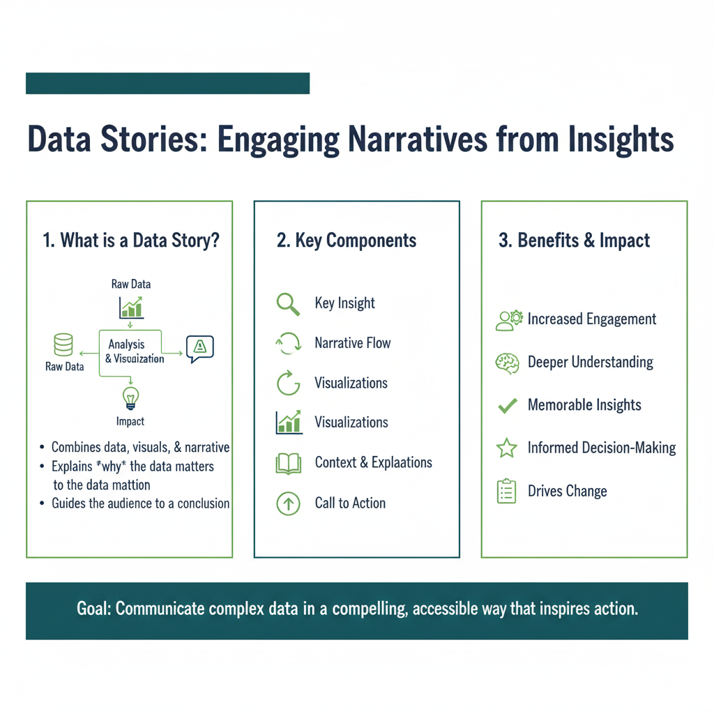
We live in a world drowning in data. Every day, businesses generate countless spreadsheets, reports, and dashboards filled with numbers. But here’s the secret: data, on its own, is powerless. It’s just noise until it’s given a voice and a purpose. The single most effective way to bridge the gap between raw numbers and real-world action is through the art of data story.
Think about it. You can show your boss a spreadsheet showing a 15% drop in user engagement, and they might nod. But if you tell them a data story—”Last quarter, we launched a new feature that accidentally made our app more complicated to use. As a result, we’ve seen a steady exodus of our most loyal users, the ones who have been with us for years. We’re not just losing numbers; we’re losing our community”—you will inspire immediate action.
A data story is more than a chart; it’s a narrative. It connects data points with context, emotion, and a clear call to action. It transforms you from a reporter of facts into a catalyst for change. This guide will walk you through ten powerful ways to master this essential skill and turn your insights into impact.
1. Find the Human Angle: Connect Numbers to People
Data is abstract. People are not. The most powerful data story always connect the numbers back to the human beings they represent.
Why it Works: Our brains are wired for empathy. We connect with stories about people far more deeply than we connect with statistics. A number is a fact; a story about a person is an experience.
How to Do It:
- Create User Personas: Instead of “users aged 25-34,” talk about “Alex, a young professional who uses our app to manage her budget during her commute.”
- Use Direct Quotes: Incorporate feedback from customer surveys, interviews, or support tickets. A single quote like, “I literally cried when this feature didn’t work,” is more powerful than a 10% increase in support tickets.
- Tell a Customer Journey: Frame your data as the journey of a single, representative user. “Let’s follow Sarah’s experience last month. She clicked the ad (data point 1), signed up for the trial (data point 2), but hit a wall on the pricing page (data point 3) and left.”
Real-Life Example:
A non-profit isn’t just reporting that “donations are down 20%.” They tell the story of Maria, a specific individual their organization helps. They show how a 20% funding cut directly translates to Maria losing her weekly meals and counseling sessions. The data is no longer about money; it’s about Maria’s well-being.
2. Start with the “So What?”: Lead with Your Insight
Never make your audience hunt for the meaning. The most important point of your data story should be the very first thing you reveal.
Why it Works: This is the inverted pyramid of journalism applied to data. It respects your audience’s time and immediately grabs their attention by answering their most pressing question: “Why should I care?”
How to Do It:
- Craft a Headline Conclusion: Start your presentation, email, or report with a single, powerful sentence that summarizes the core insight. Example: “Our new marketing campaign is attracting a younger demographic, but we’re failing to convert them because our website isn’t mobile-friendly.”
- State the Bottom Line Up Front (BLUF): This is a military and business communication technique. Before showing a single chart, state your key finding and your recommended action.
- Use Your Title Wisely: Instead of “Q3 Marketing Report,” use a title that tells the story: “Q3 Marketing: We’re Winning on Social Media, Losing on Email.”
Real-Life Example:
A data analyst doesn’t start by showing a complex chart of website traffic sources. She starts by saying, “We have a massive opportunity to increase sales by 15% by fixing our checkout process on mobile devices.” Now, everyone in the room is listening intently, and the charts that follow simply become the evidence for that initial, compelling claim.
3. Build a Narrative Arc: Create Tension and Resolution
Every great story has a structure: a beginning, a middle, and an end. Your data story should be no different. Use the classic narrative arc to give it shape and momentum.
Why it Works: The narrative arc is psychologically satisfying. It creates curiosity and emotional investment, making your audience want to know what happens next.
How to Do It:
- The Setup (Beginning): Establish the context and the status quo. “For the past year, our sales have been growing steadily at 5% per quarter.”
- The Conflict (Middle): Introduce the problem or opportunity. This is the tension. “But last quarter, our main competitor launched a new product, and our growth has stalled. We’ve also noticed a 30% spike in negative reviews mentioning ‘outdated features.'”
- The Resolution (End): Present the solution and the call to action. “Our analysis shows that by investing in a specific feature upgrade, we can not only address these complaints but also potentially recapture our market share. I recommend we allocate resources to Project X.”
Real-Life Example:
A project manager’s status report isn’t just a list of tasks. It’s a story: “We set out to launch the new platform by September. We’ve successfully built the core features (setup), but we’ve hit a critical roadblock with a third-party API that is threatening our deadline (conflict). To resolve this, we need to approve a budget for an alternative solution this week to get back on track (resolution).”
4. Visualize for Understanding, Not Decoration
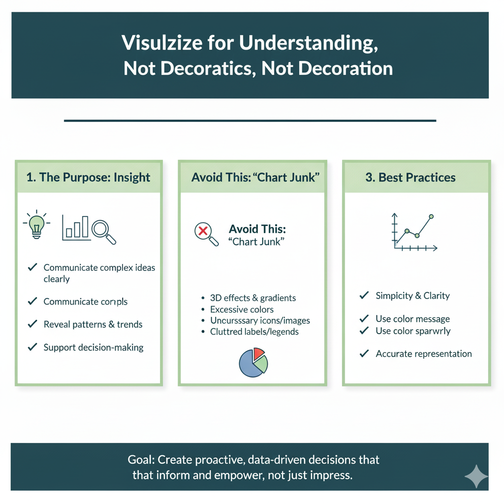
Charts and graphs are the scenes and characters of your data story. But a bad visual can confuse the narrative, while a good one can make it unforgettable.
Why it Works: The human brain processes visuals 60,000 times faster than text. The right chart instantly clarifies relationships and trends that would take paragraphs to explain.
How to Do It:
- Choose the Right Chart: Use bar charts for comparisons, line charts for trends over time, and pie/donut charts sparingly for parts of a whole.
- Eliminate Chartjunk: Remove unnecessary gridlines, backgrounds, and 3D effects. Every element on the chart should serve a purpose.
- Annotate Directly: Use labels and callouts on the chart itself to highlight the most important data points. Don’t make your audience guess what’s significant.
- Use Color Strategically: Use a bold color to highlight the key part of your data and muted colors for the context.
Real-Life Example:
Instead of a table of monthly sales figures for 10 products, a sales director shows a simple line chart. One line, representing a new product, is bright red and shooting upwards, while the others are grey. The story of the new product’s explosive growth is understood in a single glance.
5. Create a Compelling “Aha!” Moment
A powerful data story leads the audience on a journey of discovery, culminating in a clear, surprising, or insightful conclusion—the “Aha!” moment.
Why it Works: This moment of revelation creates a lasting impression. It’s the point where everything clicks, and the audience feels the genuine value of the data.
How to Do It:
- Build Suspense: Lead with a question. “Have you ever wondered why our customer retention is so high in Europe but so low in Asia?”
- Challenge Assumptions: Present data that contradicts a widely held belief in the organization. “We all thought price was our biggest barrier, but the data shows it’s actually product complexity.”
- Connect Seemingly Unrelated Dots: Reveal a hidden correlation. “It turns out that customers who watch our onboarding video are three times more likely to upgrade to a paid plan, but 80% of users skip it.”
Real-Life Example:
A marketing analyst presents data showing that website traffic is up, but conversions are down. She builds the case, exploring various theories, before revealing the “Aha!”: “The source of our new traffic is a viral social media post that’s attracting a teenage audience, but our product is designed for working professionals. We’re attracting the wrong crowd.” This insight immediately shifts the team’s strategy.
6. Speak Your Audience’s Language
The same data will need to be told as a different story depending on who is listening. A technical team, the C-suite, and customers all care about different things.
Why it Works: Tailoring your story builds rapport and ensures relevance. It shows you understand your audience’s priorities and constraints.
How to Do It:
- For Executives: Focus on the big picture: strategy, ROI, risk, and market impact. Keep it high-level and concise.
- For Technical Teams: Dive into the details, methodologies, and specific data points. They need to understand the “how” and “why” behind the data.
- For Marketing/Sales: Connect the data to customer behavior, lead generation, and messaging. Focus on the “who” and “what does this mean for our campaigns?”
- Avoid Jargon: Use simple, clear language that everyone can understand. Explain necessary technical terms.
Real-Life Example:
Presenting a data story about a server outage:
- To the CEO: “A server outage last night cost us an estimated $50,000 in lost sales and impacted our brand reputation. We have a plan to prevent this from happening again.”
- To the Engineering Team: “The root cause was a cascading failure in the database cluster triggered by a memory leak in version 2.1 of the application code. We need to roll back the deployment and patch the leak.”
7. Master the Power of “What If” Scenarios
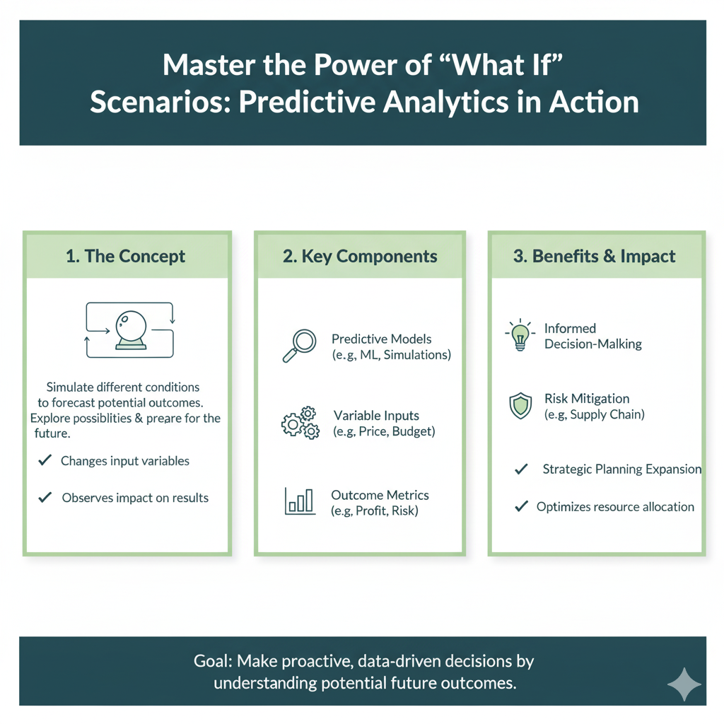
Static data shows what has happened. A great data story can explore what could happen. Using scenarios and projections makes your story forward-looking and action-oriented.
Why it Works: It shifts the conversation from passive analysis to active decision-making. It helps your audience visualize the consequences of different choices.
How to Do It:
- Use Modeled Projections: Show simple forecasts based on current trends. “If we do nothing, we will hit our server capacity in 6 months.”
- Present Alternative Paths: “If we invest in Campaign A, we project a 10% revenue increase. If we invest in Campaign B, we project a 5% increase but a 15% growth in brand awareness.”
- Quantify the Cost of Inaction: This is a powerful motivator. “If we don’t fix this security vulnerability, a potential data breach could cost us an estimated $2 million in fines and lost customer trust.”
Real-Life Example:
An HR manager presents data on employee turnover. She doesn’t just show that turnover is 15%. She tells a story: “This 15% turnover costs us $500,000 annually in recruiting and training. However, if we invest $100,000 in a new professional development program, our models project we could reduce turnover to 10%, saving the company $200,000 in the first year alone.”
8. Focus on a Single, Clear Call to Action
A story without a point is just a anecdote. Your data story must conclude with a specific, actionable request. What do you want your audience to do?
Why it Works: It provides a clear next step, eliminating ambiguity and preventing the common “That was interesting, now what?” reaction.
How to Do It:
- Be Specific: Don’t say “we should look into this.” Say, “I need approval to form a task force to investigate this solution by Friday.”
- Make it Actionable: The action should be something your audience has the power to execute.
- Connect it Directly to the Data: Explicitly link the action back to the key insight. “Because the data shows our mobile users are churning at a 50% higher rate, I am requesting a budget of $25,000 to redesign the mobile experience.”
Real-Life Example:
After presenting a data story about a successful pilot program, the conclusion isn’t “The pilot was a success.” It’s: “Based on the 25% performance improvement shown in the pilot, I recommend we roll out this training program to the entire sales department next quarter, and I need your signature to proceed with the vendor contract.”
9. Build Trust Through Transparency
For your story to be believed, your audience must trust the data. Being transparent about your sources, methods, and limitations builds that crucial trust.
Why it Works: It shows intellectual honesty. Acknowledging what you don’t know or where the data is fuzzy makes the parts you are confident about more credible.
How to Do It:
- Cite Your Sources: Where did the data come from? (e.g., Google Analytics, Salesforce, internal survey).
- Explain Your Methodology: Briefly explain how you analyzed the data. “We correlated NPS scores with support ticket data over a 90-day period.”
- Acknowledge Limitations: “This survey had a small sample size of 100 users, so it’s directional. We recommend a larger study to confirm.”
- Show Confidence Intervals: If appropriate, use ranges to show uncertainty in projections.
Real-Life Example:
A data scientist presents a model predicting customer churn. She says, “Our model has an 85% accuracy rate based on historical data. It’s most confident about customers who exhibit these three behaviors. However, it’s less accurate for new customers with less than 30 days of history.” This honesty prevents misguided actions and builds her credibility.
10. Practice, Refine, and Rehearse
Crafting a compelling data story is a skill, not a talent. It requires practice. The first draft of your story is rarely the best one.
Why it Works: Rehearsal smooths out the narrative, helps you anticipate questions, and builds your confidence as a storyteller.
How to Do It:
- Write a Script: Not to read word-for-word, but to structure your thoughts and ensure a logical flow.
- Practice on a Colleague: Someone unfamiliar with the project is the perfect test audience. If they get lost, your real audience will too.
- Time Yourself: Especially for presentations. Being concise is a sign of respect.
- Solicit Feedback: Ask specifically: “Was the main point clear? Was the call to action obvious? Where did you get confused?”
Real-Life Example:
Before presenting to the board, a manager runs her data story by a junior analyst. The analyst points out that a key chart is confusing. The manager takes the feedback, simplifies the chart, and her final presentation is much more effective because of it.
Conclusion: Your Data is Waiting for Its Story
We began this journey by acknowledging a universal truth: we are drowning in data but starving for wisdom. Spreadsheets, dashboards, and reports filled with numbers are everywhere, but they rarely, on their own, change minds or spur people into action. They are the raw, unrefined ore. The process of smelting that ore into something valuable, something that can shape decisions and drive progress, is the art and science of crafting data story.
Throughout this guide, we’ve explored ten powerful methods to transform your analytical findings from mere information into compelling narratives. Let’s revisit the core truth that binds them all: data story are not a decorative addition to your work; they are the essential bridge between insight and impact. They are the vehicle that carries your findings from your screen into the hearts and minds of your audience, compelling them to care and to act.
Remember the key pillars we’ve built:
- Connection is Key: By finding the human angle in your data story, you tap into empathy, the most powerful catalyst for action. Numbers about “user churn” are abstract; the story of a loyal customer leaving out of frustration is unforgettable.
- Clarity is Confidence: Leading with your “So What?” and building a clear narrative arc respects your audience’s time and intelligence. It transforms a confusing data dump into a logical, persuasive journey from problem to solution.
- Visuals are Vocabulary: The charts and graphs in your data story are not just illustrations; they are the very language you speak. Choosing the right visual and designing it for understanding ensures your message is seen and comprehended in an instant.
- Action is the Goal: Every single one of your data story must conclude with a clear, specific call to action. A story without a next step is merely a anecdote. Your narrative should naturally build to a point where the required decision feels not just logical, but inevitable.
As you move forward, make a conscious shift in your role. You are no longer just a data analyst, a manager, or a reporter. You are a storyteller. Your raw materials are numbers, trends, and correlations. Your finished product is understanding, alignment, and momentum.
The next time you prepare to share your findings, pause before you send that spreadsheet or presentation deck. Ask yourself the fundamental questions this guide has equipped you to answer:
- Who is my audience, and what do they truly care about?
- What is the single, most important message my data reveals?
- How can I frame this not as a set of facts, but as a story with a challenge and a resolution?
- What specific action do I need my audience to take?
Your data holds immense potential. It contains the clues to inefficiencies, the blueprints for growth, and the early warnings of risks. But that potential remains locked away until you unlock it with a powerful narrative. Stop just presenting data. Start telling data story. Master this skill, and you will no longer just inform your organization—you will inspire it to achieve what the numbers alone could only hint was possible.